

OKR Dashboard Powerpoint Ppt Template Bundles




Try Before you Buy Download Free Sample Product
 Impress Your
 Audience
 100%
100% Editable
 Save Hours
 of Time


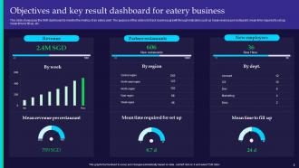
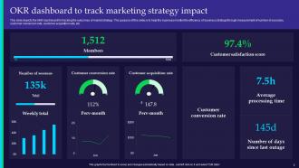
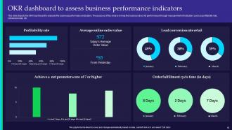
Introducing our comprehensive OKR Dashboard PowerPoint presentation. Unlock the power of Objectives and Key Results OKRs with this user-friendly and visually engaging resource. Our PPT offers a strategic framework to set, track, and manage your Objectives and Key Results efficiently. Easily communicate your goals, monitor performance metrics, and visualize progress using this KPI-focused tool. Seamlessly track key performance indicators and empower your team to stay on target with your goals. Whether you are a seasoned professional or new to OKRs, our presentation simplifies goal tracking and helps you achieve remarkable results. Elevate your performance management with our OKR Dashboard PPT and transform the way you achieve your objectives.
People who downloaded this PowerPoint presentation also viewed the following :
OKR Dashboard Powerpoint Ppt Template Bundles with all 24 slides:
Use our OKR Dashboard Powerpoint Ppt Template Bundles to effectively help you save your valuable time. They are readymade to fit into any presentation structure.









FAQs for OKR Dashboard Powerpoint
So you need four main things on your OKR dashboard. Put your objectives right at the top - super clear statements about what you're going for. Progress bars or percentages for each key result work way better than just raw numbers, honestly. Also throw in some status colors (green/yellow/red for on track, at risk, whatever) plus timestamps so people know it's current info. Oh and make sure someone owns each piece - nobody wants that "wait, whose job was this?" awkwardness. Keep everything visible without scrolling though. People are lazy and if they can't see it immediately, they'll just bounce.
Honestly, OKR dashboards are game-changers because everyone stops asking "wait, what are we even working toward?" Real-time progress tracking makes your weekly meetings actually useful instead of just status updates based on hunches. Breaking those massive goals into measurable chunks your team can tackle? That's where the magic happens. I love how visual dashboards create this natural peer pressure - when progress (or the lack of it) is right there for everyone to see, people just perform better. Oh, and don't overthink the setup initially. Grab a basic template, then tweak it based on what metrics genuinely move the needle for your specific team.
For OKRs, stick with progress bars and traffic lights - they're perfect for quick status checks. Green means on track, yellow for at risk, red for trouble. Honestly, I'm kind of obsessed with clean progress bars because you can scan them so fast during meetings. Simple trend charts work great too if you want to show momentum over time. Just don't go overboard with fancy visuals. Keep the actual numbers visible alongside everything so people can dive deeper if they need to. Executives hate wading through cluttered dashboards when they just need a quick read on how things are going.
Weekly updates work for most teams, but honestly? The best ones I've worked with do it twice weekly or even daily when things get crazy. Find what works without making it a huge time drain. If your person can't update it in 15-20 minutes, the template's probably too complicated. Weekly's good because it matches most meeting schedules and you'll actually see trends developing. But here's the thing - it needs to be fresh enough that people make real decisions from it, not just another dashboard collecting dust. Start weekly, then tweak it based on how your team actually uses the thing.
Track progress percentages and current vs target numbers for each key result. RAG status (red/amber/green) makes it super easy to scan quickly. Honestly, confidence levels are where it's at - they catch problems before they blow up. Don't forget completion dates and who owns what, plus timestamps so stuff doesn't get forgotten. Trend lines help you see if things are actually moving in the right direction. Oh, and add a quarterly view that connects individual OKRs back to company goals. Start with these basics, then tweak based on what your team actually pays attention to.
OKR dashboards are honestly a game changer - your whole team can check progress without hunting through random Slack messages or scheduling yet another status meeting. Everyone sees who's doing what and how close you are to actually hitting your goals. The visual setup makes it dead simple to spot problems early or jump in when someone needs backup. I'd definitely set up a weekly review to keep people on track. Way better than those endless email chains where updates get buried. Plus team members love being able to celebrate wins together when they see progress happening in real-time.
Oh man, cramming like 20 metrics onto one screen is the worst - nobody can focus on what actually matters. Tons of companies get obsessed with vanity metrics too, which look impressive but won't help you make real decisions. Manual updates are another killer - you'll end up with stale data and mistakes everywhere. Plus most dashboards aren't even tied to when people actually need the info for planning or reviews. Honestly, just pick 3-5 metrics that your team can act on, automate the data flow, and call it a day. Pretty charts mean nothing if they're not useful.
So basically, an OKR dashboard shows you how your big goals are actually doing over time - like, are you making real progress or just spinning your wheels? You break those massive objectives into smaller stuff you can actually measure each quarter. The visual part is clutch because trends jump out at you way faster than staring at spreadsheets. I'd definitely set up some automated updates though, because hunting down all that data manually every week gets old fast. Way easier to catch problems before they blow up your whole timeline.
Honestly, if you don't customize your OKR dashboard it's just going to sit there looking nice while being totally useless. What you want to do is tweak the metrics and layout so it actually reflects how your team operates. Change the colors, rearrange stuff - whatever makes sense for your specific situation. Set up alerts for the critical things you need to monitor because who has time to manually check everything? That's just busywork. The real benefit is people will actually use it when they can see their progress in a format that clicks for them. Otherwise they'll ignore it completely.
So your OKR dashboard basically needs tech to do all the grunt work - pulling data from your CRM, analytics tools, project management stuff, whatever. Without it you'd be stuck manually updating spreadsheets forever (nightmare). Tableau's solid for this, or there's dedicated OKR software that makes the whole thing pretty smooth. Fair warning though - the initial setup is kind of a headache. But once you get it working? Updates happen automatically and you can actually focus on the real work. I'd start by figuring out which data sources matter most to you first.
Honestly, just watch if people actually use the thing. Track daily users and see which parts they click on most. The real test though? Whether your team starts finishing their OKRs more often. Are they updating progress regularly instead of scrambling at month-end? Survey everyone quarterly - do they find it useful or just another tool they ignore? Better conversations in meetings are a huge win sign. But here's the thing: if usage tanks after week three, you know something's off and need to fix it fast.
Honestly, just get everyone involved from the start - trust me on this one. Different teams know what they actually need better than anyone guessing from above. Sales might want totally different metrics than marketing realizes. Plus people will actually use the thing if they helped build it, which sounds obvious but you'd be surprised how often this gets skipped. I'd run a quick workshop with the main players first. Map out what winning looks like for each department. Way better than building something nobody checks. The whole process takes like half the time when you're not going back and forth fixing stuff later.
Start by figuring out what actually drives success in your industry - that's way more useful than copying someone's generic template. SaaS companies should track MRR and churn instead of basic revenue stuff. Manufacturing? Production efficiency and quality metrics matter most. Healthcare needs patient satisfaction scores. Honestly, most people just grab whatever dashboard looks pretty and wonder why it doesn't help them make decisions. List your top 3-5 industry benchmarks first, then build everything around those. Don't overcomplicate it - you'll end up with something you never actually use.
Look, your OKR dashboard is pure gold for planning ahead. It shows exactly what worked and what bombed. I always dig into the trend data first - honestly way more telling than just final numbers. You'll spot where your team nails it consistently versus where they keep missing the mark. The cool part? You can see which objectives actually moved business metrics, so you know what to focus on next quarter. Resource problems become super obvious too. Use all this to set targets that aren't completely unrealistic and pick goals that matter. Trust me, beats guessing every time.
Honestly? Just start with Google Sheets or Airtable. Most teams way overthink this stuff when something simple works fine. Your company already on Microsoft? Excel + Power BI does the job. Tableau's solid if you want fancy visuals, and Notion handles OKRs pretty well too - actually surprised how good their tracking got. But here's the thing: doesn't matter how cool the tool is if half your team won't use it consistently. I've seen companies blow money on expensive dashboards that just collect dust. Start basic with Sheets, see what you actually need, then upgrade later if it makes sense.
-
“Superb. What a great finding. Thankful for SlideTeam. We were paying people to make slides which went all in vain. We are so happy to have found you.”
-
Great designs, really helpful.