

OKR Report Template Powerpoint Ppt Template Bundles




Try Before you Buy Download Free Sample Product
 Impress Your
 Audience
 100%
100% Editable
 Save Hours
 of Time


This slide highlights okr reporting benefits for increased adaptability. This further includes make work more meaningful, efficient and transparent monitoring, aligns and motivates employees and empowers teams.
People who downloaded this PowerPoint presentation also viewed the following :
OKR Report Template Powerpoint Ppt Template Bundles with all 27 slides:
Use our OKR Report Template Powerpoint Ppt Template Bundles to effectively help you save your valuable time. They are readymade to fit into any presentation structure.

















FAQs for OKR Report Template Powerpoint
Honestly, just focus on five things and you'll be set. First up - objective progress with simple percentages so people know where you stand. Then your key metrics vs targets (the gap tells the whole story). Here's where it gets good though: add a narrative section explaining what's actually happening and why. That's where the real insights are hiding. Don't skip upcoming priorities and blockers either. Oh, and keep it to one page - trust me, anything longer just sits unread. Template it once and you're golden for every quarter.
Honestly, these templates are game-changers for keeping everyone on the same page. Your team can actually see how their daily work ties into the big goals, which is weirdly motivating. Regular check-ins become way more productive when you're all looking at the same format - no more people wandering off doing random stuff that doesn't matter. The standardized layout makes it super obvious when someone's stuck or when priorities change. I'd throw it into your weekly meetings and see what happens. Takes maybe 2-3 weeks to really click, but then boom - way better teamwork.
Definitely start with progress percentages for each key result - that's like the main thing people want to see. Show actual numbers vs targets, so "40 new customers out of 100 target" instead of just saying "making progress." I'm a big fan of adding trend data because it actually shows if you're gaining momentum or losing steam. Don't forget blockers and risks that could mess things up. A confidence score helps too - just rate 1-10 on whether you'll hit targets. Sometimes I add next quarter's focus areas if I'm feeling organized (which isn't always, honestly). Start basic with these and build from there.
Monthly is definitely the way to go for most teams. Weekly feels way too intense unless you're putting out fires or something. Quarterly? Too long - by then it's too late to fix anything that's broken. I've seen teams burn out on weekly check-ins pretty fast. Monthly gives everyone breathing room to actually get stuff done between reports, but you still catch problems before they get ugly. Plus people don't start dreading the meetings as much. Honestly, just try monthly first and see how it lands with your team. Some teams thrive on more frequent check-ins, others need space.
Honestly, people overcomplicate the hell out of these templates. Don't try tracking every little metric - you'll just overwhelm everyone and they'll abandon it completely. Be super specific too, like "boost NPS from 7 to 8.5" instead of some vague "improve satisfaction" nonsense. Your template needs to change as you figure out what actually works. Oh, and skip the fancy design stuff at first - I know it's tempting but focus on making it clear instead. Just do objectives, key results, progress percentages, and next steps. That's it. You can make it prettier later once people are actually using the thing.
Dude, trust me on this - visuals are everything for OKR reports. Nobody wants to stare at endless paragraphs anymore. Throw in some charts and progress bars. Color coding is your friend too - green/yellow/red makes it super obvious what's working and what isn't. Bar charts work great for the number stuff, and random icons help break things up so it doesn't look like a boring wall of text. I learned this the hard way after watching executives' eyes glaze over during presentations. Make it scannable and they'll actually read the whole thing instead of just pretending to.
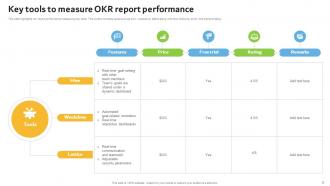
So for OKR reports, I'd probably just stick with Google Sheets honestly - it's flexible and you can customize however you want. Monday.com and 15Five have those fancy built-in OKR templates if you're feeling ambitious. Weekdone's decent too. Oh, and if your team's already on Notion, that could work really well since you can automate stuff there. I mean, I still use Sheets for like 90% of my reports because why complicate things? Start with whatever everyone already knows, then get fancier later if you actually need it.
So for your OKR template, definitely split it into two parts - numerical stuff for the hard metrics like revenue and user numbers, then separate text areas for the messy reality of what's actually happening. Trust me, I've watched teams try cramming everything into spreadsheet cells and it's painful to see. Add some prompts in those text sections too - "what's going well?" or "what's blocking us?" - so people actually fill them out properly. The numbers keep executives happy, but those qualitative updates are where you'll find the real insights your team needs to figure out next steps.
Honestly, feedback is what makes the difference between a useful OKR template and one that just sits there collecting digital dust. Ask your stakeholders what they actually need - is the format working? What's missing? After each cycle, gather thoughts and try tweaking layouts with different teams. Don't get attached to sections that aren't pulling their weight. I've watched so many pretty templates that told you absolutely nothing useful (kind of like those fancy dashboards nobody ever checks). Start simple - grab three people and ask what they'd change about what you've got now. Your template should evolve, not stay frozen.
Just tweak the language and structure to match how your team actually talks and works. If you're super collaborative, throw in sections for cross-team stuff or peer feedback. Results-focused? Go heavy on the numbers and progress tracking. The template should feel like something your people would naturally make themselves, you know? Switch up the terminology - maybe you call them "goals" instead of "objectives" or track "wins" rather than "key results." Don't force your culture to fit some generic template. Make it authentic to how you guys operate. That's honestly the biggest thing.
Make those reports super visual - traffic lights, progress bars, whatever works so people instantly get what's working and what isn't. Start with wins, then dive into problems (but always have solutions ready). Honestly, I've sat through way too many meetings where someone just reads numbers at us. Nobody wants that. End by asking for what you actually need from them. Oh, and definitely prep 2-3 solid examples of real business impact - stakeholders eat that stuff up. Skip the "we completed 47 tasks" nonsense. They care about results, not your to-do list.
Honestly, OKR templates are game-changers for transparency. Everyone fills out the same format, so you can actually see what people are working on and how they're doing. No more wondering who's doing what or if projects are on track. The template makes people get specific about their goals and be real about their progress - which sounds annoying but actually sparks better conversations about problems and wins. I'd say start with weekly check-ins using the same template. You'll probably be shocked how much clearer everything becomes when everyone's speaking the same language.
Your old OKR reports are honestly pure gold for planning ahead. Check completion rates and what kept blocking your team - you'll spot patterns super quick. Like, does your team always blow timelines on cross-functional stuff? Mine definitely does. Resource mismatches show up clearly too when you look back. The data reveals which goal types your team absolutely nails versus the ones that make everyone struggle. Also look at what sounded amazing in meetings but totally flopped in reality. Use all that to set better targets next time and stop making the same mistakes over and over.
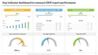
Dude, dashboards are a game changer for OKRs. No more hunting through endless spreadsheets just to figure out if you're winning or dying. Real-time updates with color coding make everything obvious at first glance. I actually got weirdly hooked on watching those progress bars climb - probably says something about me lol. Your stakeholders will love you since they can see what's happening without needing a decoder ring. Plus your team stays way more motivated when they can actually *see* their wins. Just start simple with red/yellow/green lights. You can get fancy later if you want.
Honestly, OKR report templates are a lifesaver for tracking cross-department stuff. When everyone uses the same format, you can actually see who's hitting their targets and who's falling behind. No more chasing down updates from marketing in spreadsheets while engineering sends bullet points in Slack - that gets old fast. The real magic happens when you spot dependencies between teams. Like if design's running late, you'll see how that hits the dev timeline before it becomes a crisis. I'd start by figuring out which goals involve multiple departments, then track those weekly. Makes the whole thing way less chaotic.
-
I joined SlideTeam last month and there’s no doubt that I tend to find our bond only strengthening over time. Best place to find world-class themes, templates, and icons.
-
I’m not a design person, so I couldn’t make a presentation to save my life. Thankfully, they have all kinds of templates that I regularly use for my work.