

Organisation Chart Information Technology Company Profile Ppt Template




Try Before you Buy Download Free Sample Product
 Impress Your
 Audience
 100%
100% Editable
 Save Hours
 of Time


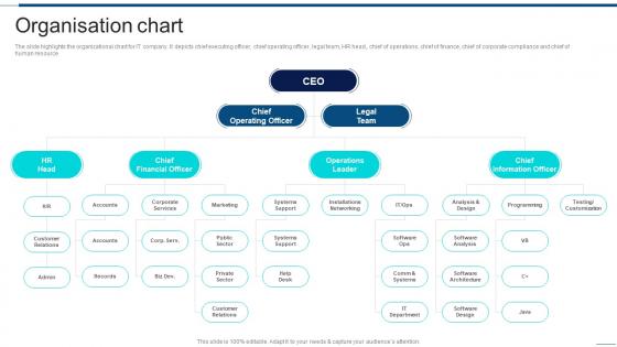
The slide highlights the organizational chart for IT company. It depicts chief executing officer, chief operating officer, legal team, HR head, chief of operations, chief of finance, chief of corporate compliance and chief of human resource.
People who downloaded this PowerPoint presentation also viewed the following :
Organisation Chart Information Technology Company Profile Ppt Template with all 6 slides:
Use our Organisation Chart Information Technology Company Profile Ppt Template to effectively help you save your valuable time. They are readymade to fit into any presentation structure.





FAQs for Organisation Chart Information Technology Company
You definitely need the basics - names, titles, who reports to whom, and which department everyone's in. Lines or boxes should connect managers to their teams so the hierarchy makes sense. Contact info like emails is clutch, especially for new people. Oh, and show any open positions you're hiring for too - gives the full picture. I swear some companies forget this part and it just confuses everyone. Update it every few months or it'll be completely wrong within a year. Nothing worse than an outdated org chart!
Dude, org charts are honestly lifesavers for figuring out who to talk to. No more awkward "um, should I ask you or your boss about this?" moments. You can see the whole chain of command at a glance - who reports to who, who makes what decisions, all that stuff. New people especially love them because they don't accidentally skip over someone's manager (been there, it's cringy). I mean, I used to just guess half the time before we had ours updated. Super helpful when you need approvals or just want to collaborate with people at your level.
Honestly, just keep it simple. Pick 2-3 colors max and stick with them - those rainbow org charts are such an eyesore. Make the text big enough that people don't have to squint, and give everything room to breathe with proper spacing. Photos help a ton since remembering faces beats trying to recall random names in boxes. Start with the CEO up top, then work down through the hierarchy logically. Oh, and align stuff properly! Nothing screams "amateur hour" like wonky boxes all over the place. You want people to actually understand who reports to whom without getting a headache.
So basically org charts show you the whole reporting chain - who's your boss, who their boss is, all the way up to the CEO. No more awkward "wait, who do I actually report to?" moments. They're like family trees but for work (and honestly way less messy). When you're trying to figure out who needs to be in the loop on something, just check the chart instead of playing guessing games. Super helpful when you're new or when they shuffle teams around again. The visual layout beats trying to decode some confusing written explanation any day.
Honestly, org charts are a lifesaver when you're restructuring. Map out what you have now versus what you want - it'll show you exactly where people are doubled up or where you're missing key roles. Reporting lines that made sense three years ago? Probably a hot mess now, and you'll spot that immediately. I'd make a before/after comparison so you can see the big picture. Oh, and employees actually get it when you show them visually instead of trying to explain who reports to who in some long meeting. Way clearer that way.
Honestly, I'd just start with draw.io (they renamed it diagrams.net or something). It's free and handles complex stuff pretty well. Lucidchart is solid too - way better interface than most tools. If your company already pays for Visio, you can use that, but ugh it's such a pain to work with. Canva's perfect for simple charts that need to look nice for meetings. Oh and if you're dealing with like 500+ people, SmartDraw has this auto-layout thing that'll save you from wanting to throw your computer out the window. But yeah, try the free ones first.
Honestly, digital org charts are such a lifesaver for remote teams. Nobody has to hunt around Slack asking "who handles X again?" You can just pull it up and boom - there's who reports to who, plus contact info. Way better than those crusty PDF versions that are probably from like 2019. New people especially love having it during onboarding since they can check it anytime without bothering anyone. Just make sure it's somewhere obvious where people will actually find it. I've seen too many companies bury theirs in some random folder.
So basically, traditional org charts are super straightforward - you've got one boss, done. Matrix ones? Total chaos honestly. You'll report to like your department manager AND some project lead at the same time. It's pretty common when companies have you working on cross-team stuff but you're still technically part of your original department. Can get confusing fast. I'd just ask your manager straight up who handles what decisions - saves you from awkwardly going to the wrong person later.
Update it right away when people join, leave, or switch roles - don't wait for some quarterly thing. Outdated charts are so awkward, like when someone's still listed who quit ages ago. I learned this the hard way lol. Do a deeper review every few months to catch stuff you missed and double-check who reports to whom. Honestly, keeping it current beats having to rebuild the whole thing later. Set a reminder or you'll totally forget - I always do.
Honestly, org charts are a game changer for new hires. Starting anywhere new is already chaos - you're trying to remember everyone's names while figuring out who reports to who. The chart basically gives them a visual map of the whole company structure. New employees can see where they fit, spot potential career paths, and know exactly who to bug when they need approvals or help with stuff. I always give mine to people on their first day. Actually, walking through their immediate team structure during orientation helps too - makes it way less overwhelming.
Yeah, org charts are actually super useful for this stuff! You can see where there are too many managers or weird reporting gaps. Career paths become way more obvious too. Honestly, most companies just update them once a year and then ignore them - such a waste. I'd start by mapping what you have now, then compare it to where you want to go strategically. You'll spot departments that need restructuring or predict hiring needs based on growth patterns. They're perfect for succession planning too, which I think more places should focus on.
Dotted lines are your best friend here - use them to show the cross-functional connections while keeping solid lines for regular reporting. Different colored boxes work too, or you could do a separate "project teams" section under the main chart. Matrix charts let people show up in multiple spots, which is pretty useful honestly. The key is adding a legend so nobody's confused about who's the actual boss vs. who they're just collaborating with temporarily. I've seen people get really weird about reporting structures if it's not crystal clear.
Honestly, org charts are pretty useless for understanding how teams actually work. They just show who reports to who on paper - but like, when's the last time that matched reality? Sarah from marketing probably talks to the devs more than her actual boss does. And you'll never see stuff like who's the go-to person everyone secretly asks for help, or which managers people actually avoid. The real dynamics happen in Slack channels and coffee conversations. My advice? Skip the chart and just watch how people interact for a week. Way more telling.
So basically your company culture totally shapes how your org chart looks. Collaborative places usually go flat - fewer bosses, more people reporting to each manager. Traditional companies? They love their tall pyramids with clear chains of command. Old school but it works for some people I guess. The culture also decides if you're showing those cross-functional teams or just sticking to the boring formal stuff. Here's the thing though - your chart should actually reflect how people work together day-to-day, not some fantasy version of perfect structure.
Honestly, start with span of control - that's how many people report to each manager. It's wild when you see one person managing 15 people while someone else has just 2. Then look at organizational depth (how many layers from CEO to bottom) and headcount by department. Manager-to-contributor ratios are clutch too. Oh, and watch for bottlenecks where everything funnels through one person - those always bite you later. The span stuff is probably most useful since it directly affects how fast decisions get made and whether managers are totally swamped.
-
I am a big fan of their newsletters because that is how I found my perfect requirement at the time of urgency. Thank God, I kept opening those.
-
Kudos to SlideTeam for achieving the high success rate in delivering the top-notch slides.