


Pitch deck slide value proposition product benefits 3 presentation visuals




Try Before you Buy Download Free Sample Product
 Impress Your
 Audience
 100%
100% Editable
 Save Hours
 of Time


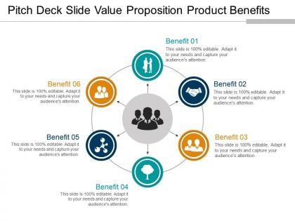
We know that you are desperate to succeed that is why we offer to all of you or most demanded and victorious pitch deck slide value proposition product benefits 3 presentation visuals. We know that business professionals like you do not always have time to craft the slides themselves that is why to save your time and energy we bring to all of you this pitch deck template for entrepreneurs diagram model. Our business experts have crafted this circular cycle diagram PowerPoint presentation slideshow using high resolution and premium quality slides which will help you raise the standard of your work. This 6 stages business slideshow has been designed in such a manner that you will be able to get rid of all the stress and workload that you usually face while crafting the slides yourself. So if you are willing to take your business organization to new heights of success simply download, edit and present this six parts PPT template. Our Pitch Deck Slide Value Proposition Product Benefits 3 Presentation Visuals conform to every conceivable clause. They fulfill all eligibility criteria.
People who downloaded this PowerPoint presentation also viewed the following :
Pitch deck slide value proposition product benefits 3 presentation visuals with all 5 slides:
Your forte is the cogency of your arguments. Add to their force with our Pitch Deck Slide Value Proposition Product Benefits 3 Presentation Visuals.
FAQs for Pitch deck slide value proposition product benefits
You know how you stare at PowerPoint for like 20 minutes not knowing where to even start? This template fixes that whole mess. Instead of wasting time on formatting and structure, you just jump right into your actual ideas. It's got pre-built sections that keep everything logical - honestly saves me so much mental energy. The story flow stays compelling too, which is huge for pitches. I used to spend forever just moving boxes around instead of focusing on what I actually wanted to say. Now I grab the template and I'm done way faster.
Dude, this template is actually pretty genius. It turns your presentations into real stories instead of just info dumps. You create a protagonist (your customer), give them a problem, then show how your solution fixes everything. Way better than just rattling off features - people actually stay engaged instead of scrolling Instagram under the table. The whole thing has built-in conflict and resolution, which sounds fancy but honestly works even for boring stuff like quarterly reports. I know it sounds cheesy, but try it on your next client pitch. You'll be surprised how much easier it is when you're telling a story.
Dude, the automation stuff is where we actually shine. Auto-resizing text boxes, one-click color changes across your whole deck - that kind of thing. Other companies? They basically just give you static layouts that look nice but don't do much. Ours actually adapt to whatever content you throw at them. We've got these industry-specific components too, like interactive financial charts and process flows you can customize. Honestly, once you build a deck in 30 minutes instead of spending your whole afternoon fighting with formatting... there's no going back. Just download some samples and compare them to whatever you're using now.
Oh yeah, you can totally go wild with the customization! Drag and drop whatever you want - colors, fonts, logos, the whole deal. I've seen people completely transform templates until they're basically unrecognizable from the original (which is honestly pretty cool). You can mess with layouts, toss in your own graphics, add sections, remove stuff you don't need. The auto-save thing is clutch too. My advice? Just pick something close to your vibe and start tweaking from there. Way easier than starting from scratch.
Honestly, we keep things super clean and minimal – lots of white space so nothing looks cramped. Typography stays consistent, colors are limited (maybe 2-3 max), and visuals actually support your points instead of being random decoration. The grid layouts might sound boring but they make everything look way more professional. Each slide has one clear focus so people aren't confused about where to look. Oh, and readability beats flashy stuff every time. Your message matters more than some crazy animation that'll just annoy everyone in the back row trying to actually read your slides.
So we've got different templates based on what you're trying to do. Persuasive ones have that whole problem-solution thing going on with strong call-to-action slides. The informative templates are more about clean data viz and logical flow - great for quarterly reports and boring corporate stuff. Step-by-step layouts work best for training presentations, complete with progress bars and little quiz sections. Honestly, the categories blur together sometimes, but that's actually good since most presentations aren't just one thing anyway. I'd start with whatever your main goal is, then tweak it from there. Way easier than starting from scratch.
So the templates basically use this hook-problem-solution-proof thing that actually works. Start with something attention-grabbing - maybe a weird stat or question. Then get into a pain point they genuinely care about (skip the "businesses struggle" garbage). Present your solution clearly and back it up with real stuff like case studies. The whole thing flows so people don't bail halfway through. Each part builds momentum toward your CTA. Honestly, most people mess up by making it too generic - you want that logical flow where one section pulls them into the next. Try the surprising stat opener next time, it hooks way better than boring intros.
Honestly, people rave about these templates - they're saving like 3-4 hours per project, which is huge. What they love most? You can tweak them for different audiences without rebuilding everything from zero. The feedback I keep hearing is "finally, something that doesn't sound like corporate BS!" Sales teams especially dig how it helps them explain actual benefits instead of just rattling off features. Though some folks want more industry-specific stuff. I'd say grab the core template first, then just adapt it based on what clicks with your customers. Pretty straightforward approach.
So we update our templates every three months to keep up with design trends. Emergency updates happen if there's some massive market shift, but quarterly works best honestly. Design moves crazy fast - gradients are hot one minute, then suddenly it's all harsh brutalist fonts everywhere. Three months gives teams enough time to actually learn the new stuff without constantly scrambling to catch up. You want fresh looks but your brand messaging needs to stay consistent, you know? Oh and definitely subscribe to the template updates so you get them automatically.
Consulting, tech, and finance teams absolutely love these templates. Makes sense though - they're presenting constantly to clients and stakeholders. Marketing agencies are huge fans too since they need to look professional but usually don't have tons of budget for design. Oh, and startups crush it with our stuff because they're always pitching investors or updating boards. The executive summary templates are probably our most popular, plus anything with clean data visualizations. Pretty much anyone who presents regularly will get good use out of them, but those industries really seem to click with what we've built. I'd definitely check out the industry packs first if you're in one of those spaces.
Yeah, so we actually build accessibility right into our templates from day one. Proper headings, good color contrast that hits WCAG standards, semantic HTML that plays nice with screen readers. Alt text fields are there for images too. Keyboard navigation flows the way it should - honestly, I love that accessibility isn't just tacked on anymore like it used to be. Font choices are clean, there's plenty of spacing, layouts work for different visual needs. Best part? You don't need to stress about any of this stuff. Just swap in your content and you're set.
Check out their resource hub first - tons of step-by-step guides and videos showing how other companies tweaked the templates. The monthly "Template Optimization" workshops are actually pretty solid for advanced stuff. There's also this private community where you can test ideas with other users before presenting anything (super helpful tbh). Oh, and they have real examples from companies in different industries. I'd start with their quick-start guide, then hop into the community to see what's working for people in your space. Way better than figuring it out solo.
Honestly, just listen to what your audience is actually complaining about. Dig through their LinkedIn posts, support tickets, even sales call recordings if you can get your hands on them. Map those problems to stuff they actually care about - more money, less waste, whatever moves their needle. The topics that come up over and over? That's your content goldmine right there. I sometimes check what competitors are doing too, but half the time they're totally missing the mark anyway. Stick to maybe 3-4 main topics per template - nobody wants to be overwhelmed with info. Oh, and definitely test a few versions with prospects you're cool with first. They'll tell you what actually hits.
UX runs the whole show when I'm designing templates. People want to get stuff done fast without wanting to throw their laptop out the window, so I focus on making navigation super obvious and keeping things loading quickly. A gorgeous template that confuses everyone? Total waste of time. I'm always watching how people actually click around - not just admiring pretty mockups in meetings (though those are fun too). Testing with real content makes such a huge difference. Don't skip that part! Get actual users to mess around with it before you call it done.
Yeah, they work really well for remote stuff! The layouts are super clean so people can actually read them whether they're on their phone or a big monitor. I always bump up the font size a bit for Zoom calls - learned that the hard way. You can share directly through Teams, Zoom, whatever you're using. Honestly, the best part is you won't get those awkward "can everyone see this?" moments because everything's designed to be clear on screens. Just test your screen share first because there's always that one person whose setup decides to be weird. Way better than trying to present those cluttered slides that look fine in person but are impossible to read remotely.
-
Commendable slides with attractive designs. Extremely pleased with the fact that they are easy to modify. Great work!
-
Easily Understandable slides.