


Value Proposition Powerpoint Presentation Slides






Try Before you Buy Download Free Sample Product
 Impress Your
 Audience
 100%
100% Editable
 Save Hours
 of Time


Ensure that there is a fit between the product and market by utilizing Value Proposition Powerpoint Presentation Slides. Communicate your value propositions effectively using business model canvas PowerPoint templates. Describe the rationale of how an organization creates, delivers and captures value. By using our professionally designed value proposition canvas PPT slideshow you can gain a customer's attention and approval that helps a company to increase sales. This visual attention-grabbing customer value proposition PPT slideshow helps you to convince your customers how your services are better than the others. Present the main components of the value creation network including key partners, key activities, key resources with the aid of the value cycle PPT templates. Utilize this business plan PowerPoint complete deck to understand the buyer’s needs and create branding strategies accordingly. Yield the best profits and maintain a consistent customer relationship by downloading our content ready business model PPT Presentation.
People who downloaded this PowerPoint presentation also viewed the following :
Content of this Powerpoint Presentation
Slide 1: This slide introduces Value Proposition. State your company name and begin.
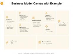
Slide 2: This slide showcases Business Model Canvas with Example such as key partners, key activities, key resources, key suppliers etc.
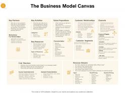
Slide 3: This slide describes The Business Model Canvas key partners, key activities, key resources, key suppliers, value proposition, customer relationship, channels, cost structure, revenue streams etc.
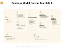
Slide 4: This slide depicts Business Model Canvas such as- Channels, key activities, customer relationships, value propositions, customer segments, resources, revenue streams etc.
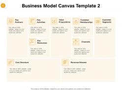
Slide 5: This slide describes Business Model Canvas Template such as- Value Propositions, Key Activities, Develop Website Marketing & Sales, Key Resources/Assets, Key Partners etc.
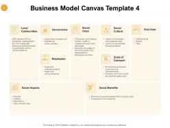
Slide 6: This slide showcases Business Model Canvas depicting local communities, governance, social value, social culture, end-user, employees, scale of outreach etc.
Slide 7: This is Value Proposition Icons Slide.
Slide 8: This slide is titled as Additional Slides for moving forward.
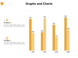
Slide 9: This slide displays Graphs and Charts.
Slide 10: This is Quotes slide.
Slide 11: This is Thank You slide with address, Email address and contact number.
Value Proposition Powerpoint Presentation Slides with all 11 slides:
Get a guarantee from our Value Proposition Powerpoint Presentation Slides. They deliver on their every claim.


FAQs for Value Proposition
Focus on the specific problem you're fixing - like "skip 3 hours of design headaches" or "look professional without the designer price tag." Time savings is honestly what sells people more than anything else. Show off your template quality and variety, mention how easy customization is, throw in any extras like bonus icons. A startup CEO worries about different stuff than a teacher making classroom slides, so really think about who you're talking to. Oh and make sure your templates actually look good - I've seen too many "professional" template sites that look like they're from 2010.
You've gotta speak their language, basically. Healthcare folks want compliance-ready templates and patient data stuff. Tech companies? They're all about sleek, modern designs that scream innovation. Finance needs templates for complex data that look professional - honestly, imagine Comic Sans on quarterly reports! Nonprofits are different though - they need storytelling templates that show impact and connect emotionally. Research each industry's pain points first. What are their presentation headaches? Any regulatory stuff they deal with? Then create industry-specific landing pages highlighting features that matter to them. Case studies from similar businesses help too.
Dude, you HAVE to get customer feedback on your value prop. Otherwise you're basically screaming into the void. Ask your recent customers what made them choose your templates in the first place - and what keeps them using them. You'll be shocked at what they actually care about vs what you think matters. I've watched so many gorgeous templates flop because the creator never bothered asking users what they needed. The feedback shows you which benefits hit home and which features are total duds. Then you can ditch the weak messaging for stuff that actually converts.
Dude, good design is like wearing a nice outfit to an interview - people judge before they even know what you're selling. Consistent fonts and clean spacing make folks automatically think your stuff costs more. Trust me on this one. Professional visuals signal you've got your shit together, which builds confidence in whatever you're actually offering. It's weird how our brains work that way, but proper color choices and layouts become this instant credibility boost. Even something as simple as decent spacing makes people assume higher value. Worth spending time on honestly.
Honestly, most people think value props have to sound super corporate and polished - like some marketing team crafted it. But that's backwards. Make it conversational and speak directly to what's bugging your audience. Also, forget the "one perfect sentence" rule. Sometimes you need a few sentences to actually explain things properly. Here's the big one though - people confuse features with value all the time. Nobody cares about your product specs. They want to know what problem you'll solve for them specifically. Always start there.
Honestly, your value prop is what'll save you from drowning in that sea of boring template sellers. Figure out what makes yours actually different - could be niche industry stuff, cool animations, or templates that don't suck for Zoom calls (seriously, most are terrible for screen sharing). Don't compete on price or throw around "professional designs" like everyone else does. What specific problem do you solve better? If your templates help design-challenged people whip up gorgeous presentations in 10 minutes, shout that from the rooftops. That's your goldmine right there.
Dude, stories are everything when you're pitching. Your brain literally remembers narratives way better than boring bullet points – like 10x better, no joke. Instead of rattling off features, you're making people actually *feel* the problem you solve. Show them the transformation, not just what your thing does. Honestly, I've seen presentations bomb because they're just feature dumps. But when you structure it like "here's what sucked before, here's how we fixed it, here's the awesome outcome" – that's when people get it. Try swapping your next template for a simple story arc. Way more memorable than lists.
Honestly, social proof is your best friend here. Get testimonials from your happiest customers and plaster them everywhere - your website, sales stuff, wherever people look. Case studies work amazing too, especially with actual numbers like ROI stats. I'd also grab reviews and social media shoutouts when you can. The "trusted by 10,000+ businesses" angle is solid if you've got the numbers to back it up. Just make sure it's relatable to who you're targeting. People need to see themselves in those success stories, you know? Start with whoever loves you most and go from there.
Conversion rates are your best friend here - that's what tells you if people actually care about your value prop. I'd watch click-through rates from your ads to product pages, then see how many visitors actually buy something. Time-on-page is helpful too, though sometimes quick buyers are actually better than people who browse forever (learned that the hard way). Customer acquisition cost vs lifetime value shows if you're getting quality customers or just random traffic. Honestly, just A/B test different versions and see what sticks - way better than guessing.
You know what really builds trust? People actually understanding what you're selling. Sounds obvious, but most companies suck at this. When your messaging is all vague and fancy, customers just leave - who has time for that? But be straight about what they get, and suddenly they're not second-guessing everything. Less anxiety means they'll actually stick around, try your free trial, whatever. I swear, the biggest mistake is thinking your message is clear just because it makes sense to you. Get some real people to read it first.
Honestly, niching down is where the magic happens. You go from boring "professional presentation template" to something like "quarterly board review template with built-in financial dashboards" - way more compelling. People pay premium for stuff that solves their exact problem. The tricky part? Your market gets smaller, obviously. I'd pick 2-3 verticals that seem promising and test your messaging with each one first. You want niches big enough to actually make money but specific enough that you're the no-brainer choice. It's kinda like being a specialist doctor vs general practitioner - same idea.
Dude, you gotta get specific with the numbers - none of that fluffy "saves time" stuff. Actually calculate it out, like "this template cuts prep from 4 hours down to 30 minutes." Then do the math with hourly rates. Survey some current users first to get real data you can use. I've noticed companies track weird metrics too - faster deal closures, fewer revision rounds, that kind of thing. The consistency angle works well since polished presentations obviously help with credibility. Honestly, before/after scenarios are your best friend here. Makes everything way more concrete than just promising vague benefits.
Honestly, video testimonials are probably your best bet - real faces just hit way harder than text, you know? Before/after sliders work great too. I'd also try those simple comparison charts that show your benefits super clearly. Oh, and interactive demos are clutch because people actually get to *experience* what you're selling instead of just reading about it. Breaking complex stuff into bite-sized visual stories with icons helps too - nobody wants to read a wall of text these days. My go-to is usually a one-page visual that maps out the customer journey and shows exactly where you solve their problems. Start with whatever feels easiest and see how people react.
Look at what actually pisses people off about making presentations - like wasting hours on formatting or dealing with those hideous default templates. Then build your pitch around fixing those exact problems. Don't just say "great templates" - say "professional presentations in 5 minutes, not 5 hours." We've all put off making a deck because the design part sucked, right? Your messaging should focus on that emotional relief and time savings people are craving. Match each pain point to a real benefit, then lead with those outcomes instead of just rattling off features.
Honestly, just don't lie about what your presentation thing actually does. Skip the whole "you'll totally embarrass yourself without us!" angle - that stuff feels gross even if it works. Make your pricing clear upfront instead of hiding it somewhere random. Oh, and think about accessibility so you're not accidentally shutting people out. I always try the "would I want to get this pitch?" test. Works pretty well. Your messaging should feel genuine, not like you're trying to manipulate someone into buying. Trust me on this one.
No Reviews