


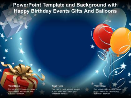
Powerpoint template and background with happy birthday events gifts and balloons




Try Before you Buy Download Free Sample Product
 Impress Your
 Audience
 100%
100% Editable
 Save Hours
 of Time


Image slide titled Powerpoint Template And Background With Happy Birthday Events Gifts And Balloons is a customizable PowerPoint template. This image slide is available in the standard and widescreen sizes. Present information on Image slides, Balloons using this image slide and create an interesting presentation. Download this PPT design to amplify the visual appeal of the presentation.
People who downloaded this PowerPoint presentation also viewed the following :
Powerpoint template and background with happy birthday events gifts and balloons with all 2 slides:
Use our Powerpoint Template And Background With Happy Birthday Events Gifts And Balloons to effectively help you save your valuable time. They are readymade to fit into any presentation structure.
FAQs for Powerpoint template and background with happy birthday events
Pick bright, fun colors that match their vibe first - that's your foundation. Make sure there's room for photos too. For fonts, go playful but not too cutesy (Comic Sans is still a no lol). Balloons and confetti graphics are classic for a reason, just don't go crazy or it gets messy fast. The date, time, and location need to pop so people actually see them. I'd start simple with the layout, then sprinkle in the decorative stuff after. Short sentences work great for key info. Keep it festive but readable!
So for kids, definitely go bright and fun - Comic Sans isn't actually evil when you're doing birthday invitations lol. Cartoons and colorful stuff work great. Adults are trickier though, they want sophisticated vibes. Navy, gold, pastels - that kind of thing. Clean fonts too, nothing too playful. I always ditch the cheesy clip art for real photos when it's grown-ups. Makes it look way more polished. Teens are honestly the hardest to nail down. Bold colors work but keep decorations simple? Modern fonts help. Just think about what would actually get them excited to show up.
So grids are honestly your best friend for birthday invites! They keep things from looking chaotic while you can still move stuff around. Skip the perfect squares though - they're way too formal for a party vibe. I'd go with something asymmetrical and fun. Make sure your main details like date and time really pop as focal points. Then fill the rest with balloons or whatever decorative stuff you want. Oh, and don't forget contrast between your text and background or people won't be able to read it. Start simple with like a 3x3 grid and see how it feels!
Dude, colors seriously matter for birthday stuff! Warm ones like orange, yellow, and hot pink just make people feel happy - there's actual brain science behind it. Blues and purples are better if you're going classy or it's for someone older. Red's amazing for energy but don't go crazy with it (I once made a presentation that looked like a fire truck lol). Oh, and green's perfect for big milestone birthdays since it feels like "new chapter" vibes. Just match whatever colors to their personality and the mood you want. Try a few combos first!
Pick your theme first, then match everything to it - colors, fonts, graphics, the works. Ocean theme? Go with blues and wave patterns. Superhero party? Bold comic book fonts are perfect. Don't just stop at decorations though. Your activities, games, and even how you present the food should tie in. Some people get crazy with costume requirements too (honestly love when they do that). Here's what works: choose 2-3 main visual elements and repeat them everywhere in your template. Start with the invitation design - it'll set the whole vibe for everything else.
Okay so for birthday presentations, definitely go with something fun but readable. Montserrat or Poppins are perfect for headings - they've got personality without being crazy. Body text should be super simple though, like Arial or Helvetica. Nobody wants to squint at your slides lol. Script fonts look cute for titles but honestly? They're awful on screens most of the time. Stick to 2-3 font families max or you'll end up with that ransom note look. Oh and test everything at actual presentation size first! I learned this the hard way when my cute font turned into an unreadable mess on the projector.
Oh there's so much cool stuff you can throw in! Animated GIFs are always a hit, plus background music and video messages from people. Interactive photo slideshows work really well too. Honestly, don't sleep on the cheesy sound effects - party horns and applause can be surprisingly fun. Countdown timers and confetti animations add nice touches. You could even do little games or quizzes about the birthday person if you're feeling ambitious. Just don't go crazy all at once though. I'd start with maybe 2-3 things and see how it looks before adding more.
Just swap the physical stuff for digital! Change venue info to Zoom links, replace in-person games with online trivia or breakout rooms. Tell everyone to grab their own cake - honestly, it's kind of nice not worrying about dessert for once. Send party supplies ahead if you're feeling fancy. The timing's actually better since no one needs to drive anywhere. Include simple tech instructions for anyone who struggles with video calls. Oh, and definitely test your platform first - I learned that the hard way at my cousin's party last month when we couldn't get the sound working!
Kids' templates are super colorful with cartoon characters and playful fonts - you know, princesses and superheroes everywhere. Adult ones? Way more sophisticated with clean designs and fancy typography. Interactive stuff like games shows up more in kids' versions, while grown-up invites stick to the basics: venue, time, RSVP details. Though honestly, milestone birthdays mess with this rule since adults want fun too! I'd say peek at what vibe your client's going for first. Some 30-year-olds still want rainbow themes, which is totally fine by me.
Colorful graphics will definitely make your birthday template way more fun! I'd throw in some balloons, confetti, maybe cake icons - but don't go crazy with them. My cousin did that once and honestly? Total mess. Pick one style and stick with it, like all flat design or all sketchy illustrations. Graphics are perfect for breaking up boring text slides too. Oh, and here's what really matters - choose 2-3 colors max that actually match your theme. Trust me, it'll look so much cleaner than throwing every color at it.
Honestly, the whole thing comes down to having a story that ties everything together. Without that, you're just throwing random activities at someone and hoping it sticks. Pick a theme that actually fits them - maybe it's their "adventure year" or just "cozy vibes only." Then let that guide your decorations, timing, all of it. I learned this the hard way after planning my sister's birthday with zero thought behind it. The story doesn't have to be deep or anything. Just ask yourself what you want their day to feel like, then build from there. Makes decision-making so much easier too.
Honestly, templates are a lifesaver - they'll save you hours of design work every time. Instead of stressing over layouts, you can focus on making each party feel personal and building those client relationships. I mean, not everyone's a design genius (I'm definitely not lol), so having that professional foundation is clutch. You just customize with their colors and themes, maybe add some specific touches. Your clients get that consistent quality they're paying for, and you're not reinventing the wheel constantly. Just switch things up enough so all your events don't look like carbon copies.
Honestly, the worst thing you can do is forget to replace all those placeholder bits - nothing screams "lazy" like seeing "Insert Name Here" pop up mid-presentation. Don't stuff every slide with tons of text either. People are there to celebrate, not read essays about someone's life story. Use decent photos that actually fit properly instead of weird stretched-out faces (learned that one the hard way). Oh, and definitely preview the whole thing beforehand. You'd be surprised how many random formatting issues slip through when you're rushing to finish it.
Honestly, just avoid making assumptions about how people celebrate stuff. Like instead of "blow out your candles," go with something broader like "make your birthday wish." Religious references are tricky too - better to skip them entirely. Not everyone does the whole cake thing anyway, you know? Also think about accessibility - alt text for images, good color contrast, that sort of thing. The whole point is making people feel included regardless of their background. I'd start by going through your current templates and swapping out anything that feels too tied to one specific tradition. "However you choose to celebrate" works way better than being super specific.
Honestly just go with Canva first - you'll have something decent done in like 10 minutes. They've got tons of birthday templates already made. If you're already good with Photoshop or Illustrator, those obviously give you way more control, but who has time to learn that stuff? PowerPoint works surprisingly well too, and you probably already have it. Oh, and Google Slides is pretty solid if you need other people to help edit it. I always forget about that one. But yeah, start with Canva - it's free and super easy.
-
Qualitative and comprehensive slides.
-
Good research work and creative work done on every template.
-
It saves your time and decrease your efforts in half.
-
Awesome presentation, really professional and easy to edit.
-
Innovative and Colorful designs.