


Presentation ecosystem presentation portfolio





Try Before you Buy Download Free Sample Product
 Impress Your
 Audience
 100%
100% Editable
 Save Hours
 of Time


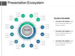
Select this presentation ecosystem presentation portfolio slideshow to define the concept of an ecosystem in the business economy and business stems. The framework of this business ecosystem PowerPoint diagram has been specifically designed for the environmentalists which acts as a framework to discuss the environmental issues to describe the increasing complexity of relationships among the companies. The presenter shall also be able to study the reciprocal relationship between business and organisms and their environments by availing this startup ecosystem. The objective of designing this PPT is to provide a platform to the presenter to discuss sustainability through the complete ecological synchronization and integration of a business with the sites which are; inhabits, uses and affects. The usage of this template facilitates the user to use it in different context which typically focus on specific parts of the ecosystem function and startups at their specific development stage(s). Most people are visual learners and learn better through the use of graphics than with words. Our Presentation Ecosystem Presentation Portfolio is a perfect blend of graphics and words to tailored to suit your needs.
People who downloaded this PowerPoint presentation also viewed the following :
Presentation ecosystem presentation portfolio with all 5 slides:
Your presentations should be memorable. Make them so with Presentation Ecosystem Presentation Portfolio for every design need.
FAQs for Presentation
Honestly, start with decent content creation software that won't crash on you mid-presentation (PowerPoint, I'm looking at you). Cloud storage is a must so everyone can actually find files. Real-time collaboration features are pretty clutch too. Template libraries will save your sanity - trust me on this one. Brand asset management keeps everything consistent without the headache. Oh, and analytics help you figure out what people actually care about vs. what you think they do. Just audit whatever tools you're using now and spot where things always go sideways. That's your starting point.
Honestly, multimedia just works because people learn differently. Some folks are visual, others need to hear stuff, and mixing it all together creates more ways for info to actually stick. Charts make boring data way easier to digest. Videos hit you in the feels. Animations can show step-by-step processes that would be confusing otherwise. I mean, who wants to stare at plain text slides anymore? That said, don't just slap random graphics everywhere - only use stuff that actually backs up what you're trying to say. Do that and you'll definitely see better engagement.
Dude, templates are a total game changer. You know how you used to sit there forever picking fonts and colors? Gone. Just plug your stuff into something that already looks good and you're done in like 15 minutes instead of hours. Your whole team will look way more put-together too since everything matches. I'd grab maybe 3 or 4 solid templates for different types of presentations - honestly wish I'd done this years ago. Once you have them, you'll never want to start from a blank slide again.
Okay so here's the thing - if your audience isn't engaged, you're basically just talking to yourself up there. When people are actually participating and asking questions, they become part of the whole experience instead of just sitting there zoning out. You'll get instant feedback from their reactions and body language, which honestly saves you from bombing. Plus engaged audiences actually talk about your presentation afterward, which is huge. The cool part is it creates this feedback loop where everything becomes more dynamic. My advice? Build in interactive moments right from the start - don't wait until the end.
Honestly, charts and graphs are lifesavers when you're dealing with tons of data. People's eyes just glaze over when they see spreadsheets full of numbers. Visual stuff lets them catch patterns and trends super quickly - like, way faster than scanning through rows of data. Some people just process things better visually anyway, you know? Good visuals create those lightbulb moments that actually stick. Oh, and here's a tip that saved me so many headaches: stick to one main point per chart. Don't try cramming everything into one visual. Start simple and you'll be golden.
Honestly, you've gotta know your crowd before you even start building slides. Three main things to tweak: how complex your language is, what examples you use, and how deep you go into details. Tech people? Go nuts with jargon and specifics. Regular folks? Keep it simple and use analogies they'll actually get. I bombed with our marketing team last month using way too many acronyms - learned that lesson fast! Don't throw software examples at finance people either. Build your content in chunks so you can swap stuff out depending on who shows up. Oh, and always have backup slides ready just in case.
Your audience's cultural background totally changes how you should present. Germans want straight facts and data - no fluff. Japanese audiences prefer subtle messaging and relationship stuff first. Americans? They eat up personal stories (sometimes way too much honestly). Asian cultures usually expect formal, hierarchical structure while Northern Europeans like clean, minimal slides. Latin American crowds respond better to dynamic, expressive delivery. Quick tangent - I learned this the hard way presenting to a Tokyo team with my usual casual American style. Didn't go great. Just research your audience beforehand and adjust your packaging, not your actual message.
Okay so first thing - grab them with something they can actually relate to. Then build it like you're telling a story, you know? Setup, problem, how you solved it. Skip the abstract stuff and use real examples instead. I always throw in personal stories because honestly, people zone out on bullet points but they'll remember a good story. Oh and don't let your data take over - it should back up what you're saying, not be the main event. Keep your "characters" consistent throughout. Finish with a clear ask that makes sense after everything you just told them.
So VR and AR are basically making presentations way more interactive - your audience can actually walk through data or mess around with 3D models instead of just sitting there. Way better than boring PowerPoint slides, right? Plus AI is getting really good at real-time translation and can even generate slides based on how you talk. Honestly, the VR stuff still feels a bit gimmicky to me, but it's improving fast. My advice? Start playing with these tools now, even small experiments. You don't want to be the person frantically learning this stuff when everyone else is already using it.
Honestly, start with collaboration - can your team edit together and does it play nice with whatever tools you're already using? PowerPoint's still the default in most offices (boring but true). Pricing gets tricky fast if you need the fancy features. For design stuff, Figma and Canva are way better than the old-school options. One thing people forget - will your audience actually be able to open your files? Templates can save you hours of work. Just grab a free trial first and test it with real content, not their demo stuff.
Honestly, you've gotta bake feedback into your whole presentation routine. Right after each talk, hit your audience with a quick 3-question survey - seriously, I kick myself every time I forget because those immediate reactions are gold. Short sentences work better anyway since people are usually rushing out. Set up regular coffee chats with your frequent stakeholders too. Oh, and track stuff like how many follow-up questions you get or if people actually seem engaged (you'll know when they're checking phones). The trick is making it automatic instead of this thing you randomly remember. Just create one simple template and stick with it. Trust me, consistency beats perfection here.
Ugh, the worst thing I see is people cramming way too much text on slides - nobody wants to read a novel during your presentation! Also, teams never stick to the same templates so everything looks like a hot mess. Skip rehearsals at your own risk. Know your audience beforehand or you'll bomb. File naming is another disaster - "Final_FINAL_v3.pptx" makes me want to scream. Here's what actually works: create templates people will use, keep slides visual, practice out loud (seriously), and set up decent file organization. Someone needs to be the presentation police or it all falls apart. Trust me on this one.
Your color choices totally make or break how trustworthy you look. Blues and greens feel calm and professional, while reds/oranges scream urgency (sometimes good, sometimes not). Font-wise? Clean sans-serif = modern and sharp. Serif fonts feel more academic. And please, for the love of god, avoid Comic Sans unless you want people to think you're joking. Keep it simple - max 2-3 colors and stick to one main font. Inconsistent typography makes you look all over the place, plus bad color contrast actually hurts people's eyes. Nobody's reading squinting.
Dude, collaborative tools are a total game-changer for presentations. No more of that "final_final_v3" nonsense when everyone's editing at once. Your team can jump in with feedback right away instead of those never-ending email threads (which honestly drive me insane). Getting different perspectives early on saves you from those cringe moments during practice runs where nothing makes sense. Everything lives in one place too, so you can access it wherever. Oh, and everyone can work on content simultaneously without losing their minds over version control. Just pick whatever tool your team actually likes using and commit to it.
Stick to the 6x6 rule - max 6 bullet points, 6 words each. Let your visuals carry the weight while you tell the story. Nobody wants to read slides anyway, trust me. Charts, images, diagrams - whatever shows your point better than text. Then you just talk through the details instead of reading everything out loud like we're in third grade. Keep words punchy. Headlines work way better than paragraphs. The goal? People glance at your slide, get it instantly, then look back at you for the real info.
-
Understandable and informative presentation.
-
Excellent products for quick understanding.
-
Very good