

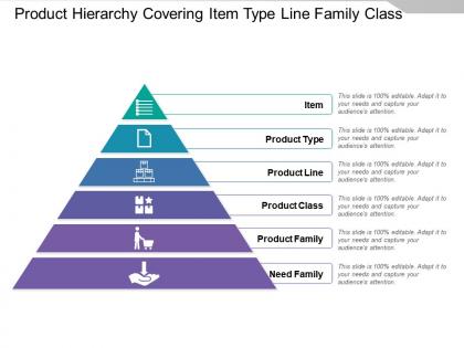
Product hierarchy covering item type line family class




Try Before you Buy Download Free Sample Product
 Impress Your
 Audience
 100%
100% Editable
 Save Hours
 of Time


Appreciation of your brilliance is bound to increase with our Product Hierarchy Covering Item Type Line Family Class. The imagery will heighten the impact.
People who downloaded this PowerPoint presentation also viewed the following :
Product hierarchy covering item type line family class with all 5 slides:
Avoid the build up of any delay with our Product Hierarchy Covering Item Type Line Family Class. Handle attempts to jib.
FAQs for Product hierarchy covering item type
Think of it like Russian dolls - product line is your biggest bucket (like "smartphones"), then you've got categories ("flagship phones"), families ("iPhone 15 series"), and finally individual SKUs ("iPhone 15 Pro 256GB Blue"). Data flows both ways too. Sales numbers roll up for reports while pricing and inventory rules trickle down from the top levels. Honestly, the inheritance thing is pretty clever once you get it set up. I'd definitely map out what you have now before trying to build anything new - saves headaches later.
So basically, when you map out product hierarchy, you can see exactly how customers think. They'll start super broad like "I need a phone" then narrow down to "iPhone 15 Pro in blue." Pretty logical when you think about it. This means you can hit them with the right message at each stage - broad awareness stuff for new launches, then get into specific features later. Your marketing budget goes way further because you're not just throwing ads at everyone hoping something sticks. Just start by figuring out how your customers actually make decisions, then match your campaigns to that process.
So basically, product hierarchy is how customers move from big categories down to the exact thing they want to buy. Look at Amazon - they go from "Electronics" to "Headphones" to "Wireless Earbuds" and it just makes sense. Bad hierarchy though? Total conversion killer. People get lost and bounce. Here's what I've learned - customers compare stuff within the same category level, so that affects how they see value too. Honestly, most companies organize things around their internal departments instead of how customers actually think. Start with mapping out your customer's brain first, then build around that. Way more effective.
Start with how customers actually browse and buy your stuff, not how your team thinks about it internally. Check your sales data for products bought together. Also look at what people search for on your site - the actual words they use matter. So many companies screw this up by organizing around their own departments instead of customer behavior! It's wild. You'll want categories specific enough to be helpful but broad enough that each has decent volume. Test different setups with real users. What feels intuitive to them might surprise you - I've seen some really counterintuitive structures work because that's just how people's brains work.
So product hierarchy is like organizing your stuff into folders - broad categories that narrow down to specific items. Makes tracking inventory way easier since you can spot patterns across whole sections. Like maybe all your electronics need more storage space, or seasonal stuff needs different shipping (learned this the hard way once). Without it you're basically juggling thousands of random products with no system. Short sentences work better here. You'll forecast demand better too when everything's grouped logically. I'd start by mapping what categories you've got now and finding the gaps.
Look, product hierarchy basically saves your customers from wanting to throw their phone across the room. Map out logical categories first - like Electronics → Laptops → Gaming ones under $1000, you know? Short, clear paths work best. Amazon's hierarchy is annoyingly good for a reason (though I hate giving them credit). Your search and recommendation features get way better too since everything's connected properly. Honestly, just watch where people get lost in your current setup - that'll tell you exactly what needs fixing. Those stuck points are goldmines for improvement.
Oh man, I see this all the time - companies go crazy with complex hierarchies from day one. They're basically planning for products that don't even exist yet! Then you've got these confusing multi-level setups nobody can figure out. Plus most teams just copy whatever their competitors are doing, which is honestly pretty lazy. The other big thing? Not matching how customers actually browse and think about your stuff. Here's what I'd do: keep it super simple at first, maybe 2-3 levels tops. Test it out, see what works, then build from there based on real data.
So B2B product hierarchies go way deeper than B2C ones - like, annoyingly deep sometimes. With B2B you've got buying committees and tons of technical specs to deal with, so you need super granular categories. Think product family > product line > models > configurations and so on. B2C is way flatter since it's just one person shopping. A consumer electronics site might do electronics > phones > iPhone and call it good. But B2B? You're looking at enterprise solutions > communication systems > mobile devices > security levels > specific models. The whole thing's built around serving committees instead of individual shoppers, so structure yours that way.
So digital transformation basically turns your rigid product structures upside down. Gone are those old-school hierarchies - now you've got these fluid, cross-functional teams that can shift direction fast when data says so. Netflix is perfect example here, their whole content setup changes constantly based on what algorithms pick up from users (not some stuffy corporate chart). Your parent-child product relationships? Way more flexible now. You need systems that won't crash when things change quickly. Honestly, I'd start by looking at which hierarchy rules actually help customers vs. just making internal processes easier.
Dude, visualization tools are total game-changers for product hierarchies. Tree diagrams and org charts make those messy parent-child relationships actually make sense instead of confusing everyone with endless bullet points. Honestly, I've sat through way too many meetings where people try explaining this stuff with just text - it's painful. Color coding different hierarchy levels helps a ton too. Templates are clutch because stakeholders already get how they work, so you're not starting from scratch every time. Start simple with a basic tree structure, then add icons or whatever to distinguish your product types.
Watch how people actually use your site - user testing shows you exactly where they get confused. Analytics tell the real story though: check conversion rates and bounce rates across different category levels. I'd definitely run some A/B tests on different structures. Card sorting is weirdly fascinating - you literally just ask users to group your products and see what happens. Search behavior data is gold too. Compare what competitors are doing, but don't copy blindly. Mix the hard numbers with what users actually tell you in feedback. That combo gives you the clearest picture of what's working.
Dude, when competitors show up, you can't just wing it with your product lineup anymore. You have to get super strategic about where you put your time and money. Like, which products actually make bank and defend your turf? Honestly feels like chess - you're always moving pieces around when someone launches a new feature or tries to muscle into your space. I'd say the biggest thing is staying flexible with your priorities. That way you can quickly shift resources to protect your main products or jump on new opportunities. Competition basically turns everything into a constant juggling act, but in a good way I guess.
Your product lineup totally controls how people see pricing - you gotta nail those value gaps between tiers. Like if your premium version costs 10% more than mid-tier but has way better features, why would anyone pick the cheaper one? Classic movie theater popcorn trick where medium exists to make large look like a steal. Each tier needs to hit different customer types with matching messaging. I'd honestly just map out what you have now and see if the price jumps actually push people toward your money-makers. The ratios probably need tweaking.
Check your support tickets and see what people actually search for - bet it's way different than how you organized everything. Your customers probably use totally different words than whatever your team calls stuff internally. I learned this the hard way when users kept asking for "workout gear" but we had it buried under "fitness equipment." Anyway, look at where people get stuck or confused during user testing. Then flip your structure to match how they think about it. Test it out with real people before you change everything though - sometimes what seems obvious still doesn't work.
So you'll want to check if people are actually finding stuff or just getting frustrated and bouncing. Navigation patterns are key - plus conversion rates by category since bad structure literally kills sales. Time-to-find metrics help too. Oh, and definitely look at search queries because honestly, when your nav sucks people just give up and search instead. Revenue per category tells you which sections are flopping. I'd start with your current analytics to spot underperforming categories, then dive into the user flow stuff. Bounce rates matter too obviously.
-
Informative design.
-
The Designed Graphic are very professional and classic.