


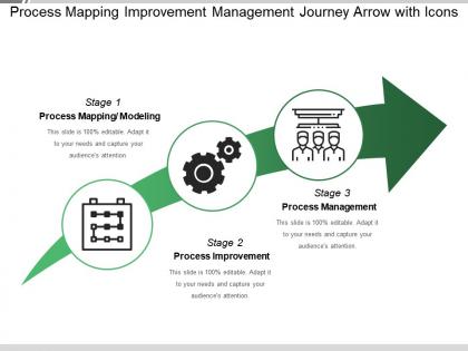
Process mapping improvement management journey arrow with icons




Try Before you Buy Download Free Sample Product
 Impress Your
 Audience
 100%
100% Editable
 Save Hours
 of Time


Correct the injudicious with our Process Mapping Improvement Management Journey Arrow With Icons. Deter them from hurried decisions.
People who downloaded this PowerPoint presentation also viewed the following :
Process mapping improvement management journey arrow with icons with all 5 slides:
Figure out the jigsaw with our Process Mapping Improvement Management Journey Arrow With Icons. Ensure all components are correctly interlinked.
FAQs for Process mapping improvement management journey
Honestly, process mapping shows you what's *actually* happening vs what you think is happening - and the gap is usually wild. You'll find bottlenecks you didn't know existed, plus all those random workarounds people create but never mention. Gets everyone aligned on who does what, which stops the blame game when things go sideways. Oh, and start with whatever process is driving you the most crazy right now. That's where you'll see real results fast, and frankly, you need those quick wins to keep momentum going.
So basically, process mapping makes everyone look at the same visual diagram instead of having their own weird ideas about how stuff should work. No more random arguments about "wait, I thought Sarah handles that part." You can actually see where things get passed between people - that's usually where everything falls apart anyway. It shows who's responsible for what and how everyone depends on each other. When someone new starts, you don't have to explain everything from scratch or hope they figure it out. Just pick one process that's been driving your team crazy and map that first.
Honestly, I'd go with Lucidchart or Visio first - they're super popular for a reason and have tons of templates. Draw.io is clutch if you don't want to spend money, and it's actually pretty solid. Miro's cool for the sticky note vibe but can get messy fast (learned that the hard way). If you need something more heavy-duty later, check out Bizagi or ProcessMaker. I always tell people to start simple though - grab Lucidchart or the free draw.io option and map out something basic first. You'll figure out what you actually need pretty quick.
Honestly, it totally depends who you're showing it to. New employees? Go detailed so they don't get confused. Executives? Keep it high-level or they'll zone out. I always start broad first - otherwise you'll drown in tiny details before you even understand the big picture. Ask yourself if someone random could follow along and spot where things get stuck. Focus on the major steps, then add more detail only where stuff goes wrong a lot or gets messy. Oh and definitely test it with people who actually do the work - they'll catch things you missed.
Dude, biggest mistake is going way too granular from the start. You'll create this monster flowchart nobody wants to touch. Also - and this one's huge - actually talk to the people doing the work! Don't just wing it based on what you think happens. Map the messy reality first, not some ideal version that doesn't exist. Keep it high-level initially, maybe 5-7 major steps max. You can always add detail later. Oh, and definitely run it by your team before calling it done. I've seen too many beautiful maps that were completely wrong because nobody validated them.
Honestly, you've gotta map out what's happening now before trying to fix anything. Makes zero sense otherwise. Draw out your current process first - you'll be shocked at how many stupid bottlenecks and redundant steps everyone just accepts as "how we do things." Once you've got that visual, it's way easier for your team to spot problems during improvement sessions. We always test changes on paper first, then map the future state. Oh, and don't forget to update these things after each cycle - processes drift more than you'd think. The visual aspect is clutch for getting everyone on the same page.
Dude, you absolutely have to talk to the actual people doing the work first. They know where things really get stuck and what workarounds everyone's using. Your official docs? Probably garbage compared to what's actually happening day-to-day. I learned this the hard way - made a beautiful process map once that nobody followed because I just worked off old procedures instead of asking around. Total waste of time. Get your key people identified early and chat with them one-on-one before any big group meetings. Trust me, you'll save yourself major headaches later when you're trying to sell changes.
Dude, process maps are seriously clutch for new hires. Instead of dumping some massive training binder on them, you're giving them this visual guide that actually makes sense. They can see how everything connects, where they fit in, and what happens if things get stuck somewhere. Walking through real scenarios with the maps during training is super helpful too. I'd definitely make different versions for each role though - like, your sales people don't need to see all the nitty-gritty backend stuff, you know? It's way easier for people to understand the "why" when they can literally see the whole flow laid out.
Process maps are goldmines for metrics! First thing I'd track is cycle time - how long start to finish takes. Throughput shows your volume per day/week. Resource utilization tells you if people are swamped or twiddling thumbs. The cool part? Bottlenecks become super obvious when you see where stuff backs up. Error rates at each step jump out visually too. Lead time versus actual processing time reveals how much waiting around happens (which honestly drives me crazy in most processes). Don't overwhelm yourself though - pick 2-3 metrics that match your biggest headaches and start there.
Dude, process mapping is honestly a game changer. You basically draw out how work actually flows (not how you think it flows), and suddenly all the stupid bottlenecks become obvious. Like, you'll literally see where things get stuck or where people are doing the same task twice. Makes spotting the real problem so much easier than just guessing. I'd start with whatever process is driving you crazy right now - maybe that approval thing that takes forever? Once you map it out, you can see exactly why it sucks and figure out the best fixes. Way better than shooting in the dark.
Honestly, process mapping is a lifesaver when auditors show up. Map out your most critical stuff first - it shows exactly how you meet regulations and where your controls are. Auditors actually appreciate good documentation because it makes their lives easier too. The visual aspect is clutch for spotting compliance risks fast. Plus everyone stays on the same page with standards. I'd focus on your biggest compliance headaches first, then branch out. It's basically like having proof you're not winging it when things get scrutinized.
Map out your whole process first - like, literally draw or write down every single step. Then time how long stuff sits at each stage. You'll see where things get backed up pretty quick. Usually it's steps that need tons of approvals (ugh, the worst) or just take forever compared to everything else. I always look for where work starts piling up too. It's kinda like spotting traffic jams - once you see it visually, the problem areas are super obvious. Focus on fixing those spots first since that's where you'll actually see results.
Honestly, consistency is everything with process maps. Same shapes, colors, fonts - the works. I've literally watched people's eyes glaze over when maps look like someone went crazy with a highlighter set. Standard flowchart symbols are your friend since everyone gets them right away. Don't cram stuff together either - white space is actually good! Pick a direction (top-down or left-right work best) and commit to it. Oh, and here's the real test: show it to someone who wasn't involved. They'll catch confusing parts you totally missed.
Honestly, process mapping is a game changer for this stuff. Map out every step of how customers interact with you - from first contact to resolution. You'll be shocked at how many pointless handoffs and approval loops slow everything down. I always tell people to start with their most common customer request and trace it end-to-end. Once you see the whole picture, cut out redundant steps and automate the boring routine tasks. Fix those communication gaps between departments too. The payoff? Way faster responses and fewer screw-ups. Your customers won't feel like they're stuck in bureaucracy hell anymore.
High-level maps are like the 30,000-foot view - maybe 5-10 boxes showing your main steps. Detailed ones break down every little decision and handoff. Start with high-level when you're trying to get buy-in from stakeholders or explaining things to executives. They don't want to see every tiny detail, trust me. But honestly? I live in the detailed maps because that's where you actually find what's broken. Go detailed for analyzing problems, training people, or when you need to build system requirements. My approach is always high-level first, then drill down wherever things get messy.
-
Informative presentations that are easily editable.
-
Unique design & color.