

Process mapping flow chart presentation design





Try Before you Buy Download Free Sample Product
 Impress Your
 Audience
 100%
100% Editable
 Save Hours
 of Time


Project the steps of your process with this Process Mapping Flow Chart Presentation Design. Make it easy for your team members to assess the work process. With a workflow PPT diagram, segregate the tasks and display them effortlessly. Devise effective strategies for efficient process management. Help your employees to follow and execute the project with precision. Business process mapping will aid in the smooth functioning of the organization. Describe how the business functions on a regular basis with the help of business process mapping tools. This editable process flowchart PPT diagram is readily available and professionally designed by our designers at SlideTeam. Give a clear and brief PowerPoint presentation on your well-organized business process. With high-quality graphics and content used in this PPT slide, impress your audience. Invest less time to create a business presentation, which is both attractive and comprehensive.
People who downloaded this PowerPoint presentation also viewed the following :
Content of this Powerpoint Presentation
Description:
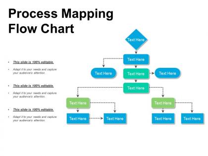
The image is a visual representation of a process mapping flow chart. This type of flow chart is a diagram that illustrates the steps of a process, showing how individual tasks or actions flow from one to another and their outcomes or decisions required at each step.
The chart is organized with a starting point, followed by sequences of actions denoted by various shapes like diamonds and rectangles, which are standard flowchart symbols. Diamonds typically represent decision points that can lead the process in different directions based on yes/no questions or other binary criteria. Rectangles are used to show process steps or actions.
The arrows indicate the direction of workflow, guiding the viewer through the process from start to finish. Dashed arrows may indicate that the process flow is conditional or less direct than the solid arrows.
This slide also includes text placeholders labeled "Text Here," which suggest that the slide is a template to be customized. It is noted as "100% editable," meaning the presenter can adapt it to fit the specifics of their process and tailor it to capture the audience's attention effectively.
Use Cases:
Process mapping flow charts are essential for simplifying complex operations, enhancing communication, and identifying improvement areas across diverse sectors.
1. Healthcare:
Use: Streamlining patient journey and treatment processes
Presenter: Quality Assurance Coordinator
Audience: Healthcare Providers, Administrative Staff
2. Automotive:
Use: Optimizing manufacturing and assembly line efficiency
Presenter: Production Engineer
Audience: Assembly Line Workers, Plant Supervisors
3. Information Technology:
Use: Managing software development and deployment cycles
Presenter: IT Project Manager
Audience: Development Team, Stakeholders
4. Finance:
Use: Enhancing banking transaction workflows and compliance checks
Presenter: Compliance Officer
Audience: Bank Employees, Auditors
5. Education:
Use: Organizing administrative and educational program development
Presenter: School Administrator
Audience: Teaching Staff, Educational Planners
6. Hospitality:
Use: Improving guest services and operational management
Presenter: Hotel Manager
Audience: Service Staff, Department Heads
7. Supply Chain and Logistics:
Use: Refining delivery routes and inventory management
Presenter: Logistics Analyst
Audience: Warehouse Managers, Distribution Personnel
Process mapping flow chart presentation design with all 5 slides:
Give a clear career breakdown with our Process Mapping Flow Chart Presentation Design. They will get an idea of what to expect.
FAQs for Process mapping flow
Dude, process mapping is like putting on glasses for the first time - suddenly you see how work actually moves through your company versus the fantasy version in your head. Bottlenecks jump out at you. Random handoffs that make zero sense become obvious. The amount of redundant crap will blow your mind, honestly. Everyone finally gets clear on who does what, so you stop having those awkward "wait, wasn't that your job?" conversations. Oh, and definitely start with whatever process currently makes you want to scream - quick wins there will get people excited about fixing other stuff too.
Honestly, process mapping is a game changer because it gets your whole team looking at the same picture of how work actually moves around. No more guessing games about who's supposed to do what or where things get passed off. When you sit down and map it out together, all those weird bottlenecks and communication gaps just pop right out - stuff you didn't even realize was slowing you down. New people love having something concrete to reference too instead of just figuring it out as they go. I'd start small though, maybe pick one thing your team does all the time and map that first.
Lucidchart and Visio are your best bets - super user-friendly with tons of templates. Draw.io is solid too if you want free but still powerful. I've honestly seen people make decent maps in PowerPoint, though it gets messy fast with complex stuff. My old manager swore by it for some reason. If you're doing serious process improvement, check out Bizagi or ProcessMaker. Just start with whatever you already have access to. Most tools export to common formats anyway, so you won't get stuck with one forever.
Dude, process mapping is honestly a game changer for finding bottlenecks. You literally draw out every step of your workflow, and suddenly all the problem spots jump out at you. Like, you'll see where tasks always get stuck or take forever. Maybe it's approvals that drag on, or handoffs between teams that create chaos. I used to think our delays were random, but mapping showed clear patterns. Short story - you get this overhead view instead of being buried in just your part of the mess. Once you spot the worst bottlenecks on paper, you can actually prioritize fixing them.
Honestly, process mapping is like creating a roadmap of how work actually gets done at your company. You can't fix quality issues if you don't know where they're happening, you know? It reveals all those bottlenecks and weird shortcuts people take that management never sees. Your customers feel the impact when processes are messy. When auditors come around for ISO stuff, they'll want to see your key processes documented anyway. I'd start with whatever processes touch your customers directly - those are usually your biggest risk areas. Makes the whole quality management thing way less overwhelming.
Process mapping is honestly a game-changer for projects. Basically you're drawing out every step and handoff so you can see the whole workflow at once. Makes it super easy to catch bottlenecks before they screw you over. You'll spot which tasks depend on others, who owns what, and what can actually happen at the same time. The timeline planning becomes way more realistic once you see everything laid out. I'd start by mapping your current project's main processes - sounds boring but trust me, it's worth it. Then use those maps in your planning meetings to find risks and places to streamline things.
Honestly, the worst thing you can do is get obsessed with every tiny detail from the start. Map out the main flow first - trust me on this one. Most people also work alone instead of actually talking to whoever does the job day-to-day. Your assumptions are definitely off without their input. Oh, and don't make it some crazy complex diagram with weird symbols nobody understands. Simple swimlanes work great. You can always add more detail later, but only if it's actually useful. I've seen so many maps that are just... painful to look at.
Honestly, process mapping is a lifesaver for compliance stuff. When auditors come knocking, you can just show them your maps and be like "here's exactly how we do things and where our controls are." No scrambling around trying to explain everything on the spot. The real beauty though? When regulations change - which happens constantly, ugh - you'll know exactly which parts of your operation need tweaking. I'd start with whatever processes have the most regulatory headaches first. Those maps basically become your proof that you're not just winging it, which regulators love to see.
So basically, you map out every step your customers go through and it becomes super obvious where things suck. Like, you'll spot the annoying delays, confusing parts, or places where info gets lost between departments. It's honestly pretty eye-opening - half the stuff we do is just internal busywork that customers don't care about. The visual aspect helps a ton because you can literally see the bottlenecks. I'd start with whatever process your customers use most. That's where fixing problems will actually move the needle on their experience.
So basically, high-level maps are like the 30,000-foot view - just your main steps and big decisions. Detailed flowcharts? They get into literally everything, every tiny action and weird edge case. It's kinda like GPS directions - high-level tells you "take I-95 north for 200 miles" but detailed breaks down every single lane change. Which can be way too much sometimes, honestly. Use high-level for presenting to stakeholders and finding bottlenecks. Detailed ones are better for training people or when you need to follow compliance rules. Always start high-level to get everyone on the same page first.
Start by mapping what actually happens day-to-day, not what's supposed to happen. Seriously, there's always a gap there. Document the current process first, then hunt for bottlenecks and redundancies - you'll be shocked how much waste you find. After that, sketch out your ideal future state. Don't go crazy trying to map everything though, just pick one process that'll make a real difference. Oh, and make sure you circle back to update these maps regularly as things change. It's kinda like spring cleaning but for workflows.
You can't really do Lean without mapping your processes first - it's like trying to fix something you can't see. Once you map everything out, all the waste jumps out at you: bottlenecks, waiting around, redundant steps. The visual part is honestly the best thing about it because suddenly everyone's looking at the same picture of how work actually moves through your system. I always tell people to map their current state first (even if it's messy), then figure out what the future should look like using Lean principles.
Oh man, cultural stuff can totally derail process mapping if you're not careful. Some people won't call out problems because they don't want to challenge their boss. Others will be brutally honest about every issue they see. Time expectations are all over the place too - what counts as a "deadline" varies wildly. Documentation standards? Same deal. I've seen teams where everyone wants to brainstorm together, others where people need to think alone first. Honestly, just ask your team upfront how they like to work. Maybe test run a quick session to see what actually gets people talking instead of just sitting there nodding politely.
Honestly, I'd start with something super basic they already know - like how they make coffee or handle customer complaints. Gets them comfortable before diving into the messy stuff. Cover the symbols first (boring but necessary), then break into small groups for practice. Drawing beats watching demos every time - people actually retain it better. Templates are your friend initially. Once they're not panicking about squares vs diamonds, teach them to spot the real goldmines: decision points, handoffs, and where things go sideways. That's where you'll find your improvements anyway. Let them fly solo on creating maps once they've got the basics down.
Just treat your process maps like another data source you can plug into whatever analytics you're already using. Pick one big process that actually matters and map it out first. Then connect those process steps to the KPIs you're tracking anyway - suddenly you'll see why certain numbers suck. Most BI tools can show process flows right next to your regular dashboards, which honestly looks pretty slick. The whole point is spotting where things get stuck so you know what's dragging down performance. Start small with something that'll make a real difference.
-
Informative presentations that are easily editable.
-
Great designs, really helpful.