


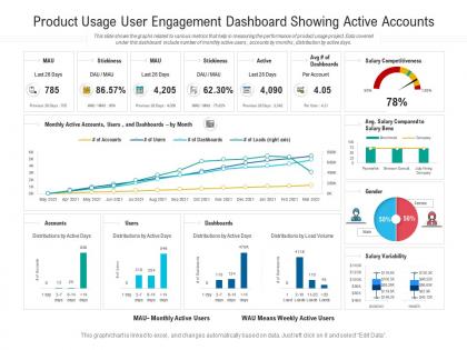
Product usage user engagement dashboard showing active accounts powerpoint template




Try Before you Buy Download Free Sample Product
 Impress Your
 Audience
 100%
100% Editable
 Save Hours
 of Time


Our Product Usage User Engagement Dashboard Showing Active Accounts Powerpoint Template are topically designed to provide an attractive backdrop to any subject. Use them to look like a presentation pro.
People who downloaded this PowerPoint presentation also viewed the following :
Product usage user engagement dashboard showing active accounts powerpoint template with all 2 slides:
Use our Product Usage User Engagement Dashboard Showing Active Accounts Powerpoint Template to effectively help you save your valuable time. They are readymade to fit into any presentation structure.
FAQs for Product usage user engagement dashboard showing active
Here's what I'd track: daily/monthly active users, how long people stick around in sessions, and which features they actually use. Retention is huge - check day 1, 7, and 30. Churn rate sucks to look at but you gotta know it. Also track your conversion funnel and time-to-first-value (basically how fast users get their "aha" moment). If you've got multiple features, some kind of engagement score helps too. Honestly though, don't go crazy with metrics at first. Pick maybe 5-7 that connect to real business goals, not just pretty dashboard numbers. You can always add more once you're in a good rhythm with reviewing the data regularly.
Honestly, sentiment analysis charts and NPS trends are your best bet for tracking user feedback. Word clouds might sound cheesy but they're actually solid for spotting themes you'd totally miss otherwise. Heat maps work well too - shows you exactly which features people love or hate. Bar charts for support tickets are pretty standard but effective. The whole point is making everything scannable without losing the details when you need to dig deeper. I'd start with whatever feedback metrics matter most to your team and expand from there. Way easier than trying to build everything at once.
Tableau's honestly the best if you've got the budget - their visualizations are just *chef's kiss*. Power BI works great too, especially if you're already knee-deep in Microsoft stuff. Makes integration super smooth. Looker's solid but more for tech-heavy teams since everything runs on SQL. Oh, and I've seen some teams build custom React dashboards but that seems like way too much work unless you need something super specific. My vote? Just go with Power BI if you're using Office 365. Way less headache to set up.
Start by interviewing a few people from each team about what's actually driving them crazy. Executives want those big picture conversion funnels and revenue numbers. Product managers? They're obsessed with granular stuff - feature adoption, user journey breakdowns, all that detailed data they love to dive into. Customer success teams need totally different things though. They care about engagement scores and churn risk. The trick is figuring out what decisions each person makes every day, then only showing them metrics that actually help with those choices. Don't overwhelm them with everything else.
Honestly, real-time data saves your butt when things go sideways. You'll catch users bailing during onboarding or see if that shiny new feature is actually bombing - not three days later when the damage is done. Picture discovering your checkout broke on Friday but only finding out Monday morning from reports. Nightmare fuel, right? Set up alerts for your biggest metrics instead of babysitting dashboards 24/7. I learned this the hard way last year. Focus on engagement stuff that actually moves the needle for your business goals.
Honestly, these dashboards are game-changers for figuring out what's actually working in your product. Users behave way differently than you'd think - features you love might be total duds while random stuff takes off. Look for drop-off patterns and what keeps people hooked. Different user segments will surprise you too. I'd start with your main metrics first, then dig deeper into the weird stuff. Way better than just guessing what to build next. My old boss used to make decisions based purely on hunches and it was... not great.
Honestly, the worst thing you can do is cram like 20 metrics on one screen. Users just shut down. Skip the vanity stuff too - nobody cares about total page views if they can't act on it. Here's what I learned the hard way: don't build it for yourself. What gets you excited as a PM will probably confuse your sales people. Real-time everything sounds cool but it's usually overkill when daily updates work fine. Stick to 3-5 metrics max. Test each one with the "so what?" question. And definitely run it by actual users first - saves you from looking dumb later.
So most A/B testing platforms like Optimizely have APIs you can tap into for your dashboard. I'd set up widgets that show conversion lifts and whether results are statistically significant - honestly the timeline view is clutch because you can actually see when changes started moving the needle. Don't just track the winning variants though, keep an eye on how they perform after you roll them out to everyone. Oh and definitely set up alerts when tests hit significance so you're not constantly checking manually. Way easier to spot patterns when everything's in one place next to your other metrics.
For engagement trends, line charts are your best bet - they show whether you're going up or down super clearly. Heatmaps are great too if you want to display patterns across different user groups or time periods (stakeholders eat that stuff up, honestly). Bar charts work well when you're comparing engagement between features or different cohorts. Whatever you do, don't use pie charts for trend data. They're pretty much worthless here. Keep it simple with 2-3 chart types max, and make sure your time periods match across all the views. Your dashboard should tell the story without making people squint at it.
So basically, user segmentation breaks down your engagement data by different groups instead of treating everyone the same. Power users act totally different from casual ones, right? Same with enterprise vs freemium customers. When you look at everything together, you miss so much - like that shiny new feature only working for one specific segment (learned this the hard way). The cool part is you can actually tailor your product decisions to how each group behaves. Way better than just throwing stuff at the wall and hoping it sticks.
So B2B and B2C metrics are totally different animals. With B2C you're looking at daily users, how often people come back, sharing rates - stuff that shows if your product is addictive basically. B2B is way more about going deep though. Think feature adoption, whether teams actually finish onboarding, how whole accounts engage together. The timing's different too - B2C can spike randomly on a Tuesday, but B2B patterns take forever to develop. Oh and B2C users are flighty but B2B ones really commit when they're in. I'd split your dashboard by customer type first, then pick metrics that actually match how each group behaves.
So basically, engagement dashboards show you where people are bailing on your product and what keeps them hooked. Look for patterns - like users who ignore a key feature for 30 days are way more likely to quit. That's super valuable intel for your team. You can build campaigns around it too, maybe onboarding flows for inactive users or "we miss you" emails. Honestly, I'd start simple - pick your top 3 metrics that actually predict if someone's gonna stick around, then set up alerts when people drop below those benchmarks. Makes spotting at-risk customers much easier.
Honestly, I'd start with your basic user stuff - DAU/MAU ratios, how long people stick around, which features they actually use. Then compare that against industry standards for your type of product (though finding good industry data can be such a pain). Your own historical trends are huge too - track month-over-month and quarter-over-quarter changes to catch patterns. Cohort retention tells you a lot about different user groups. Oh, and definitely establish your baseline metrics first before you get lost in external benchmarks.
Honestly, just keep it simple at first. Strip out anything that doesn't actually help people make decisions - I swear our first dashboard looked like we were launching rockets or something lol. Put your most important stuff where people see it first, stick to the same colors throughout, and make sure it's not slow as hell to load. Here's the thing though - test it with people outside your team. You'll be amazed what confuses them that you never noticed. Don't try to make it perfect right away. Build something basic, see how people actually use it, then fix what's broken. Way better than spending months on features nobody wants.
Dude, you definitely need mobile access for that dashboard. People won't actually use it if they can't check stuff on their phones - I've seen so many good tools just die because of this. Your team wants to peek at metrics during lunch or while they're waiting for coffee, not just when they're chained to their desks. Quick responses matter too. Oh, and make sure it actually works well on mobile, not just that tiny-text nightmare where you're squinting and zooming constantly. Trust me on this one.
-
Appreciate the research and its presentable format.
-
Design layout is very impressive.
-
Awesome use of colors and designs in product templates.
-
Out of the box and creative design.
-
Easy to edit slides with easy to understand instructions.