

Progress bar website powerpoint slide clipart




Try Before you Buy Download Free Sample Product
 Impress Your
 Audience
 100%
100% Editable
 Save Hours
 of Time


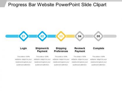
We present you a new age Progress Bar Website PowerPoint Slide to make you stand out from the rest. With our added creative components in the progress bar, you can make your PowerPoint presentations much more appealing to the viewers. A progress bar will show the status of the current slide in relation to the total number of slides in a presentation. In order to have a smooth transition in your PowerPoint presentation utilize our progress bars with every step. With this progress bar template you can demonstrate development or growth for various tasks and activities in your PowerPoint slide. Download our improvement bar template to maximize the value of your product in every angle and convey the value of your product to clients. With this PowerPoint help your team to distinguish the aspects contributing to the value of the product. Ensure a comprehensive glossary with our Progress Bar Website Powerpoint Slide Clipart. All the important contents will get included.
People who downloaded this PowerPoint presentation also viewed the following :
Progress bar website powerpoint slide clipart with all 5 slides:
Swish the air with our magical Progress Bar Website Powerpoint Slide Clipart. Pull a rabbit out of the hat with your ideas.
FAQs for Progress bar website
For presentations, keep your progress bars thick and simple - nobody wants to squint at tiny lines from the back row. Dark blue on light gray works great, or green on white. Skip the fancy gradients though, they look awful on most projectors (learned this the hard way). Horizontal beats vertical since people read left to right. Put your percentage numbers inside the filled part or right above it. I'd say make the bar at least 20-30 pixels thick so it shows up clearly on any screen. Honestly, bold and boring wins over pretty but invisible every time.
Honestly, progress bars are pretty genius for keeping people hooked. Your audience always wants to know "how much longer is this thing?" - we're all guilty of that mental countdown. Having that visual roadmap stops people from getting antsy and wondering when you'll finally wrap up. Instead they can actually focus on what you're saying right now. Shows you've got your stuff together too and aren't just winging it. Oh, and definitely update it between sections or it's totally pointless. Nothing worse than a progress bar stuck at 20% halfway through your talk.
Blue and gray is your safest bet - there's a reason literally every tech company goes with blue, it just feels reliable. Green gradients work great too since people think "progress = growth." You could also do monochromatic stuff with different shades of the same color, that looks pretty clean. Just make sure there's enough contrast for accessibility - like dark blue on light gray backgrounds. Skip red unless something's actually broken, people automatically think "error" when they see it. Oh, and definitely test how your colors look against whatever background you're using first!
Yeah, those little animations actually help a ton! Your brain sees the bar filling up or doing that pulsing thing and goes "okay, stuff's happening" instead of panicking that everything froze. People get weirdly calmer watching progress creep forward - it's like we need that visual proof, you know? Just don't go crazy with flashy effects because then it becomes distracting. Simple fills or soft glows work best. I learned this the hard way after making one that looked like a disco ball.
Just drag and drop PNG or SVG files straight into your slides - works great in PowerPoint, Google Slides, whatever you're using. SVG is way better since it won't get blurry when you resize. You can also copy-paste from websites, though sometimes the quality is meh. The animation features are actually pretty cool for showing project timelines - makes it look way more professional than static bars. Oh, and if you're doing multiple project phases, group the progress bars together so they don't get all scattered around your slide.
Ugh, the worst thing you can do is throw up a progress bar that hits like 73% when nobody knows what you're even measuring. Looks so amateur! Don't go crazy with animated ones either - they're distracting even though they look cool. Match whatever style you're already using in your slides. One thing that drives me nuts is when people switch between different bar styles in the same deck. Pick one clean look and stick with it. Oh, and make sure your percentages actually connect to real data, not just random numbers that sound good.
Progress bars are actually perfect for showing trends! Set them up at different fill levels - like 25% for Q1, then 75% for Q2, 90% for Q3. You get the idea. Just line them up chronologically or use animated ones that fill up over time. The tricky part is making sure people know what your "100%" means. Are we talking revenue goals? Project milestones? Be super clear about that upfront. Same colors throughout helps too, obviously. Works great for anything that naturally builds up - sales targets, user adoption, that kind of stuff. Way more engaging than boring old line charts, honestly.
Progress bars are actually super useful for project updates and training presentations. I use them all the time in executive dashboards to show quarterly goals, or in onboarding decks for training modules. Sales pitches too - startups love showing fundraising milestones this way. The main thing is making sure your data actually means something to your audience. Nobody wants to see a progress bar just for the sake of having one (learned that the hard way). They work best when people can instantly see where things stand and what's next. Perfect for completion status, timelines, or any step-by-step process really.
Honestly, the font you pick makes a huge difference in how fast people think your progress bar is moving. Sans-serif fonts like Roboto or Inter actually make progress feel quicker and more reliable. Serif fonts? They'll slow down how fast users think things are loading – weird but true. You want medium weight though, not super bold (feels aggressive) or too thin (makes people wonder if it's even working). I always stick with whatever matches the rest of the design. Oh, and make sure the percentage text stays readable when it's small!
Hey! So for progress bar clipart that works everywhere, SVG and PNG are your friends. SVG is amazing because it never gets blurry when you resize it, and the files stay tiny. PNG is solid for transparency stuff - pretty much everything supports it these days. Skip JPEG since you'll probably want transparent backgrounds. GIF is kinda dead at this point, honestly. Oh, and I always make SVGs first, then keep some PNGs around just in case you hit an older system that's weird about vectors. Works every time.
Honestly, the biggest game-changer is matching your progress bars to your actual brand colors instead of those boring default blue ones. I've seen people do crazy creative stuff - like turning their product logos into the actual progress indicators, which looked pretty slick. Your fonts should match too, obviously. The trick is picking 2-3 different styles upfront and sticking with them throughout the whole presentation. Nothing screams "I threw this together last minute" like inconsistent design elements. Oh, and if you've got brand patterns or textures, those work great as backgrounds for the bars themselves.
Oh totally! Progress bars are like magic for making people less impatient. Your brain basically tricks itself into thinking time's moving faster when you can actually see something happening. People won't bail on your site as much either. Just don't be that guy with the progress bar stuck at 99% forever - honestly the worst. Use them for anything taking more than 2-3 seconds. File uploads, loading screens, whatever. I learned this the hard way when my form submissions were losing people left and right.
Honestly, progress bars are genius for making data less painful to digest. Your brain just gets it instantly instead of having to decode a wall of numbers. You can show completion rates, project status, comparisons - whatever. There's something weirdly satisfying about seeing that visual progress too (probably why we all stare at loading screens). People won't have to work to understand your point, which is clutch for presentations. I'd throw them in anywhere you're normally tempted to dump a bunch of statistics. Way more effective than making someone read through paragraphs of data.
Oh man, this totally matters more than you'd think! Big progress bars steal all the attention - like, they'll completely take over your slide. Smaller ones just sit there as background info. I'd say start around 10-15% of your slide width, then see how it looks. You want enough white space so it doesn't feel squished in there. Honestly, I made this mistake once where my progress bar was so huge it made everything else look tiny. Learn from my fail! Just match it to how important that progress info actually is compared to your main points.
So the colors you pick for progress bars really mess with people's heads. Red + fast animations = panic mode, while blue with smooth filling feels way more chill. Thick, bold bars make it seem like serious stuff is happening - thin ones feel quicker somehow? I swear some progress bars give me anxiety for no reason. Pulsing effects definitely make users feel rushed. But gradients? Super calming. Really depends if you want people stressed or patient while they wait.
-
Very unique, user-friendly presentation interface.
-
Commendable slides with attractive designs. Extremely pleased with the fact that they are easy to modify. Great work!