

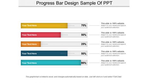
Progress bar design sample of ppt



Try Before you Buy Download Free Sample Product
 Impress Your
 Audience
 100%
100% Editable
 Save Hours
 of Time


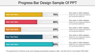
Allow the direct comparison of multiple series in a given category through this Progress Bar Design Sample of PPT. Gauge and represent the change over time. Reveal the relations between different variables and depict their effect on your company’s growth. A basic quality of a graph is that it is clear and readable. Use this progress bar chart PowerPoint slide to make a presentation that is comprehensive and easy to understand. Represent a comparative range of data to analyze your company’s progress using this bar graph. Give your investors and competitors an insight into your company’s success. Evaluate the factors that need improvement to enhance productivity with the help of this bar chart PPT template. With the horizontal progress bar graph in Excel, draw the change in economic trends over time. Use this percentage progress bar in Excel to get an idea of how much a factor contributes to your company's growth. Prepare an impressive PowerPoint presentation for your audience in less time.
People who downloaded this PowerPoint presentation also viewed the following :
Progress bar design sample of ppt with all 5 slides:
Give the journal the endorsement it deserves with our Progress Bar Design Sample Of Ppt. Ensure it is a big draw.
FAQs for Progress bar design
Honestly, the biggest thing is making sure it actually shows real progress - not just some fake animation that spins forever. Visual clarity matters too. Give people a percentage or at least show what step they're on. Don't let it jump around randomly because that's super annoying and makes everything feel broken. Colors should match your UI (green when done, blue while working). But here's what really kills me - when the timing estimates are completely wrong. Like, it says "2 minutes left" then takes 20 minutes. Test that stuff properly because once users lose trust in your progress bars, they'll never believe them again. Also, smooth updates beat jerky ones every time.
So basically, colors mess with people's heads more than you'd think. Green makes users feel like they're crushing it - total win for progress bars. Red freaks everyone out because we're wired to think "error!" even when everything's fine. Blue's your safe bet for longer processes since it feels chill and reliable. Orange has this weird pushy vibe if you go overboard, but it works for quick bursts. And yellow... ugh, don't get me started. It screams "warning" to most people. Match the vibe you want - energetic green for quick stuff, calming blue when they're waiting around.
Honestly, stick with the basic linear progress bar for deterministic stuff - people just want to see that steady 0-100% fill. Way more satisfying than you'd think. Stochastic progress is where it gets annoying though. Can't predict the timing, so pulsing bars or spinning wheels work better than fake percentages. Those stepped dots are solid too for showing phases. Oh, and please don't be one of those apps that sits at 99% forever - we've all been there and it's the worst. Mixed scenarios? Show deterministic progress for the small stuff inside bigger unpredictable operations. Just be honest about what you can actually track.
Honestly, animated progress bars are such a game changer. Users get way less frustrated when they can see smooth movement - it reassures them the system isn't frozen or whatever. Short, snappy animations work best. You don't want some crazy spinning thing that goes on forever though, that's almost worse than nothing. The movement should actually match real progress, not just look pretty. I learned this the hard way on a project last year. Keep it consistent with your overall design vibe, and people will trust that stuff's actually happening behind the scenes.
Progress bars can be tricky for accessibility. You'll want ARIA labels like `aria-valuenow`, `aria-valuemin`, and `aria-valuemax` so screen readers can actually tell users what's happening. Skip the generic "loading..." text - be specific about what's loading. Color contrast is obvious but worth mentioning. Don't make colorblind users guess at progress based on color alone. Honestly, the best thing you can do is test with VoiceOver or NVDA yourself. It's kinda wild how many "accessible" progress bars are basically useless when you actually hear them. Takes like 5 minutes and you'll catch issues you'd never spot otherwise.
Just match whatever styling you've already got - same border radius, colors, spacing, all that. I'd stick them directly into cards or forms instead of making them float around separately. Way less messy. The height and fonts should obviously match your other components too. Quick loading stuff works great next to buttons, but longer processes probably need their own space. Oh and definitely check what you're already using first - there's usually a natural spot where progress bars fit into your existing patterns. Makes the whole thing feel way more cohesive.
Dude, use both the visual bar AND percentages - trust me on this. Just the bar feels vague, and numbers alone are boring as hell. Stick the percentage inside the bar if the colors work, otherwise put it right beside it. Keep them updating together obviously. Time estimates are clutch too - like "23% done, maybe 5 more minutes" makes people way less anxious. Round to whole numbers unless it's some mega-long process where decimals actually help. The combo just works better than picking one.
Dude, progress bars are seriously a game-changer for anything that takes forever to load. People will literally sit there for like 2+ minutes if they can see stuff happening, but they'll bail after 10 seconds staring at nothing. It's wild how much of a difference it makes. Make sure yours shows actual progress though - not those fake spinning things that don't mean anything. Time estimates help too, or just telling users what's going on. I learned this the hard way when users kept thinking our app crashed during uploads. Visual feedback = happy users who don't rage quit.
Length and positioning make a huge difference for progress bars. Longer ones grab more attention and feel weightier, shorter ones blend in better. Where you put them matters - top of screen feels like overall progress, but inline placement works for specific tasks. I've noticed tons of apps screw this up with bars that are way too thick or randomly placed. Match your bar size to how important the task actually is. Keep it proportional to everything else in your UI. Also, stick them near whatever content they're actually tracking. You'll probably need to test a few different sizes - what looks good varies depending on your specific setup.
Honestly, focus on making it super clear first - fancy stuff comes later. High contrast colors are your friend, and make sure it's thick enough for mobile screens. Always throw in percentage numbers or step counts because I've used so many "pretty" progress bars that told me absolutely nothing lol. Smooth animations are nice but don't go overboard. Match whatever design language you're already using in your app. Test it with real people doing actual tasks - they'll roast you real quick if it looks good but sucks to use.
Honestly, the biggest thing is just don't lie to users about progress - that kills trust instantly. Those spinners that spin forever with zero context? Skip them. I've seen some ridiculously over-animated progress bars that literally made me nauseous lol. Keep timing estimates realistic instead of super optimistic. Be upfront about what's actually happening and how long it'll really take. Short bars work better than distracting fancy ones. Test with real data too, not fake progress that rockets to 100%. Users aren't dumb - they'll notice if something feels off.
So progress bars are actually super flexible for branding! Start with your brand colors - fill and background are the obvious spots. Border radius makes a huge difference too. Sharp corners scream tech/modern, while rounded feels way more friendly. Honestly, some companies go crazy with animated icons that travel along the bar (kinda cool but easy to overdo). Play around with thickness and gradients too. Don't forget you can style the percentage text with your brand fonts. The trick is keeping it usable while making it distinctly yours. I'd definitely A/B test different versions - you'll be surprised what users actually prefer.
Honestly, the biggest thing is just being upfront about timing - show real percentages or actual estimates so people aren't left guessing. Break longer stuff into chunks so they see movement instead of staring at 3% for ages (that's the worst). Micro-animations are cool, maybe some cheeky loading text if it fits your vibe, but don't overdo the humor if you're building something serious. Oh and this should be obvious but apparently isn't - make sure your progress bar actually matches what's happening behind the scenes. Random jumping around will make users lose faith in your whole app pretty quick.
Basically, mobile progress bars need to be way chunkier since you're squinting at a tiny screen. Desktop ones can be thin and subtle - there's plenty of room. But on mobile? Make everything bigger - the bar itself, text labels, all of it. People are usually just glancing at their phones real quick anyway. Oh and if it's interactive (like those video scrubber things), you definitely need huge touch targets. Trust me, nobody wants to keep missing with their thumb. I always go for at least 44px height on mobile - anything smaller is just asking for frustrated users.
Definitely start with completion rates - are people actually finishing or bailing halfway through? Time-to-completion matters too since good progress bars should keep users calm and moving. I'd also check click-through rates at each step to see where folks get confused. Heat mapping's pretty useful here - sometimes users just stare at the bar instead of doing the actual work, which is kinda funny but not helpful. Oh, and satisfaction scores are clutch because everyone hates those lying progress bars that jump all over the place. Focus on completion and timing first though - they'll show you right away if your bar's actually working.
-
Innovative and attractive designs.
-
Unique and attractive product design.