


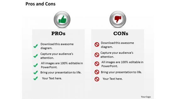
Pros and cons powerpoint template slide




Try Before you Buy Download Free Sample Product
 Impress Your
 Audience
 100%
100% Editable
 Save Hours
 of Time


Want your business to stand out in the competitive world than you will be needing an outstanding analysis regarding the pros and cons of your business structure. So our professional team of designer have made pros and cons PowerPoint template slide, using which you can describe the strong and weak points of your business. This PPT design is also useful while you explain key elements of a business such as business plan and its execution to achieve the business objectives and goals and what hurdles are there in the way for the employees from achieving the goals. This PPT template slide will give your target audiences a clear picture of the business target. Our Pros and Cons PPT template will also help in explaining the challenges involved in achieving the business targets and goals. This PowerPoint slide can be useful to various professionals and educationalist from diverse sectors to present their data. Simply download the PowerPoint template for giving an enthralling PowerPoint Presentations. Colour your thoughts in bright hues. Our Pros And Cons Powerpoint Template Slide will paint the picture.
People who downloaded this PowerPoint presentation also viewed the following :
Pros and cons powerpoint template slide with all 5 slides:
Leave a lasting impression with our Pros And Cons Powerpoint Template Slide. They possess an inherent longstanding recall factor.
FAQs for Pros and cons
Honestly, templates are lifesavers because you're not starting with a blank slide staring back at you. The formatting stays consistent, colors actually match instead of looking like a rainbow threw up, and you get layouts that don't make people's eyes hurt. They keep your content organized too - which, let's be real, most of us need help with. Even if you're terrible at design (guilty), your slides will still look decent. Oh, and find like 2-3 good ones you can switch between depending on what you're presenting. Game changer.
Honestly, templates are a lifesaver for keeping your slides consistent. You won't have that awkward mix of random fonts and colors that screams "I made this at 2am." They guide people through your story logically instead of making them guess what comes next. The visual hierarchy is already built in, so your main points actually pop. Plus you get useful layouts like timelines and comparison charts - way better than trying to design those yourself. Your audience can focus on what you're saying rather than being distracted by messy design. Just find one that fits your vibe and tweak it.
Honestly, just pick something clean with fonts people can actually read. White space is your friend - cramped slides make everyone miserable. Stick to colors that don't clash (please, no neon green on hot pink). Keep layouts super simple. Like, 2-3 bullet points tops per slide. Skip the fancy animations unless they actually help explain something. And definitely use images - way better than boring text blocks. Oh, and test it first! Nothing worse than realizing your template looks terrible once you've already built half your presentation.
Oh totally! Finance and healthcare are crazy strict about this stuff - they want super clean layouts since they're dealing with patient data or earnings reports. Tech companies? They can do whatever wild designs they want (honestly jealous). Manufacturing usually sticks to basic templates that work well with diagrams and specs. Marketing agencies obviously go all out to flex their design skills. Here's what I'd do - check out your competitors' presentations first. You really don't want to be that person rolling up with some weird font choice when everyone else is keeping it professional.
Yes, they absolutely do! I've watched people with solid content get written off just because their slides looked thrown together. Honestly, it's pretty unfair but that's reality. When you use a clean template, people automatically think you're more organized and credible. Plus it keeps everyone focused on your actual message instead of getting distracted by wonky fonts or clashing colors - which happens more than you'd think. The consistency thing matters too. Just pick one template and use it throughout your whole presentation. It shows you respect their time and didn't just wing it.
Honestly, the worst thing you can do is go for those flashy templates with crazy backgrounds or fonts that make people squint. I made that mistake once - picked this "cool" design that nobody could actually read. Don't choose stuff that clashes with your vibe either. Like, Comic Sans for a work presentation? Hard pass. Complex layouts are another trap - you'll end up cramming text everywhere or cutting important stuff just to make it fit. Start simple and clean, then tweak the colors and fonts later. Trust me, boring beats unreadable every single time.
Honestly, you want something in the middle - not too rigid but not crazy customizable either. Too many options and you'll waste hours tweaking fonts instead of actually writing. But super basic templates make you look like everyone else. Look for ones where you can change layouts and colors but the spacing and typography stays consistent. I swear, I've watched people take a perfectly good template and absolutely wreck it by changing everything. Find moderate flexibility and then... just stop. Don't touch every single setting you see.
Honestly, branding matters way more than people think when you're picking templates. Your slides need to match your company colors and fonts - otherwise it looks super off-brand and kinda unprofessional. I've sat through presentations where the template was completely wrong for the company and it was just... weird? You want people to instantly know it's YOUR presentation. Grab your brand guidelines first, then hunt for templates that'll work with your logo and color scheme. The whole thing should feel like it belongs together, you know? Trust me, it makes a huge difference in how credible you look.
Your color choices totally mess with how people feel about your presentation. Reds and oranges pump up energy, but blues and greens make everyone chill and trust you more. I bombed a morning meeting once with this dark, "sophisticated" background that just felt depressing lol. High contrast gets attention but don't go crazy with it. Also think about eye strain - nobody wants to squint through your slides for 30 minutes. Test everything on different screens first because colors look weird on projectors sometimes. Match your vibe to your message and you'll be good.
Honestly, the biggest thing is making sure people can actually read your slides. High contrast is key - that light gray text on white background thing is brutal for anyone past row 2. Pick fonts that aren't too small or overly fancy (Comic Sans is still a no though lol). Give your content room to breathe with some white space. Oh, and definitely run it through a colorblind simulator online - those tools are actually pretty cool and you'd be surprised how many color combos just don't work. Quick test: squint at your slides from across the room. Can't read it? Your audience won't either.
PowerPoint templates are way more flexible than you'd think! You can totally swap out text for charts, videos, images, whatever. Most decent templates automatically resize stuff when you drop in multimedia - seriously saves your butt when you're scrambling last minute. Just avoid the super text-heavy ones. Go for templates with varied layouts that already have chart spots and image frames built in. That way you're not constantly wrestling with the design every time you want to add a graph or photo. Makes the whole process so much smoother.
Yeah, digital's definitely better for the environment. You're cutting out so much paper waste and all those printing chemicals. Remember how we used to make like 30 copies of everything? That was insane. Your devices and servers still use energy obviously, but way less carbon footprint overall. The cool thing is you can update presentations forever without wasting more materials. Just try to get people viewing on their phones instead of printing afterward - some people still do that for some reason.
I'd say every 6-12 months, depending on how much you're presenting. If you're pitching clients constantly, maybe closer to 6 months. Internal stuff? You can probably stretch it to a year. Honestly, nothing screams "I don't care" like a template that looks like it's from Obama's first term. Your audience totally picks up on outdated fonts and colors, even if they can't put their finger on why something feels off. When your brand guidelines change, that's an automatic refresh. Otherwise, just set a reminder every few months to tweak things. Small updates to color schemes or fonts can make everything feel fresh again without starting from scratch.
Dude, there are way better options than boring PowerPoint templates. Canva's my go-to - their drag-and-drop thing is so much easier and the designs actually look good. Google Slides is solid for collaborating, works on everything. Figma gives you crazy design control if you're into that. Oh, and Prezi does those zoomy presentations that don't suck people to sleep. Beautiful.ai is pretty cool too - it formats stuff automatically while you type. Honestly? Just try Canva first. It's free and you'll immediately see why I never touch PowerPoint anymore.
Templates are seriously a lifesaver - you'll save hours instead of fussing with fonts and colors from scratch. Just dump your content into pre-made slides and boom, you're done. I used to waste forever making things look perfect when I should've focused on what I was actually saying. The design work's already handled for you. Sure, you lose some creative freedom, but let's be real - most of us aren't design experts anyway. Oh, and pick something that actually fits your topic's vibe. Trust me on this one.
-
Very unique and reliable designs.
-
Great designs, really helpful.