

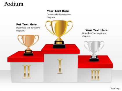
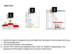
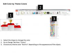
Podium powerpoint template slide




Try Before you Buy Download Free Sample Product
 Impress Your
 Audience
 100%
100% Editable
 Save Hours
 of Time


Highlight the significance of your business strengths in its development process though our creative PPT designs on podium PowerPoint template slide. The most important fact that can be well defined with this PPT image is to express the various business achievements on the basis of their occurrence and priority so that to attain long term growth. Whereas you can also describe the various benefits of managing your business processes though such podium style PowerPoint image such as it helps you in taking important business decisions, establishes the ways for you to achieve your long term business goals, aids towards eliminating the heavy or cutthroat market competition and more. With this creative and unique PPT diagram you will able to represent your divergent plans or strategies related to your business or other areas with their suitability of providing maximum , minimum and low returns or impact. Therefore just simply start engaging yourself with this Presentation slide now. Our Podium Powerpoint Template Slide give you that extra zing. Add your views and make your audience sing.
People who downloaded this PowerPoint presentation also viewed the following :
Podium powerpoint template slide with all 5 slides:
Encourage great feats with our Podium Powerpoint Template Slide. Embolden them to act fearlessly.
FAQs for Podium
Okay so for podium templates - make your text big and high-contrast so people in back can actually see it. White space is your friend, don't cram everything together. I'd stick to just a few bullet points per slide because honestly, no one wants to squint at paragraphs. Keep your fonts and colors consistent with your brand stuff. Charts or icons help break things up visually. One main idea per slide works way better than information overload. Oh and definitely test it by standing across the room first - you'd be surprised how small text looks from distance. Your audience will actually pay attention instead of zoning out.
Your slide design can totally make or break audience attention. Too much clutter and people zone out - they're looking at your messy visuals instead of listening to you talk. I'd stick with clean layouts, lots of white space, and fonts that don't suck. Color contrast matters too since someone's always sitting in the back squinting. Honestly, I've sat through way too many presentations where the slides were just... a lot. Keep your branding consistent and readable. Simple beats fancy every time. Oh, and test it from across the room first - you'll thank me later when people actually pay attention.
Okay so for presentations, stick with high contrast stuff - dark blue with white/yellow text is solid, or just go classic with white background and dark navy text. Skip red-green combos since colorblind people exist. Low contrast like light gray on white is basically invisible from the back row. Here's what I do: squint at your slides from across the room. Can't read it? Nobody else can either lol. Oh and definitely test it on the actual projector first if you can - sometimes colors look totally different than on your laptop screen.
Okay so images totally make your points stick better. People forget bullet points instantly, but they'll remember that perfect photo or chart that made everything click. Your brain processes visuals way faster than text anyway. Choose stuff that actually connects to what you're saying - not those awful generic stock photos that look like every corporate deck ever. I swear, a good image is like having a second voice backing up your argument. Pick something your audience will still be thinking about the next day, you know?
Dude, font choice can totally make or break your presentation. Go with something clean like Arial or Calibri - nothing fancy that'll make people squint from the back. Size matters too, obviously. Dark text on white backgrounds works best, and honestly? Script fonts are the worst - I cringe every time I see them in presentations. Oh, and here's something most people forget: actually test your slides by standing across the room first. You'd be surprised how many times text that looks fine on your laptop turns into a blurry mess on the big screen.
Honestly, just start with a master slide template and don't deviate from it. Keep your fonts and colors the same throughout - I know it sounds boring but trust me on this. Same footer on every slide, same spacing between text blocks. The worst presentations are when someone decides to get "creative" on slide 15 and suddenly everything looks chaotic. Your text formatting needs to match too. Before you present, flip through the whole thing quickly. You'll spot any weird slides that look different from the rest, and yeah your audience will definitely notice if you don't fix them first.
Simple fades and slides work way better than crazy spinning effects - nobody wants to feel dizzy during your presentation. I always stick to 0.5-1 second transitions max because anything longer feels awkward. One bullet point at a time keeps people focused on what you're saying instead of reading three slides ahead. Honestly? The flashier you make it, the more likely something's gonna break when you're presenting (Murphy's law and all that). Test everything beforehand - animations are weirdly glitchy sometimes. You want smooth flow, not some Vegas light show situation.
Oh man, the text thing is HUGE - people cram novels onto slides and wonder why everyone zones out. Make your fonts big enough so someone in the cheap seats can read it. Skip those fancy serif fonts too, they're impossible to see from far away. Those spinning transitions? Total amateur hour. Pick colors that actually work together and stick with them. I learned this the hard way in college lol. Quick test: stand across the room from your laptop. Can't read it? Make it bigger or cut half the words.
Honestly, visuals are a game-changer for presentations. Nobody wants to stare at boring spreadsheets from the back of the room - I've been there and it sucks. Charts and graphs tell your story way faster than bullet points ever will. People actually remember stuff 65% better when you pair it with images instead of just text. Wild, right? Replace those endless bullet lists with clean bar charts or throw in some icons for your stats. Even simple changes make a huge difference. Your audience won't be zoning out trying to decode walls of numbers.
Yeah, definitely think about who's actually sitting in those seats! Older execs usually want clean, traditional stuff with bigger fonts they can actually read. Younger crowds? They can handle flashier visuals and smaller text no problem. Industry makes a huge difference too - finance people expect boring conservative designs, but creative teams will judge you if it's not interesting. Oh, and don't forget accessibility stuff. Honestly, the biggest thing is just matching your design complexity to what your audience can actually process without getting overwhelmed or bored during your talk.
Yeah definitely! Start by swapping out those boring default colors - honestly, why do templates always use the same bland blues? Pick colors that actually match your style or brand. Then mess with the fonts and spacing until it feels right. I usually replace their stock photos with my own stuff too. The layout can be tweaked pretty easily in most programs. Just change one slide first to test things out, then copy those changes to the rest. Oh and don't forget text styles - make them sound like you, not some corporate robot. Small changes make a huge difference.
Honestly, just focus on getting the basics right first. Clean title areas, bullet points that don't randomly shift around (PowerPoint is so annoying with spacing), and keep your fonts consistent. I always make placeholder spots for logos and charts - saves you from that awkward resizing thing during presentations. Oh, and definitely create both light and dark versions because who knows what ancient projector you'll get stuck with. Neutral colors are your friend here since you won't have to redo everything for different clients. The template shouldn't be the star of the show anyway - your content should be.
Oh definitely! Colors are huge - red screams luck in China but screams danger here. White means purity to us but mourning in other places. Text direction matters too, plus how much info people actually want crammed on one slide. I bombed a Tokyo presentation because of this stuff. Some cultures love minimal designs, others want everything spelled out. Religious stuff can be tricky. Also business formality varies like crazy between countries. Honestly? Find someone local to review your slides first. Way easier than guessing what'll work.
Honestly, I'd just start with PowerPoint's Slide Master feature - it's super straightforward for setting up your basic layout and fonts. Canva has some nice templates too, but their free stuff is kinda meh. If you're feeling fancy later, you can always create graphics in Figma or Illustrator and drop them in. My biggest tip? Figure out your colors and fonts first before you get distracted by all the bells and whistles. I made that mistake once and spent way too long tweaking random design elements instead of actually finishing my presentation.
Honestly, feedback is your best friend for figuring out what's bombing vs. what's actually landing. Like if everyone keeps squinting at your slides, maybe bump up that font size? I'm weirdly obsessive about jotting down notes after each presentation - sounds dorky but whatever, it works. Watch for those moments when people look confused or start scrolling their phones. That tells you everything. Also don't just wing it and hope you'll remember later (you won't). Fire off a quick survey or literally just ask "what was unclear?" Most people will give you honest feedback if you make it easy.
-
Awesome use of colors and designs in product templates.
-
Perfect template with attractive color combination.