


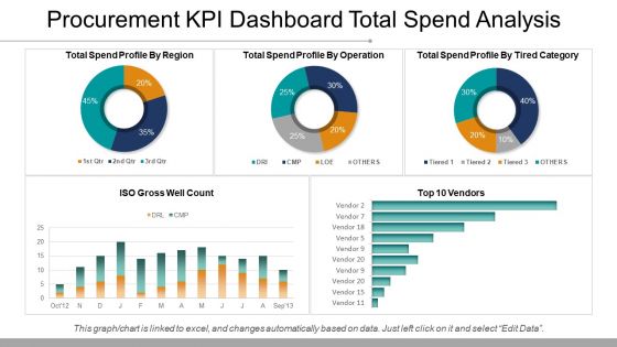
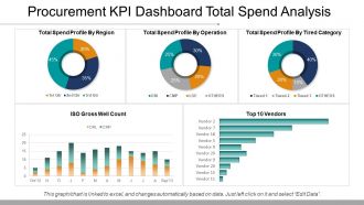
Procurement Kpi Dashboard Total Spend Analysis Ppt Samples





Try Before you Buy Download Free Sample Product
 Impress Your
 Audience
 100%
100% Editable
 Save Hours
 of Time


Folks express faith in your even handed approach due to our Procurement Kpi Dashboard Total Spend Analysis Ppt Samples. You will be called to interpose.
People who downloaded this PowerPoint presentation also viewed the following :
Procurement Kpi Dashboard Total Spend Analysis Ppt Samples with all 5 slides:
Wow everyone with streamlined design on your next presentation. With thousands of Procurement Kpi Dashboard Total Spend Analysis Ppt Samples available making beautiful presentations is a breeze.
FAQs for Procurement Kpi Dashboard Total Spend
Focus on the stuff that actually matters - cost savings, spend under management, supplier performance scores, and contract compliance. Purchase order cycle times are critical too because nobody wants to wait around for approvals. Track supplier diversity and maverick spend percentage as well. Honestly, I'd cap it at 8-10 KPIs max or you'll drown in data that doesn't help anyone. Oh, and make sure you can drill down into details - your stakeholders will definitely ask follow-up questions. Cost avoidance figures are worth including too if you've got the bandwidth.
Track your hard savings first - those are easy since you're just comparing actual spend to old contracts. Soft savings though? Total pain because everyone defines them differently. Focus on cost avoidance stuff like when you negotiate price freezes or get bulk discounts. Here's the thing - measure everything as percentages of total spend, not just raw dollars. Otherwise you can't tell if you're actually making an impact. Set up alerts for when you miss targets and definitely look at year-over-year trends. That's where you'll catch the real patterns.
Dude, seriously - charts and graphs will change your life with that KPI dashboard. Nobody wants to stare at spreadsheet rows all day. With visuals, you can spot trends and weird outliers in seconds. It's honestly night and day compared to digging through numbers manually. Heat maps are clutch for seeing supplier performance issues right away. Cost savings opportunities? They basically highlight themselves. Budget variances jump out too. I'd start simple though - pick your top 3-5 KPIs and turn them into basic bar or line charts first. You can always get fancy later.
-
Best Representation of topics, really appreciable.
-
Great quality slides in rapid time.