


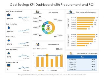
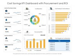
Cost savings kpi dashboard with procurement and roi




Try Before you Buy Download Free Sample Product
 Impress Your
 Audience
 100%
100% Editable
 Save Hours
 of Time


Our Cost Savings KPI Dashboard With Procurement And ROI are topically designed to provide an attractive backdrop to any subject. Use them to look like a presentation pro.
People who downloaded this PowerPoint presentation also viewed the following :
Cost savings kpi dashboard with procurement and roi with all 2 slides:
Use our Cost Savings KPI Dashboard With Procurement And ROI to effectively help you save your valuable time. They are readymade to fit into any presentation structure.
FAQs for Cost savings kpi dashboard with
Track your actual savings against targets first - that's your bread and butter. Cost reduction percentages by category matter too, plus ROI on whatever initiatives you're running. Don't forget procurement savings and operational efficiency stuff. Year-over-year comparisons are solid for showing trends. Honestly, the pipeline view of upcoming opportunities has been huge for us - way easier to plan ahead. You need both hard savings (real budget cuts) and soft savings (avoided costs). Those are pretty different beasts. Start there and see what your stakeholders actually care about before going crazy with metrics.
Honestly, having a good cost savings dashboard is a game changer. You can finally see where your money's going in real-time instead of guessing. Quick example - you'll catch which departments are nailing their targets and which ones are struggling way faster than before. Makes those budget meetings with leadership so much easier when you've got actual data to show them. The trick is tracking stuff that matters for your bigger goals, not just random metrics that look impressive. Oh and actually use the insights to change course when you need to - sounds obvious but you'd be surprised how many people build these things then ignore them.
So for your cost savings dashboard - waterfall charts are clutch for showing how savings build up over time. Bar charts work awesome for comparing different departments. I'd throw in some trend lines to track against your targets too. Pie charts are kinda basic but honestly they do the job for category breakdowns. Oh and definitely add those KPI cards at the top - total savings, goal percentage, all that good stuff. Start there, then maybe get into heat maps later if you want to analyze correlations and stuff.
Monthly updates work great for most teams, but weekly's even better if you can pull it off. Don't bother with daily unless everything's on fire or you've got automated feeds doing the heavy lifting. Cost savings data is weird - it needs time to actually mean something, you know? Like, daily tracking is basically useless. Weekly keeps you nimble enough to catch problems early. Monthly gives you the bigger picture and real trends you can actually act on. Honestly, I'd start monthly until your team gets the hang of reading the patterns, then bump it up.
Honestly, Power BI or Tableau are your best bets for cost savings dashboards - they handle financial data like champs. Excel still kicks ass if your data isn't too messy and you need something fast. Google Data Studio works too if you're being cheap about it. My old boss swore by Looker but that might be overkill. Pick whatever plays nice with your current systems and won't make your team want to quit. I'd start simple with whatever tool you already know, then get fancy later if needed.
Think of benchmarking as your sanity check - it tells you if your cost savings are actually impressive or just... okay. You can compare against competitors, last year's numbers, or industry leaders. Otherwise you're just staring at random figures that don't mean much. Honestly, leadership won't be impressed by "we saved money" without context. Pick benchmarks that actually relate to what your company cares about. Then you'll see where you're killing it and where there's room to improve. It's like having a scoreboard instead of just counting points.
Figure out what's actually bleeding money in your industry first. Manufacturing? Track downtime and waste. Tech companies obsess over cloud costs and dev cycles. Healthcare looks at readmission rates while retail watches inventory turnover like hawks. Don't get caught up in those boring "cost per unit" metrics that sound impressive but tell you nothing useful. Pick maybe 3-5 things that your boss actually loses sleep over - that's where you'll see real impact. You can always add more later once you've got the basics down.
Honestly, the worst thing you can do is cram everything onto one screen. I've worked with teams who had these monster dashboards with like 20 charts - total nightmare. Nobody could figure out what mattered. Keep it to 5-7 metrics tops, and make sure they're actually useful for decisions. Vanity metrics are tempting but they're garbage. Your data sources better be clean too, because conflicting numbers will destroy everyone's trust real quick. Always add context like targets so people know if things are good or bad. Oh, and start simple - you can get fancy later.
Honestly, you've gotta tie your cost savings directly to what the C-suite actually obsesses over - profit margins, quarterly numbers, that kind of stuff. Figure out your company's top priorities first (usually 3-5 big ones), then show how your cost cuts help hit those targets. I made this mistake once - spent weeks on this gorgeous dashboard that got completely ignored because it didn't connect to revenue at all. Pretty embarrassing actually! Track savings that clearly flow to the bottom line. Tell stories like "we cut X dollars, which freed up budget for the new product launch." Makes it way more compelling.
First thing - set up automated rules to catch weird outliers before they even reach your dashboard. I do monthly audits where I cross-check everything against the source systems, but honestly that timeline depends on how much people freak out over bad numbers. Make sure someone actually owns each metric too, otherwise accountability just disappears into the void. Oh, and definitely set up alerts for missing data or crazy spikes. Trust me, it's way better to build these checks upfront than scramble after your boss sees something that makes no sense.
Honestly, dashboards work because nobody wants to be the slacker when everyone can see the numbers. Real-time visibility means your team sees who's crushing their savings targets and who's struggling. Think of it like those step-counting apps - once you can compare yourself to others, you naturally try harder. Weekly reviews are clutch here. Have each person walk through their metrics and explain what they're doing next. It shifts the whole vibe from people making vague promises to actually backing up their words with data. Plus you'll spot who needs help before they fall too far behind.
You're gonna be flying blind without that baseline data - trust me on this one. Can't tell if your 15% cost reduction is actually impressive or just normal ups and downs. I'd grab at least 12-18 months of history if you can swing it. More is better obviously, but that should give you enough to spot real patterns and seasonal weirdness. Otherwise you're just guessing whether your cost-cutting moves actually worked or if it's temporary luck. Super helpful for realistic forecasting too, which honestly saves you from looking like an idiot later when targets are way off.
Oh this is actually pretty straightforward! Think of it like telling a story - start with your problem (those awful baseline costs), then show the journey with all your initiatives, and finish with the wins. Honestly, the dashboards that do this well are SO much easier to pitch to executives. Add little callouts when something really made a difference. Break it into sections that flow logically, toss in quick explanations for the big changes, and don't forget a "what's next" bit at the end. Makes the whole thing way more engaging than just throwing numbers at people.
Honestly, having mobile access is clutch when you're stuck in meetings all day or traveling. I can pull up cost savings data right from my phone during budget talks instead of awkwardly saying "I'll check on that later." The push notifications are pretty helpful too - they'll ping you when you hit savings targets or if something's off track. Being able to spot trends while I'm away from my desk has saved me more times than I can count. Download the app first and definitely set up those key alerts right away. Trust me, it beats scrambling back to your computer every time someone asks for numbers.
Honestly, you'll be surprised what people actually care about versus what you think they want. Finance might obsess over budget variance trends while you're focused on cost per unit. Talk to your actual users - they'll tell you which charts make zero sense and what's missing. I learned this the hard way when I built this beautiful dashboard that nobody used because it didn't show the right stuff. Monthly check-ins work great for catching when priorities change. Plus people love feeling heard about this kind of thing. Just don't overthink it.
-
Innovative and attractive designs.
-
Professional and unique presentations.
-
Awesome presentation, really professional and easy to edit.
-
Editable templates with innovative design and color combination.