


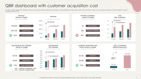
QBR Dashboard With Customer Acquisition Cost




Try Before you Buy Download Free Sample Product
 Impress Your
 Audience
 100%
100% Editable
 Save Hours
 of Time


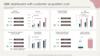
The following slide highlights KPI dashboard which can be used for quarterly business review QBR. It provides detailed information about actual revenue vs target, number of new customers, average revenue per customer, customer acquisition cost CAC etc.
People who downloaded this PowerPoint presentation also viewed the following :
QBR Dashboard With Customer Acquisition Cost with all 7 slides:
Use our QBR Dashboard With Customer Acquisition Cost to effectively help you save your valuable time. They are readymade to fit into any presentation structure.





FAQs for QBR Dashboard With
For your QBR dashboard, start with what your execs bug you about most - that's usually revenue growth and customer stuff like acquisition and retention rates. Throw in your main operational metrics too (conversion rates, customer satisfaction, whatever matters for your business). Don't forget progress on those big strategic initiatives everyone's always wondering about. Show current numbers AND trends over time - leadership loves seeing if things are heading up or down. Keep it tight though, maybe 6-8 KPIs max. Nobody wants to stare at a wall of charts. Oh, and honestly? Sometimes less polished data that tells a clear story beats perfect formatting that confuses people.
Honestly, QBR dashboards are game-changers because they get everyone on the same page. No more confusion about priorities or departments working in silos. Marketing, sales, product - they're all looking at the same data and can see how their work connects to company goals. Makes it super obvious when things are off track. Pick 3-5 objectives that actually matter across teams (not like 20 random metrics that nobody cares about) and track those religiously. When everyone's staring at the same numbers, course corrections happen way faster. Trust me on this one.
For your QBR dashboard, I'd go with Power BI - it's got the right mix of features without breaking the bank. Tableau and Looker Studio are solid too (Looker's free if budget's tight). These tools actually handle big datasets without choking, unlike Excel which... yeah, don't even go there for executive presentations. Trust me on this one. Focus on your KPI trends and quarter-over-quarter stuff since that's what the C-suite actually looks at. The key is making visuals that tell a clear story rather than just dumping data everywhere.
Honestly, I'd go with monthly at minimum, but bi-weekly is way better if you can swing it. Made the mistake once of showing executives old data - super awkward lol. Weekly works too if things are moving crazy fast or you're mid-quarter push. The main thing? Pick a schedule and actually stick to it. Your team will thank you for consistency. I just set a recurring reminder and call it good - that way everyone knows when fresh numbers are coming. Don't overthink it too much, just find what works for your situation.
Oh man, data integration is going to be your worst enemy. Sales tracks stuff one way, marketing does something completely different, and don't even get me started on customer success. Then every exec wants their favorite metrics plastered everywhere - your dashboard turns into total chaos. I'd honestly just pick 3-5 KPIs that actually matter and start there. Get everyone to agree upfront (good luck lol) and build it piece by piece. Way better than trying to fix everything at once and losing your mind.
Honestly, good charts can save your QBR from being a total snoozefest. Nobody wants to stare at endless spreadsheet rows - executives will check out immediately. When you use the right visuals, people actually get it. Trends jump out, weird outliers become obvious, opportunities practically highlight themselves. Bar charts work great for comparisons, line graphs show changes over time, heat maps are perfect for regional stuff. The trick is telling a story with your data instead of just throwing numbers at people. Keep things clean though - cluttered dashboards are almost worse than no visuals at all.
Honestly, getting feedback on your QBR dashboard is everything. Without it, you're just making something that looks nice but doesn't actually help anyone. Ask your stakeholders what they really care about - which metrics matter, what's confusing them, what questions they can't answer. I've watched so many beautiful dashboards get ignored because they missed the mark completely. Set up quick review sessions after each QBR and actually make the changes people want. Sounds obvious but you'd be surprised how often this gets skipped.
Honestly, QBR dashboards are pretty clutch. Instead of digging through a million different reports, everything's right there - revenue, customer satisfaction, team performance, whatever you need. The cool part is seeing how things connect, like when customer happiness actually drives your numbers up. Way better than just going with your gut, you know? I used to waste so much time pulling data from different places before quarterly reviews. Now I just look at the dashboard and boom - I can see what's working and plan the next quarter. Oh, and definitely set it to auto-refresh or you'll be working with old info like an idiot.
Honestly, you've gotta build in regular check-ins for your dashboard - quarterly works pretty well. After each QBR, I'd do like a quick 30-minute "what actually worked here?" session with your stakeholders. Ask them which metrics they're really using to make decisions vs. what just looks pretty. Business stuff changes so fast (this market is wild), so retire the KPIs that don't matter anymore. Oh, and set up those automated alerts for when things get weird with your key numbers. The whole thing should evolve with your priorities - otherwise you're just staring at useless data.
So basically I always throw in a "Key Themes" box right next to my charts - honestly makes such a difference. Customer quotes work great too, just stick them near your main metrics. Color-coding helps connect the dots between what people are saying and what the numbers show. Don't go overboard though, maybe 3-4 insights max per section or it gets messy. I've found that pairing one qualitative note with each big metric you're tracking really helps explain why the trends are happening. The whole point is telling the story behind your data instead of just showing pretty graphs.
Tell the story behind your numbers instead of just throwing data at people. Start with wins and problems, then show the metrics that back it up. Clean slides work best - executives hate clutter and honestly get distracted super easily. You'll want to practice those transitions so you're not fumbling around mid-presentation. Have extra data ready because someone always asks random detailed questions, but don't put it all upfront. Oh, and end each part with what you actually need from them - decisions, approvals, whatever. Makes things way more actionable.
Dude, real-time data is a game changer for QBRs. You're not stuck talking about stuff from months ago anymore - you can actually see what's happening right now and fix problems before they blow up. Your stakeholders will actually pay attention instead of zoning out over old numbers. Mid-quarter pivots become possible when you spot trends early. Honestly, I'd go crazy trying to manually update everything, so definitely set up automated feeds if you can swing it. Makes the whole thing way less painful and you'll actually use the dashboard.
Yeah, you can totally customize QBR dashboards for different industries. Start with the template library - way easier than building from scratch. There are solid pre-built ones for SaaS, manufacturing, healthcare, etc. From there, swap out those generic KPIs for metrics that actually matter to your industry. The data viz can be tweaked to match what your audience is used to seeing. White-labeling is clutch too - throw in your branding and industry-specific terms. Makes clients way more receptive. Oh, and you can set up custom report templates if the standard ones don't cut it.
Honestly? Just see if people actually use the thing. Half the dashboards I've worked with end up abandoned after like two months. Check if your action items get done faster now and whether revenue forecasting got more accurate. Client retention rates matter too. But here's what really works - straight up ask your stakeholders if it's helpful. I'd pick maybe 3-4 KPIs tied to revenue or client happiness and track those quarterly. The fancy features don't mean squat if nobody finds value in it. Focus on whether decisions actually change because of what they're seeing.
Okay so with QBR dashboards, definitely don't just share with everyone - some people really don't need to see revenue breakdowns or churn data, right? I'd set up role-based permissions instead of doing blanket access. You can create filtered versions for different groups too. Oh and check that any embedded links keep the same security settings - learned that one the hard way lol. Honestly, run it by your data team first before you send anything out. They'll catch stuff you missed.
-
Based on my personal experience, I would recommend other people to subscribe to SlideTeam. No one can be disappointed here!
-
I want to express my gratitude to SlideTeam’s presentation design services team for helping me create the best presentation of my life!