

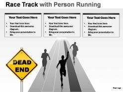
Race track with person running powerpoint presentation slides




Try Before you Buy Download Free Sample Product
 Impress Your
 Audience
 100%
100% Editable
 Save Hours
 of Time


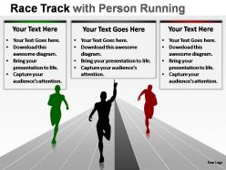
Channel your thoughts along our Race Track With Person Running Powerpoint Presentation Slides. See them flow ceaselessly on.
People who downloaded this PowerPoint presentation also viewed the following :
Race track with person running powerpoint presentation slides with all 23 slides:
Each time you need to make a presentation make sure it is perfect. Thousands of Race Track With Person Running Powerpoint Presentation Slides are on hand at all hours to make your next pitch a winner.


FAQs for Race track with person running
Start with the track layout - turns, straights, elevation changes, all that visual stuff. Safety features are honestly the biggest deal though, so barriers, runoff areas, emergency access need to be crystal clear. Technical specs matter too: length, width, surface material, grip levels. Oh and pit lane setup is weirdly important - people always ask about that. Spectator areas and race day logistics should go in there somewhere. Construction timeline at the end is smart so everyone knows when things'll actually happen. The safety section will probably get the most scrutiny anyway, so don't half-ass that part.
Dude, race tracks are super confusing without visuals. Banking angles, elevation changes, racing lines - all that stuff just doesn't click when you're only talking about it. 3D models work awesome, or even basic diagrams showing how cars take different sections. I swear, sitting through presentations where someone just says "turn radius" without actually showing it... ugh. Interactive stuff is clutch too - like highlighting overtaking zones vs. defensive sections on the same layout. Makes it so much clearer why drivers choose certain strategies. Oh, and stick to one visual per main concept you're covering.
Ugh, the worst thing you can do is cram everything into each section - stick to like 3-4 points max or people's eyes will glaze over. Also make your milestones actually mean something? "Increase engagement" is useless compared to "hit 25% email open rates." Most people totally butcher the visual flow too. They jump all over the place instead of going left to right chronologically. Oh and skip those fancy animations - they're just annoying distractions honestly. Keep it simple, make everything measurable, and just walk through it step by step when you're presenting. Way more effective that way.
Dude, analytics will seriously change your race presentations. Instead of guessing, you'll have actual data showing tire wear patterns and fuel rates. Weather overlays are clutch too - they help predict when drivers will gain or lose positions. The best part? You're not just saying "pit now" but actually proving why lap 23 is mathematically perfect. Honestly, the visuals make everything click for people who don't live and breathe racing data like we do. Just practice explaining the key metrics beforehand so you don't stumble when someone asks tough questions.
Dude, you've gotta read the room and match their vibe - sponsors need different energy than fans do. Interactive stuff works amazing though. Ask questions, show live footage, maybe bring actual helmets or car parts they can touch. My first track presentation was brutal - everyone was scrolling their phones because I just dumped data on them. People connect with stories and emotions way more than lap times and stats. Oh, and start with something that hooks them right away, then don't let that energy drop. Trust me, a memorable presentation beats boring slide decks every single time.
Think of your data like telling a story - start with the "before," show what changed, then hit them with the "after." Seriously, people's brains just work better with narratives than random numbers. Instead of throwing percentages around, use real customer examples moving through each stage. That's where the magic happens. Connect everything with phrases like "but then something shifted" or "here's where it gets interesting." Short transitions work too. Your audience should feel like they're following a plot, not sitting through some boring data dump. Trust me, stories stick way better than isolated metrics ever will.
Honestly, just go with **PowerPoint** or **Google Slides** for the basic setup - they're perfect for that racing flow you want. **Canva** is where it gets fun though, tons of sleek track templates that'll make you look like you actually know design. I've wasted way too much time trying to draw custom tracks in **Adobe Illustrator** but unless you're doing this stuff constantly, it's not worth the headache. **Lucidchart** works great too if your process is super complex and needs those winding paths. My advice? Start with a Canva template and tweak it. You'll be done in like half the time and it'll still look professional.
Try clickable hotspots on your track maps - people love poking around those. Real-time polls work great during the meaty sections, plus live Q&A breaks where folks can ask about specific turns or safety stuff. Some presentations I've seen use VR headsets for virtual track walks, which is honestly pretty sweet but probably overkill unless you're going all out. Oh, and gamification is clutch - throw in quizzes about track records or driver trivia between segments. Just match whatever you pick to your crowd's vibe and how tech-savvy they are. Don't go crazy with tons of features right off the bat.
Dude, electric racing is absolutely taking off - Formula E's gotten legitimately exciting and even NASCAR's dabbling in it now. Fans want everything digital these days: VR experiences, betting apps, interactive streams. Sustainability matters way more than it used to, especially with younger crowds, so tracks are going solar and using biofuels. Oh and data analytics is changing everything from how cars perform to keeping fans engaged. Honestly, the sport's changing faster than I expected. Just make sure you've got real examples and numbers to back this up when you present it.
Dude, branding makes a HUGE difference - it's what separates the pros from people just throwing together PowerPoints. Look at Monaco or Silverstone, right? Those tracks are brands themselves. You need a solid logo and consistent colors across everything. Makes investors see it as an actual business instead of just some sketches. Honestly, I've seen great track designs get shot down because the presentation looked amateur. Start with your visual identity first, then apply it to all your materials. It sounds superficial but trust me, it works.
Hit those three main things: barriers, emergency response, and driver protocols. Show actual photos of SAFER barriers and runoff areas instead of just describing them - way more impactful. Emergency response always grabs attention (makes total sense honestly), so walk through your response times and where medical teams position themselves. Driver briefings are huge too - cover yellow flags, safety car stuff, and how communication works. Oh and definitely include real data on response times and how safety's improved over the years. People love seeing those numbers. Your audience will eat that up.
Know your audience first - that's everything. Executives want the bottom line and ROI upfront, no fluff. Technical people? Give them the real details about how stuff actually works and what could go wrong. Sales teams are easy - just show them how it makes their job easier or helps them close more deals (honestly, they're the most grateful audience). For everyone else, skip the jargon and tell stories they can relate to. I always prep like 2-3 different versions of the same pitch because you never know who's gonna be in that room.
Dude, focus on lap times and sector splits - that's your foundation. Get your fastest lap, average times, and the gap between best/worst laps for consistency. Most people totally overlook that delta but it shows way more about actual driving skill than just being fast once. Tire wear and fuel consumption per lap are clutch too. Corner speeds through the main sections matter. Oh, and definitely pull data from multiple sessions if you can swing it - showing improvement over time makes everything look way more professional. The progression stuff really impresses people.
When you're presenting historical data, compare it to industry benchmarks and seasonal patterns. Call out anything weird - like that mess of Q3 2020 when nobody knew what they were doing with remote work. Year-over-year comparisons help, but don't forget the external stuff that moved the needle: market crashes, competitor launches, internal restructures. Your audience needs context to know if they're looking at normal ups and downs or something actually worth digging into. Honestly, half the battle is just separating outdated trends from patterns that still matter today.
So there's basically three ways to tackle this - tech demos, safety stuff, or fan experience improvements. Interactive prototypes work amazingly well, especially VR simulations where people can actually see your concept working instead of just talking about it. Safety presentations hit different when you show before/after scenarios with real pilot program data. Fan experience pitches? Tell stories about how race day actually changes for people. Honestly, interactive demos always win because they're way more engaging than slides. Oh, and whatever direction you go - have your implementation timeline and budget numbers ready. That's literally what they'll ask for first.
-
Very unique, user-friendly presentation interface.
-
Excellent Designs.