

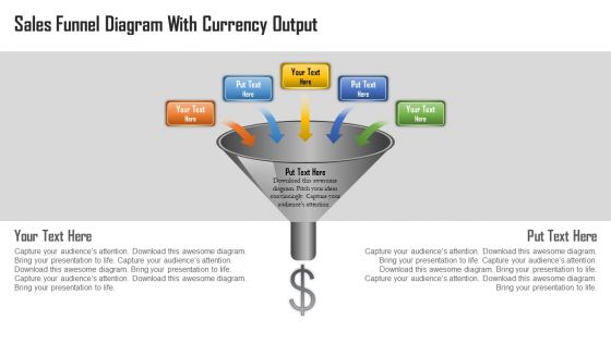
Sales funnel diagram with currency output powerpoint template





Try Before you Buy Download Free Sample Product
 Impress Your
 Audience
 100%
100% Editable
 Save Hours
 of Time


Do you want to represent your sales in more entreating style? Then you should download our pre designed sales funnel diagram with currency output PowerPoint template to make your sales figures more approachable to all. This PPT slide design consists of graphics, diagrams and PowerPoint images etc., for better conception of the related topic. Our PowerPoint template will help in ensuring that the sales are the most important key element of the business for making profits. In addition to this, our PowerPoint Presentation crafts a good illustration to the various areas linked to the sales management such as customer satisfaction management , marketing analysis management New or existing product management, financial management etc .This PPT design helps you in achieving the organizational objective and goal with better sales management tools and by generating more profits and revenues. So what are you waiting for! Simply download our PPT design and let everyone see your proactive approach of sales with currency output.Widen the scope with our Sales Funnel Diagram With Currency Output Powerpoint Template. Broaden the horizons of your audience.
People who downloaded this PowerPoint presentation also viewed the following :
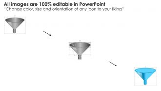
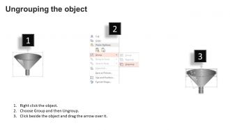
Sales funnel diagram with currency output powerpoint template with all 5 slides:
How many times have you created your presentation only to realise you have to change a whole lot of information on most slides. This wouldn?t have been a problem if you had made use of professionally created Sales Funnel Diagram With Currency Output Powerpoint Template.

FAQs for Sales funnel diagram with currency
Ok so first thing - get your stage labels clear. Awareness, Interest, Decision, Action, whatever makes sense for you. Then track how many prospects you've got at each stage plus the conversion rates between them. Honestly, the conversion rates are where you'll learn the most about what's actually working. Oh and add timeframes too - like how long people typically hang out in each stage before moving on. Visual stuff helps a lot, so throw in some colors or icons to make it easy to scan. Start simple with this foundation and build from there once everyone's used to it.
Mix up your visuals - colors, icons, different shapes work well. Classic funnel's solid, but I've seen teams do horizontal flows or even circles that show the customer journey better. Different widths can show conversion rates too. Honestly? Your sales team will know right away which format actually makes sense to them. Sketch out a few options first - they'll tell you pretty quickly where people are getting stuck. The whole point is matching how your team already thinks about the process anyway.
Honestly, I'd go with that cold-to-warm color thing - start with blues, move through greens, then hit yellows and oranges. Feels super natural since it matches how customers actually warm up to buying stuff. Traffic light colors work too, just maybe don't lead with red since it's kinda harsh? You could also do different shades of one color if you want it looking clean and professional. Oh, and definitely check it on a few different screens first - learned that one the hard way when my boss couldn't read half my chart in the conference room!
Just add your key numbers to each stage - conversion rates, lead volume, revenue stuff. I throw in text boxes next to each section since most templates have room for it anyway. Top of the funnel gets leads generated, middle tracks qualified prospects, bottom shows closed deals. Honestly though, stick to like 2-3 metrics per stage or it turns into a hot mess. Nobody wants their funnel looking like some crazy spreadsheet. Start with whatever numbers you have now, then figure out where you want to improve. The whole point is actually using the thing, not making it perfect.
Honestly, the worst thing you can do is overcomplicate it. People get lost when there are too many stages or conversion points crammed together. Map out what actually happens with your customers first - like, the real journey, not what you think should happen. Then build your visual around that. Oh, and don't assume everyone already knows your product exists. The awareness stage matters more than you think. Keep your stages simple and clearly defined. Also - this might sound obvious but I've seen it happen - avoid those weird fonts and color schemes that nobody can read when you're presenting. Your funnel diagram should actually reflect reality, not just look pretty on paper.
Okay so basically the funnel diagram shows you the exact numbers at each step, which makes it super clear where people are bailing out. Like if tons of leads aren't booking demos after initial contact, boom - there's your problem. Way better than staring at boring spreadsheet rows that don't really tell you much. The visual just makes those drop-off points so obvious. Then you can actually fix what's broken instead of randomly tweaking stuff and hoping it works. Honestly saved me so much time when I figured this out.
Yeah, funnels are totally different across industries. E-commerce keeps it simple - awareness, consideration, purchase, retention. Done. B2B is where things get messy though, with all these stages like "qualified lead" and "proposal sent" because those sales cycles take forever. SaaS companies throw in trial periods and onboarding steps. Service businesses usually need consultation phases somewhere in there. Honestly, the whole point is matching how your customers actually buy stuff, not cramming them into some cookie-cutter template that makes zero sense for your business.
Look, those generic funnel templates are pretty much useless. Map out how one actual customer bought from you first - that's your real starting point. B2B folks need way more touchpoints and time to think, but B2C customers usually decide faster. Switch up your messaging to match how they actually talk, not some corporate BS. Oh and ditch whatever channels aren't working for your specific people. I'd honestly just follow one real customer's path and build everything around that. Way better than guessing what might work.
Dude, visuals are a game-changer for sales funnels. Icons make it so much easier to scan - people can instantly see what's happening at each stage instead of reading through boring text blocks. Use different icons for emails, social posts, phone calls, that kind of stuff. Illustrations showing customer emotions work really well too. I swear I've watched presentations completely bomb because their funnel looked like an Excel nightmare. When you're pitching to executives, they'll actually remember the visual stuff. Oh, and keep your icons consistent - don't go crazy with different styles. Start simple and add more later if you need to.
Honestly? I'd go with Lucidchart first - their templates look super professional and business-ready. Canva's really easy to use but can look a bit too "cute" for serious presentations, you know? Figma's solid if your team's already using it for other stuff. PowerPoint actually works fine too with SmartArt if you're feeling lazy (I've totally done this before). Just grab Lucidchart's free trial and mess around with their funnel templates. See what clicks with your style.
Okay so basically treat your sales funnel like chapters in a story. Your customer's the main character dealing with some problem at the top. Then they discover solutions, weigh their options, and boom - your product saves the day. I'd ditch those boring corporate labels like "Awareness Stage" and go with something like "The Moment of Discovery" instead. Way more interesting, right? Think of it as their hero's journey - just don't make your company the hero (huge mistake people make). This approach actually helps your team visualize what customers are going through instead of staring at some soulless flowchart.
Okay so for multi-channel stuff, I'd definitely go with the horizontal swim lane template first. Each channel gets its own lane - email, social, paid ads, whatever - and they all flow into the same conversion points. Super clean. The hub-and-spoke thing works too where everything feeds into your main funnel stages. Honestly though, sometimes I just do a basic side-by-side comparison and call it a day (depends how fancy you need to get). Main thing is your stakeholders can actually see how each channel contributes to the end goal. Swim lanes are probably your best bet for presentations since they're pretty intuitive.
Honestly, less is more here. Stick to 4-6 main steps and cut everything else - I know it's tempting to add every detail but don't! Use bullet points and simple verbs like "discovers" or "purchases" instead of long descriptions. The whole thing should make sense in 30 seconds max. Here's what I do: show it to someone who doesn't know your process. If they're confused, it needs work. Only include metrics that actually help your team make decisions - the rest is just noise. Keep tweaking until someone can scan it quickly and get it right away.
Honestly, ditch the boring inverted triangle - there's way better stuff out there. Circular funnels are cool because they show how customers come back through referrals. Multi-path ones work if you've got different customer journeys happening. I'm personally a fan of the spiral design since it captures that ongoing relationship vibe better. For presentations, horizontal layouts flow really naturally left to right. Oh, and bowtie layouts are interesting too - they get narrow where leads convert, then expand out again for retention and upsells. Just pick whatever actually matches your sales process instead of cramming it into the standard boring shape.
Honestly, just bake feedback collection right into your design process from day one. Your sales team knows where people actually drop off - not where your fancy analytics think they do. Test different versions with small customer groups too. Monthly updates based on real conversion data work best. I've watched so many companies create these gorgeous funnels that literally no one follows in practice (kinda defeats the purpose, right?). The trick is treating it like a living doc instead of something you build once and ignore. Your reps will thank you for actually listening to their input for once.
-
The Designed Graphic are very professional and classic.
-
Great experience, I would definitely use your services further.