


Self presentation creative resume ppt template





Try Before you Buy Download Free Sample Product
 Impress Your
 Audience
 100%
100% Editable
 Save Hours
 of Time


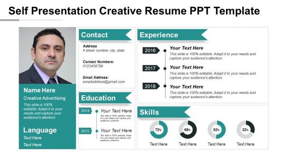
Slide designs like self-presentation creative resume PPT template is an encouragement for individuals who wish to create the first impression with their portfolio. Be it a job interview, group meeting, or any motivational and work-related seminar, this self-introduction presentation model slide is often used by the speaker to present a summary of who he/she is and what all merits are attached to him/her. This ensures that the audience is at ease with the new face of the speaker and now they listen to speech attentively. These curriculum vitae PPT PowerPoint template is also used in school and casual event presentations as well. The self introduction PowerPoint template assist the presenter to demonstrate their set of skills and capabilities. This template of self-introduction provides an infographic layout in blue and green color theme. The PowerPoint presents a graphical layout of the following topics: name, language known, contact information, experience, education, and skills. There is immense use of a wide selection of infographic icons and text apart from a profile picture. The space for creative clipart icons and layouts for placeholders and photos in the slide make it more attractive. Enable folks to generate high interest with our Self Presentation Creative Resume Ppt Template. Enlighten them on investment.
People who downloaded this PowerPoint presentation also viewed the following :
Content of this Powerpoint Presentation
From conference talks to client demos, it’s always essential to include an About Me slide in any presentation you are giving. Introducing yourself early into the presentation helps build a better rapport with the audience.
You can start with fun facts about me, slide to break the ice or go for a more formal professional bio to explain your background and what makes you qualified to talk about the topic at hand. At any rate, your goal is to get the audience on your side by revealing some of your personality. Strong introductions are personable. They are meant to offer a sneak-peak into your personality and the passion behind your work. That’s why for less formal presentations, you can (and should!) start with a short personal story.
How to Introduce Yourself in a Presentation?It’s a good practice to include self-introduction slides at the beginning of your presentation. If you are looking to answer how to introduce yourself professionally, typically do this somewhere after the title, the opening slide, or before the main agenda. However, the presentation structure will depend on whether you are presenting to a new audience or a group of people familiar with (e.g., your team, clients, or business partners).
Mention Your Name and Affiliations
Start with the introduction basics. State your name, company, title/position, and quick facts about who you are and what you do. Even if you present to a familiar audience, a brief recap is always a good idea. To keep things a bit more engaging, consider adding some little-known facts about yourself may it be your interests, recent accomplishments, etc
Work On Your Elevator Pitch
One of the best ways to introduce yourself in a presentation is to share a punchy elevator pitch. This works extra well if you are presenting to a new audience.
Writing a solid elevator pitch requires many attempts and iterations. But the sooner you start — the faster you’ll arrive at the best formula! And we’ve got that formula ready for you too! Click here to checkout.
Use this Self Presentation Resume Template to introduce yourself! The 100% customizable nature of the template provides you with the desired flexibility to edit your presentations and present the best version of yourself. The content-ready slide will give you a structure to get started.
Template 1: Self Presentation Creative Resume PPT Template
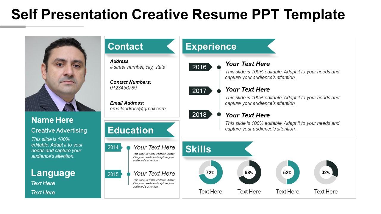
In the PPT Template, use the header to add your name and contact information, and other information including your address, phone number, and email address. The experience section allows you to highlight your professional experience in reverse chronological order. For each position, you can include the company name, your job title, the dates of your employment, and a brief description of your responsibilities and accomplishments. In the education section, list your background, including the name of the school you attended, the degree you earned, and the dates of your attendance. This skills column enables you to showcase your technical or soft skills in a visually appealing way. You can use a pie chart to represent your interdisciplinary proficiency. There are also text boxes throughout the template that you can use to provide additional information about yourself, such as your career objectives or your interests. Download right away!
Do justice to yourself with an impressive introduction!
When asked to talk about yourself, it is normal to feel a little stumped. You could discuss a lot of things, but you don't always have to. At the same time, you don't want your introduction to seem like a bragging session. Always consider from the perspective of your audience. Do the facts add value to their storehorse of knowledge in any way? If so, you must include them on the slide. Our template will help you make that pick!
PS: Master the Self-introduction Model with the use of these world-class templates from SlideTeam here.
Self presentation creative resume ppt template with all 5 slides:
Our Self Presentation Creative Resume Ppt Template are always at the forefront. Get to the action before anyone else.

FAQs for Self presentation creative
So basically, creative resumes ditch the boring black-and-white look for something with actual personality. They'll throw in colors, cool fonts, maybe some icons or sidebar layouts – you know, stuff that makes it look designed instead of just typed up. Some people go crazy with illustrations and graphics, but honestly? Only do that if you're actually in a creative job. Otherwise you might look a bit extra. The whole point is making yours pop in a stack of identical resumes while still being easy to read. Think of it more like a mini design project than a typical document.
Honestly, yeah - a good-looking resume totally helps when recruiters are drowning in applications. It buys you those crucial extra seconds of attention. But don't go overboard with the design stuff. I've seen some that looked like someone's art school portfolio, which... no. Keep it clean and readable above all else. Strategic color and plenty of white space work wonders. Oh, and make sure it'll still work with those automated screening systems if you're applying online - learned that one the hard way. In competitive fields especially, standing out visually can be the difference between getting that interview call or not.
Honestly, just pick two colors max - like navy and coral, or maybe charcoal with some teal. I've seen resumes that look like rainbow explosions and it's... not good. Use your colors for headers or little accent pieces, but keep most of your text black or dark gray. Here's the thing though - you gotta print it out and see how it looks in black and white too. Some colors just disappear completely. Oh, and match your industry vibe! A finance resume shouldn't look like you're applying to design children's books, you know?
Honestly, typography can make or break your whole resume. I've seen some truly awful ones where you can't even read the person's name. Pick something creative for your header—maybe a cool display font—but keep the body text super readable. Nobody wants to squint at your job descriptions. Use different font weights to create hierarchy so recruiters can scan quickly. Oh, and test it at different sizes! What looks good on your laptop might be tiny when printed. The goal is standing out without looking like you designed it in 2003.
Honestly, creative resumes work best for design, marketing, advertising - basically anywhere they want to see your actual creative chops. It's like showing instead of just telling, you know? Startups and agencies dig them too since they're all about innovation. But here's the thing - if you're going for finance or law firms, don't even think about it. Those places are super traditional and a colorful resume will probably end up in the trash. I learned that the hard way from a friend who tried it. Just match whatever vibe the company has.
Think of branding as your visual vibe across everything - resume, LinkedIn, portfolio, the works. Pick 2-3 colors that fit your field and stick with them. A graphic designer can go wild with bold choices, but if you're in accounting? Keep it clean and professional. Same fonts, same color scheme, same energy throughout. It's really about being memorable without looking like you tried too hard (which honestly is harder than it sounds). The whole thing should feel cohesive - like someone could see your resume and immediately recognize your other stuff. Don't overthink it though.
Honestly, keep it minimal with infographics - like 2-3 data points tops. Years of experience, skill levels, that kind of stuff. Don't scatter them everywhere though, that looks terrible. I've seen way too many resumes that go nuts with charts and it's just... no. Maybe do a simple timeline for your career or a clean skills bar chart? Each one should actually serve a purpose, not just fill space. Oh, and give them room to breathe - nobody wants cramped graphics competing with your actual experience. Simple designs work way better than trying to get fancy.
Honestly, Canva's probably your best bet if you want something quick and painless - tons of templates you can just drag and drop. Adobe Express is similar vibes. InDesign is amazing for professional stuff but wow, the learning curve will humble you real fast. Figma's actually pretty solid too and it's free, which is nice. I know this sounds weird, but PowerPoint can work for basic edits if that's what you've got. Oh, and everything's web-based with Figma so no annoying downloads. I'd say start with Canva, see how it goes, then maybe level up later if you're feeling fancy.
Think of it this way - your resume layout is like a roadmap for whoever's scanning it. Font sizes, colors, and white space guide their eyes from your name down to experience. Poor hierarchy = instant confusion, which is the last thing you want when showing off design skills. Start with your most critical info visually "popping" - contact details, key experience, that sort of thing. Honestly, I've seen way too many creative resumes that look amazing but are impossible to navigate quickly. Test yours by having someone glance at it for like 10 seconds. Can they find what matters? If not, you'll need to rework the flow.
Honestly, the worst thing you can do is go crazy with colors and fancy fonts that make everything impossible to read. I've seen resumes that look like rainbow explosions - terrible idea. ATS systems can't even process that stuff properly, so you're screwed before a human even sees it. Plus when you focus too much on making it "pretty," your actual experience gets lost in all the visual chaos. Clean and simple wins every time. Oh, and here's a good test - show it to someone and see if they can spot your contact info and main skills in like 10 seconds. If not, dial it back.
Start with 300 DPI so it prints crisp. Also save a 72 DPI version for web stuff. Font choice matters more than you'd think - some look great printed but awful on screens, which is honestly frustrating to find out later. Your colors should pop digitally but still work if someone prints in grayscale. Save everything as PDF for applications, PNG for online portfolios. Maybe throw in a Word version too since those ATS systems can be picky. Oh, and definitely test print first! You'll catch weird formatting issues that way.
Pick like 3-4 work samples that actually match the job you want. Quality matters way more than quantity - blurry stuff will kill your chances instantly. I'd throw in some QR codes or short links to your full portfolio instead of cramming everything on there. Your resume stays clean but they can still see your best work easily. Oh, and add quick one-line explanations under each piece so they know what you were trying to accomplish or what part you did. Trust me, context makes all the difference when someone's scanning through dozens of resumes.
Yeah, so creative templates basically flip everything around - they put your skills front and center instead of hiding them at the bottom. The work history gets shrunk down or broken up into smaller pieces. Some templates have these cool sidebars where you can show off technical skills and certifications separately. I'm honestly a fan of the ones with progress bars or little icons because they make your abilities really stand out. Instead of focusing on where you worked, the whole layout draws attention to what you can actually do. Those infographic-style templates with skill ratings? They're pretty effective at guiding people's eyes to your strengths first.
Yeah so creative resumes can totally backfire with those automated systems. Like, all those cool graphics and fancy layouts? The software literally can't read them and just tosses your resume in the reject pile. It's so frustrating. You basically need to find this balance between looking decent and being boring enough for the robots to understand. Use normal headings, throw in keywords from the job post, and keep the fancy stuff for your actual portfolio. I learned this the hard way after getting zero callbacks despite having solid experience. Wild how backwards the whole system is.
Think of your resume like a story - what problems did you solve and how? Skip the boring "managed social media" stuff. Instead try something like "took a dying brand from 200 to 15K followers in 6 months." Honestly, it might feel weird at first, but people remember stories way better than lists. Make each job sound like a mini case study with real numbers. Action verbs help too. The whole point is getting them excited about what you'd do for them next - which is probably the most important part anyway.
-
Great
-
wonderful
-
Excellent design and quick turnaround.
-
Visually stunning presentation, love the content.
-
very useful, thank you every much
-
Very usefull, thank you so much
-
very useful.Thank you, Sir