


Solution options concept ppt sample presentations





Try Before you Buy Download Free Sample Product
 Impress Your
 Audience
 100%
100% Editable
 Save Hours
 of Time


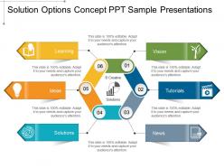
Convince folks that you can conquer adversity with our Solution Options Concept Ppt Sample Presentations. Be an example of grit and determination.
People who downloaded this PowerPoint presentation also viewed the following :
Solution options concept ppt sample presentations with all 5 slides:
Create a factory of ideas with our Solution Options Concept Ppt Sample Presentations. Get your brains going at a high gear.
FAQs for Solution options concept
Go for something clean and simple - you don't want your template fighting your story for attention. Consistent fonts and colors are key, plus it needs to handle whatever you're throwing at it (text, images, charts, etc). I've watched too many good presentations get killed by flashy templates that just... distract people. The good ones have clear hierarchy and readable fonts. Also, make sure there's slides for your opening, transitions between sections, and a solid ending. Pick something your audience can actually focus on instead of getting lost in the design.
Dude, customizable slides are a game changer. When you tweak colors and fonts to match their vibe, or swap in examples from their actual industry, people suddenly care way more. It's wild how much difference it makes. Instead of glazed-over faces, you get real engagement. Honestly, generic presentations are kind of insulting when you think about it - like you couldn't be bothered to know your audience. The flow matters too. Adjust based on whether they're experts or newbies. Trust me, spending even 10 minutes personalizing those template elements pays off big time. Your audience will definitely notice.
Think of visual hierarchy as your slide's GPS - it shows people where to look first. Size matters here: bigger stuff grabs attention. Colors help too, plus good spacing between elements. Honestly, I used to throw everything on one slide and wonder why people looked confused lol. Your main message should dominate the slide. Everything else? Make it smaller and less flashy. People will naturally follow from your big headline down to the details, then hopefully to whatever action you want them to take. Works way better than cramming text everywhere.
So basically, these templates are like having a shortcut for turning your messy data into something that actually makes sense. You know how staring at spreadsheets makes your brain hurt? Well, you just drop your numbers into these pre-made charts and boom – patterns jump out instantly. Honestly, they're lifesavers because they handle all the design stuff for you. No more wondering if you should use a pie chart or whatever. Bar charts and line graphs are your best friends here – they'll fix most of your data headaches. Think of them as translators, but for numbers instead of languages.
Honestly, just pick 2-3 colors from your brand and call it a day. The 60-30-10 rule works great - main color for backgrounds, secondary for headers, then one accent color for the important stuff. Make sure there's enough contrast so people can actually read your text (learned that one the hard way). Bright colors everywhere = instant headache for your audience. Trust me on this. Create a simple color guide your team can use, and definitely test everything on different screens first. Colors look way different on a projector than your laptop.
Okay so templates usually have specific spots for images and videos - don't just dump them anywhere or your whole layout gets messed up (trust me on this one). Look for the placeholder areas that are already the right size. Videos look amazing in those big hero sections at the top. Gallery areas work perfectly for multiple images. Make sure your file dimensions actually match what the template wants, and stick with the same formats throughout. Oh and definitely check how it looks on your phone - some templates get weird with responsive stuff and your carefully placed media ends up looking janky on mobile.
Check what templates the big players in your field actually use - that's your starting point. Finance and consulting folks expect clean, chart-heavy presentations without much visual noise. Creative industries are the opposite though - marketing and design teams will literally side-eye you for boring slides. Healthcare and government? Play it safe with conservative layouts and clear text hierarchies. Oh, and think about who's actually sitting in that room. Executives want the quick overview while technical people need all the nitty-gritty details. Honestly, half the battle is just not overthinking it.
Templates are like your safety net for staying on-brand. They've got all the right colors, fonts, and logos already locked in, so you literally can't mess up the basics. Honestly, you're pretty much done before you even start writing. Just don't be that person who uses rainbow Comic Sans - marketing will have a heart attack lol. The main thing is keeping your templates current. Nothing worse than using some crusty 2019 version that's totally off. Set up a shared library that actually gets updated when brand stuff changes. Trust me on this one.
Honestly, go super visual for remote stuff. Big fonts and high contrast colors are clutch since everyone's squinting at tiny screens. Interactive elements like polls or breakout prompts actually keep people awake - way better than just talking at camera squares for an hour. Skip anything cluttered or with tiny details that'll vanish once it hits video compression. Clear section breaks help too so people don't completely zone out halfway through. I'd start with your company templates but just gut all the messy elements first. Oh, and progress indicators are surprisingly helpful when people can't read the room.
So adding accessibility stuff to your templates is actually huge for reaching more people. Alt text on images, good contrast, readable fonts - that kind of thing helps screen readers work right. About 15% of people have some kind of disability, so you're opening up your content to way more folks. Honestly, proper heading structure makes slides easier for everyone to follow anyway. High contrast colors are just better design, period. Start with alt text since it's super quick to add to your templates. Oh, and readable fonts - Comic Sans is still a no though lol.
So basically, pitch decks are for selling your idea to investors - you want flashy visuals, minimal text, that whole "wow factor" thing. Educational templates? Totally different beast. They're about actually teaching people stuff, so you need more detailed content and clear explanations. I learned this the hard way when I first started out, honestly. Think of it like... you wouldn't wear a suit to go hiking, right? If you're pitching for funding, grab a template that's built for storytelling. Don't dump a bunch of info on investors - they'll zone out. Save the detailed educational approach for when you're actually trying to teach something.
Template design seriously makes or breaks how people engage with your stuff. Clean layouts let your audience actually absorb what you're saying instead of getting lost in messy formatting. Bad design? People's brains get overloaded and they'll just click away or miss your main points completely. Good templates create flow - they guide where someone looks first, second, third. It's like having road signs for your content. I'd honestly look at what you're using now and ask yourself: is this layout actually helping me communicate better, or is it just... there? Sometimes the simplest fixes make the biggest difference.
Honestly, templates are like having a roadmap already drawn out for you. They follow those classic story patterns - you know, problem, tension, then boom, solution. So much easier than staring at a blank slide wondering where to even start. Your audience gets that satisfying beginning-middle-end thing instead of random info dumps. I mean, it's basically storytelling training wheels, which isn't a bad thing at all. Just pick one that matches what you're trying to do - problem-solving, showing transformation, whatever. The sections flow naturally and keep people actually engaged.
Templates are honestly game-changers for team presentations. No more endless debates about fonts or colors (seriously, I've watched teams waste entire meetings on that stuff). Everyone starts with the same visual foundation, so you can actually focus on what matters - the content. The whole process moves way faster too since nobody's building slides from scratch. Handoffs between teammates become super smooth, and you end up with something that looks professional without anyone having design skills. My advice? Pick your template first, then split up the work.
Okay so templates are seriously a lifesaver - they give you a structure that actually works instead of staring at blank slides like an idiot. Most people get completely stuck on the design stuff and waste forever on it. With a template, you can just focus on your actual content. Plus they make sure you don't forget any important points your audience is expecting. I always feel way more confident knowing I'm using something that's been tested before. Just pick one that fits your presentation type and tweak it for your specific topic. Way easier than starting from scratch.
-
Very well designed and informative templates.
-
Editable templates with innovative design and color combination.