


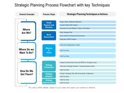
Strategic planning process flowchart with key techniques




Try Before you Buy Download Free Sample Product
 Impress Your
 Audience
 100%
100% Editable
 Save Hours
 of Time


Our Strategic Planning Process Flowchart With Key Techniques are topically designed to provide an attractive backdrop to any subject. Use them to look like a presentation pro.
People who downloaded this PowerPoint presentation also viewed the following :
Strategic planning process flowchart with key techniques with all 2 slides:
Use our Strategic Planning Process Flowchart With Key Techniques to effectively help you save your valuable time. They are readymade to fit into any presentation structure.
FAQs for Strategic planning process flowchart
Start with your vision/mission at the top, then do a SWOT analysis for the environmental stuff. Strategic objectives come next, followed by action plans with actual deadlines. Performance metrics are crucial too - you need to know if this thing's working. Honestly, the part where most teams screw up is stakeholder roles. If people don't know who owns what, everything falls apart fast. Your flowchart should connect all these pieces logically. Build in regular review cycles because strategies aren't set-it-and-forget-it. Keep it simple at first, then layer on complexity once everyone gets the hang of it.
Honestly, flowcharts are a game-changer for getting your team aligned. You can literally see the whole process laid out - who does what, when stuff happens, where things might get stuck. No more awkward moments where everyone's staring at each other like "wasn't that your job?" Short sentences work. Longer ones help you spot those tricky handoff points and dependencies that always seem to trip people up during meetings. Here's the thing though - don't just make it once and forget about it. Keep updating it as things change. Oh, and definitely map out your current process with everyone first. You'll be shocked how differently people think the same workflow actually works.
Start with those diamond decision points and arrows - they're seriously the backbone of any good flowchart. I always use the same colors for related stuff, makes it way easier to follow. Oh, and make your text big enough! I've made that mistake before and people just gave up trying to read it. White space is clutch too - nobody wants to look at a cramped mess. Simple shapes work better than anything fancy (trust me on this). But here's the real trick: show it to someone fresh. They'll catch confusing spots you totally missed since you're too close to it.
Honestly, flowcharts just make way more sense than those boring strategy docs that nobody ever looks at again. You can actually *see* how decisions connect instead of digging through paragraphs of text. Regular planning documents tell you what to do, but flowcharts map out how everything branches based on different scenarios. Way easier to follow when you're actually trying to execute stuff and need quick answers. I always get a bit nerdy about this, but seriously - try turning your next quarterly plan into a flowchart. The decision points become so much clearer it's ridiculous.
Ugh, don't go overboard with details - that's the fastest way to create something nobody wants to look at. Keep it simple and focus on the big stuff that actually matters. Also, please don't just sit in a room by yourself making this thing! I've watched so many people build these perfect flowcharts that have zero connection to reality. Talk to the folks who'll use it first. Skip the corporate buzzwords too - they just confuse people. Honestly, if your coworkers can't figure it out in like 30 seconds, you need to simplify before sharing it with everyone else.
Update that flowchart yearly at minimum. But honestly? Don't wait if big stuff happens - market changes, org restructuring, whatever. I've watched teams cling to charts that made zero sense anymore. Pretty painful to see. If you're in a crazy-fast industry, check it quarterly. The whole point is making sure it actually shows how decisions move through your company right now. Not how things worked last year or even last month. Quick tip - set that calendar reminder today or you'll totally forget.
Oh totally! Lucidchart and Miro are game-changers for this stuff. Drag-and-drop templates beat starting from zero every time. Your team can all work on it at once too, which is clutch. Microsoft Visio works but honestly it's kinda clunky compared to the newer options. The cool thing is you can connect your data sources so charts update themselves when things change. Just grab a basic template first and tweak it - way faster than building everything manually. Trust me on this one.
Honestly, flowcharts are clutch for this. Show stakeholders the whole path visually instead of drowning them in docs they won't read anyway. During meetings, you can literally point to each decision and milestone - people get it way faster than when you're just talking through abstract stuff. Plus it makes super clear when each person's input actually matters, which saves everyone time. I'd share it before your next meeting and ask for feedback on specific steps. Way more productive than those "any general thoughts?" conversations that go nowhere.
Honestly, feedback is like a reality check for your flowchart - you need to know if it actually works when real people use it. Ask the stakeholders who follow your process where they get stuck or confused. I've seen so many charts that look great on paper but are total disasters in practice. Their input will show you what's missing or overly complicated. Short sentences work better than long ones sometimes. Set up reviews every few months so you can keep tweaking things - processes are never really "done," you know? The goal is making something people can actually follow without wanting to throw their computer out the window.
Honestly, it really depends on how big your company is. Small teams can get away with like 3-5 simple steps - just hit the basics like goals, market stuff, and what resources you actually have. Don't overcomplicate it or you'll never make decisions. Medium companies need more approval boxes and stakeholder input (ugh, stakeholders). Big corporations? They're gonna want detailed branches for every department, compliance checks, feedback loops - the whole nine yards. Sometimes it's ridiculous how many people need to sign off on things. Just match your flowchart to how decisions actually get made there. Start simple, then add complexity only where you truly need it.
Honestly, I'd go with Lucidchart first - it's cloud-based and has tons of templates specifically for strategic planning. The collaboration stuff is really smooth too. Visio's great if your company is already all-in on Microsoft. Oh, and Miro is awesome for brainstorming sessions since it's like a giant digital whiteboard where everyone can work at once (gets a little crazy but in a good way). You could even use Canva for basic flowcharts - I know it sounds weird but it actually works pretty well. I'd just grab Lucidchart's free trial and mess around with it first.
Honestly, just mark off completed stuff right on your flowchart and update each decision point as you go. Color-coding works great - green for done, yellow for in-progress, red for stuck. Makes it super obvious where bottlenecks are happening. Your team will actually know where they stand instead of guessing. Monthly reviews are clutch too - literally walk through the whole flowchart together and update everything. I've seen this work really well for keeping everyone on the same page, plus stakeholders love the visual updates.
So KPIs are like your reality check throughout the whole planning thing. They pop up everywhere in the process - setting targets upfront, tracking progress while you're executing, then measuring if stuff actually worked. Don't just pick metrics that sound impressive though (learned that the hard way). You want ones that actually tell you if you're hitting real business goals. Short version: they're your early warning system. If numbers start looking weird, you know it's time to switch things up. Way better than waiting until the end to realize your strategy was totally off track.
So basically a flowchart makes you map out how your big goals connect to what you're actually doing day-to-day. You can literally see if your current tasks are moving you forward or just keeping you busy (spoiler: usually it's the latter). It's like GPS for your strategy - wish more people would try this honestly. The visual part is key because you'll spot those weird gaps where you're working hard but not on the right stuff. Oh and definitely use one for your next quarterly planning thing. It'll totally change how you talk about priorities with your team.
Start with the big picture, then break it down phase by phase. Honestly, clean visuals are everything - I've sat through way too many presentations with flowcharts that look like spaghetti disasters. Use the same colors and shapes throughout so people can actually follow along. Don't just point at boxes though. Tell the story behind each step and tie it back to what they actually care about - the business results. Oh, and definitely pause for questions at each major point instead of waiting until the end. People zone out otherwise. One last thing - bring printed copies even if you're going digital. People love scribbling notes on paper during these things.
-
Colors used are bright and distinctive.
-
Awesomely designed templates, Easy to understand.