


Training ppt summary background designs





Try Before you Buy Download Free Sample Product
 Impress Your
 Audience
 100%
100% Editable
 Save Hours
 of Time


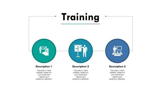
Do you need creative and engaging design for your next training related presentation? Well if yes then our training PPT summary background slide is perfect for you. Training is the important aspect of the business operations as you have to share information about the work with the freshers as well as provide details about the new updates to the old ones. People engaged in the training department use this PowerPoint slide to let their team understand the concepts in the best possible way. When you hire some new people, the role of the training professionals is to make them aware of the business operations as how you manage it, what all are the challenges and how they can overcome them. With our training presentation template, illustrate every information using training PPT summary template. The three descriptions PowerPoint diagram will add value when you use it for the right purpose. Download training PPT summary graphic that comes with professionally designed icons. Have the grandest day with our Training Ppt Summary Background Designs. Nothing else will ever come close.
People who downloaded this PowerPoint presentation also viewed the following :
Training ppt summary background designs with all 5 slides:
Be in control at the helm with our Training Ppt Summary Background Designs. Establish the course you desire to follow.
FAQs for Training ppt
Simple backgrounds are your best friend - trust me on this one. High contrast between text and background is key so people in the back can actually read your stuff. I'd stick with light grays or whites honestly. Patterns behind text? Total nightmare. Your brand colors might look cool but if they clash with content, ditch them for the presentation. Oh and definitely test on different projectors first! What looks crisp on your laptop can turn into a blurry mess when projected. Been there.
Honestly, color choice makes a huge difference for keeping people awake during training. Blues work great because they help with focus - especially for boring technical stuff. Green's your friend for longer sessions since it won't fry people's eyes. I made the mistake of using bright orange once for a 3-hour compliance thing and everyone looked overstimulated by lunch. Red screams "urgent!" but also stresses people out, which isn't ideal. My go-to strategy? Cool, subtle colors that don't fight with your actual content. Way better than trying to be flashy and losing your audience halfway through.
Honestly, go subtle with your backgrounds - soft textures or muted gradients work way better than flashy stuff. I've seen way too many presentations where the graphics totally overshadow the actual content. Low contrast is your friend here since it won't fight with your text. Oh, and definitely check how it looks on different screens because colors can be weird on various devices. Pick images that actually relate to your topic (seems obvious but you'd be surprised). Short version: boring backgrounds = people actually pay attention to what you're saying instead of getting distracted by rainbow explosions or whatever.
Look, when your slides have the same visual vibe throughout, people actually focus on what you're saying instead of getting thrown off by random design changes. Pick maybe 2-3 colors that work together and just stick with them - trust me on this one. Same fonts, similar layouts, all that stuff. It creates this smooth flow that honestly makes you look like you know what you're doing. Your audience won't be sitting there mentally readjusting every time you click to the next slide. They can actually absorb your content. Oh and it reinforces your messaging too, which is nice.
Oh man, typography can make or break your whole presentation! First thing - pick clean fonts like Arial or Calibri, nothing fancy. Comic Sans is still a crime against humanity, don't do it. Make sure your text is huge - 24pt minimum, bigger for titles. Dark text on light backgrounds works best. Your background shouldn't fight with your words, so skip the busy patterns behind important stuff. I always do this weird squint test where I step back and squint at my slides. If I can't read it, nobody else will either. High contrast is honestly your best friend here - learned that the hard way after bombing a presentation once.
Yeah totally doable! Just don't go overboard with it. I'd stick your logo in a corner somewhere small - nobody needs it taking over the whole slide. Brand colors work great as accents or maybe a super light watermark in the background. Honestly, I've sat through so many presentations where the branding was so loud I couldn't even focus on what they were saying. Keep it clean and minimal. Maybe use your company's color palette or add some subtle texture that matches your vibe. Main thing is people can actually read your text without squinting.
Okay so for PPT backgrounds, go with 1920x1080 at 72-96 DPI. That resolution hits the sweet spot for projectors and screens. I made the mistake once of using huge files that crashed during a client meeting - not fun. Keep your images under 2MB if you can. 16:9 aspect ratio is pretty much standard everywhere now. Oh, and definitely test white text over your background first! You'd be surprised how many "cool" designs make your actual content impossible to read. Learned that one the hard way too.
Honestly, contrast is everything - dark text on light backgrounds or flip it around. Don't use busy patterns behind your text because it's impossible to focus when there's random stuff competing for attention. I learned that the hard way lol. Font size matters too, go with at least 24pt for presentations. Stick to clean fonts, nothing fancy. Oh and definitely test your slides beforehand on different screens if you can. Bad lighting can totally kill even good contrast. If you're squinting to read it, your audience will be too.
Honestly, just start with Canva - you'll have something decent in like 15 minutes. Their templates are solid and easy to tweak. If you're feeling ambitious and want total control, Adobe Photoshop or Illustrator will let you go wild, but fair warning... those programs can be a pain to learn if you're starting from scratch. PowerPoint itself has some surprisingly good design tools built right in. Oh, and grab images from Unsplash or Pexels - way better quality than random Google searches. But seriously, Canva first. You can always get fancy later.
Oh man, I made this mistake so badly once - had this "artistic" dark blue background and watched everyone squint for an hour straight. Super embarrassing. You want dark text on light backgrounds, like black on white or cream. High contrast is everything. Don't put text over busy patterns or gradients either, it's just torture for your audience. Clean, simple backgrounds work best. Save the fancy stuff for title slides where there's barely any text. Trust me, people actually reading your slides is way more important than looking cool.
So basically everyone's going minimalist now - clean gradients, subtle textures, tons of white space. Dark backgrounds are everywhere (and honestly they do look way cooler). Muted colors with high contrast text are big for readability. Oh, and interactive stuff with little animations is pretty much expected now. The mobile thing is huge since people pull up presentations on their phones constantly. I'd avoid anything too busy that fights with your actual content. Wait, did I mention accessibility? That's becoming a real priority too - backgrounds need to actually help people focus on what you're saying.
Keep corporate backgrounds super clean - solid colors or subtle textures work best. You don't want some crazy pattern making your text impossible to read (learned that the hard way once). Educational stuff can be way more fun though! Bright colors, playful elements - especially if you're dealing with kids. The audience totally matters here. Boardrooms need that sleek, polished vibe. Classrooms? Go nuts with creativity. Oh, and definitely test your slides on the actual projector beforehand. I can't tell you how many times something looked great on my laptop then looked awful projected on the wall.
Oh man, the worst thing you can do is make your background super busy or colorful - people will stare at your design instead of listening to you. Dark backgrounds with light text? Skip it unless you're in a dim room. It's harder to read and honestly looks so 2010. Also don't use those pixelated, low-res images that look terrible when projected. Animated backgrounds are the devil during long training sessions - way too distracting. I always go with light, neutral colors and maybe a subtle pattern if I'm feeling fancy. Test your slides on different devices first though, because what looks good on your laptop might be a disaster on the projector.
Look, animations are tricky - they can either help your audience focus or totally derail everything. Simple stuff like fade-ins work great for highlighting key points. But those bouncing headers? Pure chaos. I learned this the hard way when half my team was mesmerized by spinning charts instead of listening to anything important. Keep it minimal - just gentle transitions that actually serve a purpose. Preview everything beforehand because what looks smooth on your screen might be a hot mess on the projector. Trust me, subtle beats flashy every time.
Dude, totally think about who's gonna be staring at your slides. Younger crowds dig bold, colorful stuff while older execs usually want something more buttoned-up. Oh, and don't forget cultural context - certain colors mean totally different things depending on where people are from. Healthcare presentations need to feel way more serious than if you're pitching to a design agency, obviously. Even gender mix can influence what works. I made this mistake once with a super bright pink template... anyway, just spend like 5 minutes figuring out your audience before you go with that crazy neon background you're probably considering.
-
Excellent products for quick understanding.
-
Great quality product.