

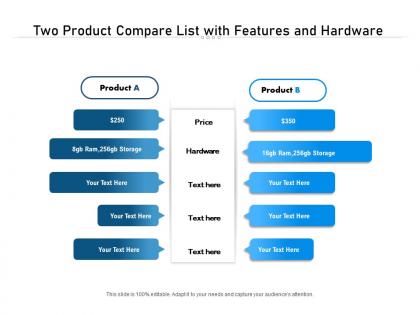
Two product compare list with features and hardware




Try Before you Buy Download Free Sample Product
 Impress Your
 Audience
 100%
100% Editable
 Save Hours
 of Time


Introducing our Two Product Compare List With Features And Hardware PowerPoint Presentation Slide. Draw a comparison between two products in an organized and clearly demarcated way by taking the aid of this PPT template. Gain an understanding of the features and characteristics of the products with the assistance of our PPT layout. With this PPT design, you can create a table describing each and every element clearly and concisely. Analyze and research various products by taking advantage of this PPT graphic. Identify the differences and similarities between the two variables by employing our PPT design. Analyze whether a product is worth continuing in the market or must be discontinued by taking the help of this PPT visual. Create an effective and successful product positioning and pricing strategy with the help of this PPT theme. Assess the likeability and profitability of your products with this PPT presentation. Without any further ado, click the download button!
People who downloaded this PowerPoint presentation also viewed the following :
Two product compare list with features and hardware with all 2 slides:
Give your audience a fulfilling experience. They will find our Two Product Compare List With Features And Hardware elevating.
FAQs for Two product compare list with
Honestly, start with design flexibility - can you tweak colors and fonts without wanting to throw your laptop? Check if they actually have the slide types you need (learned this the hard way when I had zero timeline slides for a project overview). Image quality matters too - vector graphics won't look like garbage when you resize them. Your audience is huge though. Creative pitch? Go bold. Quarterly reports? Keep it clean and boring. Oh, and double-check it works with your PowerPoint version because that's always fun to discover last minute. Grab some free samples first to test how annoying they are to edit.
Honestly, your design choices can make people bail on your content super fast. Bad fonts or cluttered layouts? They're gone in seconds. I learned this the hard way when my old blog looked like a hot mess. Clean templates with good white space actually help people focus on what you're saying instead of getting distracted. Pick something that matches your vibe and makes info easy to scan. Typography matters more than you'd think - readable fonts keep people around longer. Test a few different layouts and see which ones make your audience actually stick around instead of bouncing immediately.
Honestly, premium templates are worth it if you're presenting to important people. Free ones are super basic - like maybe 3-4 layouts and boring transitions. Everyone uses them too, so you'll probably look exactly like whoever presented before you (awkward). With premium you get way better animations, custom fonts, and multiple layout options that actually look professional. The color schemes don't suck either. I mean, free templates work fine for internal stuff or school projects. But if you're pitching clients or presenting to executives? Spend the money. The polish makes a real difference.
Honestly, customization can totally make or break your presentation. You want something that actually fits your audience and message, not just whatever template was first on the list. I've sat through way too many meetings where everyone's using the same boring default PowerPoint look - it's so obvious and kinda lazy? Good templates let you tweak colors, fonts, layouts so it feels intentional. Makes you look way more professional too. Oh, and definitely think about your brand or the vibe you're going for. Find templates that give you flexibility in the spots that actually matter for what you're presenting.
Honestly, color schemes can make or break your whole presentation. They set the vibe and show whether you actually know what you're doing. Pick something that matches your brand - trust me, that generic blue template everyone uses screams lazy. Good colors keep everything looking cohesive and help guide people's eyes to the important stuff. Oh, and make sure whatever you choose won't clash horribly with your existing brand colors. Nothing's worse than a headache-inducing color combo that makes your audience want to look away.
Oh man, definitely check compatibility first! I made this mistake once - had a "perfect" template that totally wrecked our brand colors when we opened it in the client's software. Such a nightmare. PowerPoint, Google Slides, Keynote... they all handle fonts and animations weird in their own ways. Test it out before you actually need it. Last-minute reformatting when you're already stressed? No thanks. Your future self will be so grateful you took five minutes to double-check this stuff upfront instead of discovering problems during showtime.
Dude, go with industry-specific ones for sure. They've got all the fields and workflows you actually need already built in - saves so much time. Generic templates look flexible but you'll just end up redoing half the stuff anyway, which is annoying. The industry ones usually have compliance requirements and best practices already there too. I mean, why make your life harder? Start with a couple industry templates and see how they work. You can always switch to generic later if you need something super custom, but honestly most people don't.
Basically, you want people to scan your stuff in the right order - most important thing first, then everything else flows from there. Size and color are your best friends here. Make your big selling points pop with bold text or bright colors, then tuck the smaller details underneath. Short sentences work great for key points. Longer explanations can come after once you've hooked them. Honestly, most people just skim anyway, so don't bury your best stuff. I always think of magazine layouts - they nail this perfectly. Your product comparison should work the same way so customers aren't drowning in random info everywhere.
Your layout is basically how people's brains will process the comparison - it's like their GPS through the info. Side-by-side works awesome for features since you can scan across and catch differences fast. When you've got 3+ products though, grids keep everything neat. Don't jam too much on one slide or you'll lose them completely. Complex products? Go sequential so you can walk through each one properly. Honestly, I see people pick layouts just because they look nice, but you want something that matches how you want them to actually think about the choice.
Honestly? Go minimal if you want fast load times and mobile that actually works. Your audience probably cares more about finding stuff quickly than fancy animations anyway. Content sites, portfolios, landing pages - they all work better when there's nothing fighting for attention. I've seen so many feature-heavy sites where people just bounce because they can't figure out basic navigation. Maintaining minimal templates is way less of a headache too. You won't accidentally break three things trying to change one color. Ask yourself: does my content need to shine, or do I actually need all those extra bells and whistles?
Templates are actually pretty smart for hitting different learning styles. Visual people love the clean layouts and charts - makes everything easier to scan. Kinesthetic learners get to physically mess with them, fill stuff out, move sections around. That hands-on piece is huge. Reading/writing folks can build on those written frameworks, and auditory learners do better when you walk through templates together in meetings. I'd honestly try giving your team 2-3 different template options next time - you'll probably see way more people actually using them. It's one of those simple fixes that works better than you'd expect.
Honestly, animated templates are pretty solid for grabbing attention - they make boring info way more digestible. But here's the thing: go overboard and you'll distract people instead of helping them focus. Some templates are straight-up cringey too, not gonna lie. They take forever to customize properly, and good luck if someone's running ancient PowerPoint or has sketchy wifi. File sizes get massive which is annoying when you're trying to email stuff. I'd say save them for presentations that actually matter - like when you're pitching something important. Test everything first though, because nothing's worse than broken animations mid-presentation.
Dude, user reviews are everything when picking templates. I always hit up the 3-star ones first - way more honest than those overly cheerful 5-star posts. Look for people in your field who actually used the thing. They'll tell you if that gorgeous design is a pain to customize or if there's some annoying quirk nobody mentions upfront. Oh, and filter by your specific needs right away so you're not drowning in irrelevant feedback. Trust me, it's like getting insider info from someone who's already been through the headache.
Honestly, I'd check how often they update the template first - got burned once buying this "premium" one that was basically abandoned for two years. Such a waste. Look at their documentation too, and see if there's real support behind it or just some bot copy-pasting responses. Recent reviews will tell you everything. Also figure out if updates cost extra later because some sellers are sneaky about that. WordPress templates especially need regular compatibility updates or they'll break on you. Short version: don't just buy the prettiest one without doing a quick five-minute background check first.
Dude, templates are honestly a lifesaver for product demos. They give you that whole problem-solution-results flow so you're not just randomly jumping between features like most people do. You know that awkward rambling we've all done? Yeah, templates fix that. I'd start with a simple before/after setup next time. Walk them through what your customer was dealing with, show how different options tackle it, then explain why yours comes out on top. The visual stuff stays consistent too, which keeps people actually listening instead of getting distracted by messy formatting. Trust me on this one.
No Reviews