


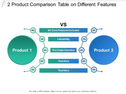
2 product comparison table on different features





Try Before you Buy Download Free Sample Product
 Impress Your
 Audience
 100%
100% Editable
 Save Hours
 of Time


Fear of hazards diminish with our 2 Product Comparison Table On Different Features. They help counter bad effects.
People who downloaded this PowerPoint presentation also viewed the following :
2 product comparison table on different features with all 5 slides:
Convey the fact that you are impressed through our 2 Product Comparison Table On Different Features. Be able to indicate your joy.

FAQs for 2 product comparison table
So here's the deal - start with visual style and what your audience expects. Tech startups can get away with bold, flashy graphics, but finance clients? They want conservative layouts packed with data. Think about your specific needs too. Good chart sections for consulting, product slides for retail, that boring compliance stuff for healthcare (ugh). Colors actually matter more than you'd think - some industries are weirdly picky about what looks "professional." Honestly, I'd grab 2-3 templates that fit your industry's whole vibe and test them with real content first. Don't just go with whatever looks prettiest in the preview.
Dude, good design literally saves presentations. People zone out fast when your slides look messy or like they're from 2005. Your fonts and colors either help your message or totally kill it. I once watched someone bomb a great presentation because they used Comic Sans with neon green text - tragic honestly. Clean templates make you look credible and help people actually absorb what you're saying. Just match the vibe to your content, you know? Don't grab some random free template that screams "I didn't try." Professional doesn't mean boring, but it definitely means intentional.
Honestly, customization makes or breaks a presentation template. Don't just throw your logo on there and hope for the best - I've seen too many people do that. The good templates let you actually tweak things without everything falling apart. You need something that matches your brand and speaks to your specific audience. Look for ones where you can easily change colors, fonts, and layouts. Multiple layout options are clutch. What you're really after is flexibility - templates that bend to fit your content instead of forcing you into some cookie-cutter format that screams "generic."
Check user reviews before downloading anything - they'll tell you which templates actually work vs just look good in previews. Some gorgeous ones are total disasters to customize, trust me. Look for comments about loading speed and whether stuff breaks when you add your content. Font readability is huge too. Recent reviews matter most since you want current version feedback, not ancient complaints. People usually mention if templates play nice with different software versions. Oh, and see what they say about exporting graphics - that can be surprisingly annoying if it doesn't work right.
Honestly? Go minimal - clean layouts that don't fight your content for attention. Cluttered slides are presentation killers, so find something with good white space and professional fonts. You want consistent colors too, nothing too crazy. Make sure there's variety in the slide layouts - title slides, content pages, chart templates - because cramming everything into one format sucks. Oh and check if you can easily swap out colors/fonts to match your brand. I learned this the hard way lol. Pick whatever makes your actual data pop, not some template with flashy graphics everywhere.
Dude, template compatibility will literally make or break your whole workflow. Start by checking if it works with whatever software you actually use most - don't get seduced by a gorgeous template that only opens in some random program you touched once. Look at what export formats they offer too. Trust me, you don't want to be stuck recreating everything from scratch or dealing with wonky conversions later. I always grab the preview files first to test things out. Way better than buying something and then realizing it's completely useless for your setup.
So it really depends on who you're presenting to. Students need bright, engaging stuff or they'll just tune out - learned that the hard way! Corporate folks expect clean, professional designs though. Nothing too flashy. Educational presentations work best with smaller text chunks and visual breaks. Corporate audiences can actually handle more detailed slides without getting overwhelmed. Honestly, I'd just mock up a few slides in both styles using your real content. You'll know pretty quick which one feels right for what you're trying to say.
Honestly, the pricing's kinda all over the map. Canva does that freemium thing with monthly plans, but then you've got sites like GraphicRiver where you just buy individual templates outright - usually $5 to $50+ depending on how fancy they are. Envato Elements is pretty sweet if you need tons of stuff since it's unlimited downloads for one flat monthly rate. Oh, and bigger companies can get custom enterprise deals if they're buying in bulk. Really depends what you're after though - if you only need something once in a while, just buying per template is probably gonna save you money over those monthly subscriptions.
Honestly, loading speed is everything when picking templates. I made this huge mistake once - chose this gorgeous template that looked amazing but took forever to load. Big regret. People will literally leave your site if it takes more than 2-3 seconds, especially on mobile. Your SEO gets hammered too, which sucks for getting found on Google. Sales tank because nobody's got patience anymore. Test the demo speed first on both desktop and your phone. Make sure it's actually optimized and not just pretty. Trust me on this one.
Those analytics tools actually show you which slides people engage with most and how long they stick around on each one. Honestly, it's kinda brutal when you see that slide you obsessed over gets totally ignored! Track your click-through rates on embedded links too - that stuff matters. After a few presentations, you'll start noticing patterns in what prospects actually care about versus what you think they want to hear. I always check the data afterward now because it's way more telling than trying to read the room during the pitch. Use it to cut the fluff and double down on features that actually move the needle.
Honestly? Premium templates are worth it if you can swing the cost. Free ones are super limited - you get maybe 3 color options and the same boring fonts everyone uses. Premium gives you way more control over layouts, better graphics, and actually decent animations (some free ones look ancient lol). Plus you get tons of slide variations so you're not stuck with the same template as half your coworkers. If this is for something important like a client pitch, definitely go premium. The difference is pretty obvious and makes you look way more professional.
Most libraries update their templates every 2-4 weeks, though some do it weekly. You'll want to check the "last updated" date before downloading - trust me on this one. Outdated designs are the worst, especially when you're scrambling to meet a deadline. Fresh updates usually come with bug fixes too, which is clutch when you need things to actually work. Oh, and bookmark your go-to template sites so you'll notice when new stuff drops. The update frequency really depends on how active their community is, but honestly? Weekly updates are becoming more common these days.
Dude, you want something clean that doesn't look sketchy - I've seen so many nonprofits with websites that make me not want to donate lol. Make sure your donation buttons are super obvious and easy to find. Mobile-friendly is huge since people donate on their phones all the time. Include impact stories or testimonials somewhere prominent, plus a clear volunteer signup section. Stick with professional but warm colors - blues and greens work way better than anything too flashy. Oh and contact info should be easy to spot. Trust me, start with a template that already has this stuff rather than trying to add it all later.
So accessibility features make your template work for everyone, including people with disabilities. You want proper color contrast, alt text for images, keyboard navigation - that kind of stuff. It helps users with visual impairments, motor issues, or cognitive differences. Honestly, it's just smart design anyway. Here's the crazy part - you're potentially reaching 15% more people globally. Most accessible design choices actually make things better for everyone too, which is pretty cool. I'd start simple: check your color contrast ratios and write decent alt text for images.
Start with your brand's vibe - colors, fonts, the whole look. You'll want something that actually fits with your website, not some random template that looks cool but totally clashes. Think about your audience too. Like, a fun creative template works great for designers but would be weird for accountants, you know? The layout should match how professional (or casual) you want to come across. Honestly, I'd just filter by industry first to save time - there's way too many options otherwise. And don't get sucked into fancy features you won't even use!
No Reviews