

United states of america map with states and territories




Try Before you Buy Download Free Sample Product
 Impress Your
 Audience
 100%
100% Editable
 Save Hours
 of Time


Our United States Of America Map With States And Territories are topically designed to provide an attractive backdrop to any subject. Use them to look like a presentation pro.
People who downloaded this PowerPoint presentation also viewed the following :
Content of this Powerpoint Presentation
The United States of America, a country as diverse as it is large, is often represented by its iconic map composed of vivid colors of its states and territories. However, the image of the United States map with states and territories is more important than its aesthetic value. Indeed, when knowledge is a weapon, understanding a nation’s map to this extent may be beneficial for a student to submit his assignments or a business representative on an important assignment, or even a simple local or international traveler eager to learn more about the world.
How does one keep information about each state in mind, determine which part of the world this state is in, and determine what is in it? Well, worry not, for the answer lies in the modern world of presentations—the SlideTeam United States of America Map with States and Territories PowerPoint Presentation Slides.
Specifically designed for ease of understanding and the presentation of US geography, our slides will lead you to a path of light and empowerment. No longer will you find it challenging to present your ideas or information; instead, you will have complete confidence, dominating attention, and impressive data delivery at your disposal.
Discover a kit complete with content-friendly, user-friendly slides on download. Our PPT Templates are equipped with next-generation, high-end, professional graphics and visuals. And with downside download options in JPG and PNG formats – sharing information with your colleagues, friends, and acquaintances has never been this easy. Let’s explore our slide now.
Look out for our blog on the dotted map icon of the United States of America to know about everything in detail.
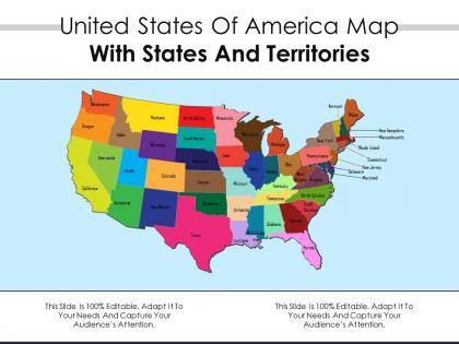
United States of America map with states and territories

What is inside the Slide?
The slide includes an exhaustive visual depiction of the US, including all states and territories, portrayed. It is a comprehensive and detailed map of the USA, which has been subdivided into each state and territory. Each region is visible and well-documented, making it a valuable tool for those who wish to study the geography of the USA or for other relevant purposes. Additionally, the slide may be used for presentations in settings, such as business strategy meetings, academic instruction, and lectures on geography or history.
What is the use of slides?
The primary function of the slide is multipurpose. First, it may be used to convey geographical information to businesses that are looking to select appropriation sales territories. Such presentations may be accompanied by relevant data analysis and include information about existing markets. In addition, the slide may be used during educational activities in which students need to be aware of the location of each state and territory. Finally, the slide makes an excellent visual background for effective presentations.
Get an insight into our blog map of the United States of America to know about American maps in detail.
Who Can Use this Slide?
Business managers, educators, researchers, and government officials will benefit from this slide. Sales managers may use it to make critical sales territory decisions, and marketers might want to use it for market analysis and directing their campaigns. Educators can rely on the map when teaching students and need to make sure the latter understands the location of each US state. Policymakers can use the slide for legislative and jurisdictional district presentations.
TO CUT A LONG STORY SHORT
Things are not always as simple when navigating the US map with states and territories. With 50 states, a plethora of territories, and a volatile geopolitical world, it is not unusual for one to feel overwhelmed by the dizzying numbers and marks that stare up from the image he/she is looking at. Unveil the power of our United States of America Map with States and Territories. Experience the truism that PowerPoint Presentation Slides unlock knowledge with perfection!
PS Refer to our blog on the United States of America With Flag to delve deeper.
United states of america map with states and territories with all 2 slides:
Use our United States Of America Map With States And Territories to effectively help you save your valuable time. They are readymade to fit into any presentation structure.
FAQs for United states of america map with
Basically we started with 13 colonies and just kept grabbing more land. Louisiana Purchase in 1803 was huge - bought it from France. Then we fought Mexico and got California plus the Southwest. Alaska? Bought that from Russia too, which seemed weird at the time but worked out pretty well. The Civil War made it clear states couldn't just peace out whenever they felt like it. Spain gave us Florida through some deal. Most of those random squiggly state lines you see are just old rivers or mountains that made sense back then. Oh, and we definitely screwed over Native Americans throughout this whole expansion thing - that's the ugly part nobody likes to talk about much.
Map projections totally mess with how the US looks, honestly. Alaska appears huge on Mercator maps but it's way smaller than you'd think. Equal-area ones like Albers get the state sizes right, though everything looks kinda squished. Flight distances are super misleading too - I learned this the hard way planning a trip once. What seems like a quick hop might actually be hours longer. Just check what projection you're looking at before making any assumptions about size or distance.
Yeah, so basically everyone's moving to Texas, Florida, Arizona, North Carolina - those Sun Belt states are exploding right now. Meanwhile places like NY and California are actually losing people, which is kinda crazy if you think about it. Remote work totally changed the game after 2020 too. People are ditching expensive city centers for suburbs where they can actually afford a decent place with some space. The whole South and West are growing while the Northeast and Midwest are shrinking. If you're thinking about anything location-related, this migration stuff is huge - it's literally reshaping housing markets and even politics.
So basically, state lines are just old arguments that got frozen in place. The Mason-Dixon line? That's from Pennsylvania and Maryland fighting over territory back in colonial times. Oklahoma's weird panhandle exists because of competing land claims and railroad drama. Western states have those neat rectangles because surveyors literally just drew lines on empty maps - nobody was there to complain yet. Great Lakes borders follow water treaties we made with Britain. Honestly, Florida's shape still confuses me though. Every line on the map represents some long-dead politician or businessman arguing over dirt.
So there's five main regions you'll see: Northeast (New England down to DC area), Southeast (Virginia to Florida and over to Texas), Midwest (Great Lakes + Plains states), Southwest (desert states like Arizona), and West Coast (California, Oregon, Washington). Different maps draw the boundaries kinda differently though, which is honestly annoying when you're trying to compare data. Oh and the Midwest thing - I know it's confusing since it's not actually west anymore, but that's what stuck. These regions are super helpful for understanding climate patterns and cultural differences across the country.
Interactive maps are honestly a game-changer for seeing how different urban vs rural areas really are. You can layer stuff like population density, income, internet access, voting patterns - whatever you want. The zoom feature is clutch too, going from counties down to specific neighborhoods so you don't miss those weird suburban in-between areas. Census data overlays are probably your best starting point. I got lost looking at this stuff for like two hours last week - it's wild how clearly the patterns show up when it's all mapped out geographically.
Oh there's tons you can map! GDP per capita, unemployment, median income, poverty rates - the usual suspects. Industry concentration and business formation rates too. The patterns are wild honestly - coastal areas with high incomes pull in investment and talent like magnets. Meanwhile rust belt regions are still dealing with manufacturing decline. Unemployment and income data really show where opportunities actually exist vs where they don't. Census Bureau has great visualization tools that'll make the regional trends super obvious. You'll see why some places boom while others... well, don't.
So climate change actually shows up pretty clearly on US maps - you've got those red zones for extreme heat, blue areas getting more rain, and all the wildfire/drought risk stuff mapped out. Honestly, it's wild how real it looks when you see it color-coded like that. Coastal cities are already redesigning whole neighborhoods based on flood projections, and western towns are planning around water shortages. The maps directly affect insurance rates and where people decide to move, which is kind of crazy when you think about it. If you're doing any regional work, NOAA's climate tools are actually super helpful to check first.
Dude, there's so much good stuff to work with! Hollywood Walk of Fame, Broadway theaters, Nashville's Country Music Hall of Fame. New Orleans has all those amazing jazz clubs - honestly that city's just incredible for music culture. Mount Rushmore's obviously a big one, plus Cleveland's Rock and Roll Hall of Fame. Don't forget the Smithsonian museums in DC either. Each region really developed its own vibe over the years. I'd probably start mapping out these major spots first, then you can fill in the smaller local gems around them.
Transportation networks are literally the backbone of US trade - without good roads, rails, and ports, commerce just dies. Major highways like I-95 and I-10 create these massive commercial corridors where most goods flow. Rail handles the heavy stuff - grain, coal, you know. Then you've got ports and airports connecting everything to global markets. Here's the thing though: one bridge goes down and entire supply chains get screwed. I swear logistics people must have stress ulcers from this stuff. When you're looking at trade patterns, start by mapping the transportation routes first - that's where you'll actually see how commerce moves.
So basically these days it's all about satellite imagery - Landsat stuff and commercial providers. They use GPS surveying to double-check everything on the ground. ArcGIS and QGIS are the main software tools that crunch all this data together. LiDAR is pretty crazy too, shoots lasers from planes to get super accurate elevation readings. The detail now versus like 2010? Night and day difference. Drones are getting popular for smaller local mapping projects. Oh, and if you need data for something, check out USGS first - their free satellite stuff is actually really solid and you won't have to pay anything to get started.
So basically, educational maps are all about cramming in learning stuff - capitals, geography, historical borders. Business ones focus on money-related data like demographics and market areas. Tourism maps just want to show you the fun spots and scenic drives. Educational maps honestly look like information overload sometimes, but that's kind of the point I guess. Business maps cut out all that school stuff to highlight population density, income data, and commercial zones. Tourism versions do their own thing - they're all about parks, landmarks, and cool highways while basically ignoring state lines. Just think about what you actually need it for first. Saves a headache later.
So the Electoral College map is basically the only one that actually matters - shows which states each candidate won and their vote counts. You need 270 to win, not the popular vote. California's always worth 55 votes whether they win by 1% or 20%, which is honestly pretty weird if you ask me. That's why campaigns dump millions into Pennsylvania but totally ignore Wyoming. Swing states get all the attention while safe states get nothing. Next time you're watching election night, compare the electoral map to popular vote numbers - you'll see why candidates campaign where they do instead of just hitting big cities.
Dude, GIS tools are game-changers for map stuff. You can stack different data layers - demographics, economics, whatever - and patterns just pop out that you'd totally miss on regular maps. The interactive part is what really gets people hooked though. Instead of boring static charts, stakeholders can actually click around and explore themselves. I watched someone lose their mind seeing census data play out over time like a movie - honestly pretty cool to witness. QGIS is free if you want to mess around with it first, or ArcGIS Online works great too. Way better than staring at PDFs all day.
Looking at US population maps over time is honestly fascinating - you can see cities like Phoenix and Austin just blow up while places in the Rust Belt basically emptied out. Compare 1920 to now and it's crazy dramatic. The whole Sun Belt exploded, California had its massive boom (and now people are fleeing lol). You'll spot how the Great Migration totally changed both southern and northern cities. Immigration shows up as ethnic neighborhoods clustered in big metros too. Definitely check out some census mapping tools and jump between decades - the story of where everyone moved becomes super obvious visually.
-
Great product with effective design. Helped a lot in our corporate presentations. Easy to edit and stunning visuals.
-
Very well designed and informative templates.