


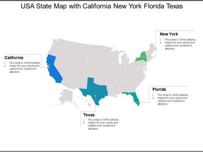
Usa state map with california new york florida texas




Try Before you Buy Download Free Sample Product
 Impress Your
 Audience
 100%
100% Editable
 Save Hours
 of Time


Bring interdepartmental differences to an end with our Usa State Map With California New York Florida Texas. It helps handle internal disputes.
People who downloaded this PowerPoint presentation also viewed the following :
Usa state map with california new york florida texas with all 5 slides:
Ensure folks comprehend the intent of the judgement with our Usa State Map With California New York Florida Texas. Drive home the implications of each clause.
FAQs for Usa state map with california new
For your map template, definitely include state boundaries and major cities with labels big enough to read during your presentation. A legend is crucial if you're using any colors or symbols - people always ask about that stuff. Make sure there's good contrast so it shows up clearly on whatever screen you're using. Oh, and don't forget Alaska and Hawaii! Put them in little inset boxes since they usually get chopped off otherwise. One thing I learned the hard way - test it with real data first. Nothing's worse than text overlapping everywhere when you add your actual content.
Dude, colors totally make or break a map! Try contrasting ones to make certain states pop, or go with gradients if you're showing data ranges. Blues work great for water stuff, warm colors for population - that kind of thing. Honestly, I've seen so many boring gray maps that could've been awesome with better color choices. Just don't go crazy with like 15 different shades or people's eyes will hurt. Oh, and definitely check that colorblind people can read it too - learned that one the hard way on a project once.
Maps are everywhere in social studies - geography basics, historical events, demographic data. Honestly can't think of a history class that didn't have at least three hanging on the walls! Election results are huge too, plus economic stuff and climate comparisons between states. Interactive ones get kids way more engaged than those old pull-down maps we used to have (do they even make those anymore?). Color-coding works great for data visualization since patterns jump out immediately. Students pick up on trends super fast when you use different colors for population density or whatever you're teaching.
Geographic data is what makes your state map actually mean something instead of just being a pretty outline. Population density, elevation, climate zones, economic stuff - pick whatever fits your project. Honestly, I've watched maps go from boring to "holy shit, now I get it" just by adding the right data layer. Don't go crazy though. Choose one or two things that answer your audience's biggest questions first. You can always add more later, but too much at once just makes it messy. The data should tell your story, not fight against it.
Okay so first figure out if your audience actually knows US geography or if you'll need way more labels. Age matters too - older people definitely need bigger text and clearer borders. I swear half the maps I see are completely unreadable! Are they looking for population stuff, voting data, or just basic reference? Don't do red/green colors together since colorblind people can't tell the difference. Oh and definitely test it on someone first - like grab a coworker who's similar to your target group. You'd be surprised what seems obvious to you but confusing to them.
Adobe Illustrator's your best bet if you want total control - it's what pros use for vector editing. Canva's way easier though, and their map templates are actually pretty good now. Figma works too if you're already using it for other stuff. QGIS is free but honestly kind of a pain to learn unless you're into that sort of thing. PowerPoint can work for basic stuff, which sounds weird but whatever works, right? Start by grabbing a decent SVG template from VectorStock or somewhere similar, then just import it into whatever tool fits your skill level. Don't overthink it.
Honestly, clickable states are a game-changer for map presentations. People can hover over regions for quick stats or click to see detailed info pop up. Color-coded overlays work great too - you can switch between different data sets and watch the map transform. Dropdown filters let your audience dig into whatever interests them most. I'd probably start simple though, maybe just hover effects and one filter. Too many bells and whistles can be distracting. Oh, and animated data flows between states look pretty slick if you're feeling ambitious. Way better than boring static slides.
State labels need to be all caps and centered in each state - except don't even try cramming text into Rhode Island, it'll look awful. Put city names in sentence case, positioned slightly right or above the dot so they don't overlap. Make states the biggest text, major cities medium, smaller ones tiny. You can abbreviate state names if you're running out of room, but spell out the cities completely. Oh, and definitely check how it looks at actual print size first - I learned that one the hard way. Trust me on that.
So basically you'd take a US map and layer your demographic stuff on top using different colors or patterns. Like darker blue = more people, lighter = less dense, that kind of thing. Works great for income levels, age breakdowns, education data - whatever you're looking at. Honestly beats staring at spreadsheets any day. The cool part is you'll spot patterns right away that you'd never notice otherwise. Maybe all the high-income areas cluster near certain cities, or voting trends follow geographic lines. Just pick colors that make sense and won't confuse people. Oh and start with clean data obviously - garbage in, garbage out situation there.
Oh man, you can put pretty much anything on those state maps! Population stuff, election data, unemployment rates - whatever you want to compare between states. Most people go with those color-coded ones (choropleth maps if you're being fancy). But you could also do dots or symbols depending on what works better. The tricky part is picking good colors that actually make sense. I've seen some maps where the colors are so confusing they basically lie about the data. Climate info works great too - actually some of the coolest maps I've seen show temperature or rainfall patterns across states.
Oh totally! Colors are huge - like Southwest states look way better with those warm desert tones, while New England goes for cooler blues and greens. You've gotta think about what each state actually cares about too. Texas wants their state pride front and center, Vermont's all about the outdoors. Some states are weirdly picky about their border lines being perfect (looking at you, geography nerds). Honestly the trick is just doing your homework first - figure out what visual stuff resonates with people there before you start throwing colors around.
Oh totally, state maps are so important for kids to actually get geography. Like, you can't understand why certain regions have different climates or economies if you don't know where things are first. I'm probably dating myself here, but I loved those fill-in-the-blank state maps we did in school - somehow made it stick better than just staring at a complete map. It builds that spatial thinking they'll need later for history and current events. Start simple with outline maps. Have them add states, then capitals, maybe some rivers. Works way better than you'd think!
Animated maps are definitely the way to go - set up a timeline slider so people can watch boundaries shift over time. Way more engaging than static images. You could also do side-by-side comparisons showing before/after views. Different colors help distinguish old vs new boundaries. I'd probably start with something dramatic like the Louisiana Purchase since those changes are huge and obvious. Though honestly, westward expansion stuff works great too. ArcGIS is solid if you want something professional, but there are simpler web tools that'll do the job just fine.
Vector graphics are perfect for state maps - they'll stay crisp no matter how big you make them. File sizes stay pretty small too, which is nice. The best part? You can edit everything super easily. Need to highlight certain states or change colors for different data? Takes like two seconds. No pixelation when you mess with boundaries either. I swear, once you try an SVG map you won't go back to regular images. Way better for presentations whether you're projecting or just printing handouts. Honestly can't think of a downside.
Oh definitely try the themed map thing! Have them make their own state maps but focus on like population or climate zones. Road trip planning works great too - they map routes between states and actually get into it. My kids always loved the color-coding stuff more than I expected. You could also do those comparison exercises with different map projections, or have them research neighboring states and make travel brochures. Honestly anything beats just staring at a regular map. Start simple with one interactive thing and add more as you go. Gets them actually working with the maps instead of zoning out.
-
Easy to edit slides with easy to understand instructions.
-
Very unique, user-friendly presentation interface.