

User Experience UX Powerpoint Presentation Slides





Try Before you Buy Download Free Sample Product
 Impress Your
 Audience
 100%
100% Editable
 Save Hours
 of Time


Grab our professionally designed User Experience PowerPoint presentation. It briefly explains the user experience in the software development environment, its importance, market size, and trends. Initially, our Usability Engineering PowerPoint Presentation covers the difference and relationship between user experience and user interface. It also showcases the overview of lean user experience methods, dark patterns, and user experience building block elements. In addition, this Information Architecture PPT contains the essential skills, main functions, and tasks UX designers perform. It also comprises the user experience design process steps and thinking process of UX designers. Also, the User-Centered Design UCD PPT presentation includes the steps to integrate user experience into DevOps and the challenges and solutions associated with user experience. Furthermore, this Customer Experience Design template caters to best practices and checklists for user experience. It also includes the training schedule for IT professionals, training cost, and budget for implementing user experience. Moreover, this Human-Computer Interaction HCI deck comprises Googles HEART framework to measure the user experience success rate and a RACI matrix. Lastly, this User Experience PowerPoint Presentation contains a 30-60-90-day plan, a timeline, a roadmap, and a dashboard. Download our 100 percent editable and customizable template, which is also compatible with Google Slides.
People who downloaded this PowerPoint presentation also viewed the following :
Content of this Powerpoint Presentation
Slide 1: This slide introduces User Experience (UX). State your company name and begin.
Slide 2: This slide states Agenda of the presentation.
Slide 3: This slide shows Table of Content for the presentation.
Slide 4: This slide highlights title for topics that are to be covered next in the template.
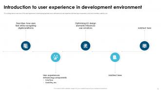
Slide 5: This slide presents Introduction to user experience in development environment.
Slide 6: This slide displays Main principles of user experience design.
Slide 7: This slide represents Universal design (UD) principles for user experience.
Slide 8: This slide represents Importance of user experience in software development.
Slide 9: This slide showcases Business benefits of user experience design.
Slide 10: This slide highlights title for topics that are to be covered next in the template.
Slide 11: This slide shows Global user experience (UX) market size.
Slide 12: This slide presents Latest user experience design trends.
Slide 13: This slide highlights title for topics that are to be covered next in the template.
Slide 14: This slide displays Relationship between user experience and user interface.
Slide 15: This slide represents Comparison between user experience and User Interface.
Slide 16: This slide highlights title for topics that are to be covered next in the template.
Slide 17: This slide showcases Overview of Lean user experience (UX) method.
Slide 18: This slide shows Steps of Lean user experience (UX) approach.
Slide 19: This slide presents Benefits of Lean user experience (UX) design approach.
Slide 20: This slide highlights title for topics that are to be covered next in the template.
Slide 21: This slide displays Types of dark patterns in user experience.
Slide 22: This is another slide continuing Types of dark patterns in user experience.
Slide 23: This slide represents Building block elements of user experience.
Slide 24: This slide showcases Information Architecture (IA) elements of User Experience.
Slide 25: This slide highlights title for topics that are to be covered next in the template.
Slide 26: This slide shows Key skills of user experience designers.
Slide 27: This slide presents Main functions of user experience designers.
Slide 28: This slide displays Tasks performed by user experience designers.
Slide 29: This slide highlights title for topics that are to be covered next in the template.
Slide 30: This slide shows User Experience (UX) design process steps.
Slide 31: This slide presents User Experience (UX) design process steps.
Slide 32: This slide displays UX designers design thinking process.
Slide 33: This slide highlights title for topics that are to be covered next in the template.
Slide 34: This slide presents Steps to integrate user experience into DevOps.
Slide 35: This slide highlights title for topics that are to be covered next in the template.
Slide 36: This slide represents Challenges and solutions associated with user experience design.
Slide 37: This slide showcases the guidelines for designing User Experience.
Slide 38: This slide shows Best practices for user experience design.
Slide 39: This slide shows Checklist for satisfactory user experience design.
Slide 40: This slide highlights title for topics that are to be covered next in the template.
Slide 41: This slide presents User experience training schedule for IT professionals.
Slide 42: This slide displays Cost for user experience training program.
Slide 43: This slide represents Budget for implementing user experience design project.
Slide 44: This slide highlights title for topics that are to be covered next in the template.
Slide 45: This slide showcases Google HEART framework to measure UX success.
Slide 46: This slide highlights title for topics that are to be covered next in the template.
Slide 47: This slide shows RACI matrix for user experience design.
Slide 48: This slide presents 30 60 90 days plan for user experience design implementation.
Slide 49: This slide displays Timeline for implementing user experience design.
Slide 50: This slide represents Roadmap for user experience design deployment.
Slide 51: This slide showcases User experience and satisfaction monitoring dashboard.
Slide 52: This slide contains all the icons used in this presentation.
Slide 53: This slide is titled as Additional Slides for moving forward.
Slide 54: This slide presents Bar chart with two products comparison.
Slide 55: This is a Timeline slide. Show data related to time intervals here.
Slide 56: This slide depicts Venn diagram with text boxes.
Slide 57: This is a Financial slide. Show your finance related stuff here.
Slide 58: This slide contains Puzzle with related icons and text.
Slide 59: This is Our Goal slide. State your firm's goals here.
Slide 60: This is an Idea Generation slide to state a new idea or highlight information, specifications etc.
Slide 61: This slide provides 30 60 90 Days Plan with text boxes.
Slide 62: This slide shows Post It Notes. Post your important notes here.
Slide 63: This is a Thank You slide with address, contact numbers and email address.
User Experience UX Powerpoint Presentation Slides with all 71 slides:
Use our User Experience UX Powerpoint Presentation Slides to effectively help you save your valuable time. They are readymade to fit into any presentation structure.












FAQs for User Experience UX
Honestly, it's all about making stuff easy to use and accessible for everyone. Map out your user's journey first - that's where you'll spot the real pain points. Keep everything consistent across your interface, and make sure people can actually figure out where to go. Users need feedback when they click stuff too, which seems obvious but you'd be surprised how often that gets missed. Research is huge - you can't just guess what people want. Oh, and clear hierarchy matters way more than fancy design tricks. Once you nail down those basics, prioritizing fixes becomes way less overwhelming.
Okay so basically - figure out who's actually using your templates first. Are they busy execs who just want the key points? Or researchers who need all the details laid out? Makes a huge difference in how you design things. Like, one group wants clean visuals they can scan quickly, the other wants comprehensive layouts with room for data. Honestly, I'd pick your top 2-3 user types and create different template versions for each. You'll end up making way better decisions about colors, layouts, how to organize info - all that stuff. It's kinda like designing for skimmers vs deep-dive people, you know?
Honestly, usability testing is a game-changer for templates. Watch people actually use your stuff and you'll see them break it in the weirdest ways - ways you'd never think of. They'll get stuck on basic things like finding the right formatting options or figuring out your layout structure. Real eye-opening stuff. The feedback shows you what's genuinely broken versus what's just "eh, would be nice to fix someday." I always test with like 3-5 people doing real tasks, not just asking what they think. Way more useful than sitting there guessing what might go wrong.
Accessibility totally changes how you build templates from the ground up. Can't just use red/green color coding - colorblind people miss that completely (found that out the embarrassing way). Bigger default fonts are a must, plus you need good contrast ratios and alt text spots for images. The heading structure matters too for screen readers. Honestly, it's way easier to build this stuff into your base templates instead of trying to fix everything later. More people can actually use your presentations, and you're not scrambling to make changes at the last minute.
Dude, complicated navigation is engagement poison. People bail if they can't find stuff in like 3 clicks max. Slow loading times? Instant death. Also those popups that smack you in the face the second you land on a page - ugh, who thought that was a good idea? Mobile needs to work perfectly or you're screwed since everyone's on their phones anyway. Your call-to-action buttons should be obvious. Don't make people guess what to click. Test everything with actual humans first, not just your team who already knows how it works.
Start with your main headlines being the biggest thing on the slide – that's where eyes go first. Use consistent fonts for subheadings and give your key points breathing room with white space. Bold colors are perfect for buttons or CTAs, but honestly, less is more here. Too many bright elements just fight each other. Your most important stuff should live in the upper left since that's where people naturally look. Oh, and try this weird trick – squint at your slide. The important bits should still pop out when everything's blurry. That's how you know you've got good hierarchy going.
User feedback basically shows you what actually works vs what you *think* works. Super humbling sometimes! When people get lost in testing or can't find stuff, those exact pain points get fixed next round. It helps you figure out which templates need the most attention and spot patterns across different users. The real win though? Seeing if your design choices actually fit how people work. Oh and test early - don't wait till everything's "perfect" or you'll miss the good insights. Way better to catch issues when they're still easy to fix.
Honestly, presentation templates are just copying what we see in apps now. People want that same smooth feel everywhere. Clean layouts, bold fonts, tons of white space - you know the drill. Interactive stuff is everywhere too, like clickable menus and hover effects. Even PowerPoint's trying to keep up (kinda funny tbh). Instead of shoving everything onto one slide, good templates create a story flow. Oh, and readability matters way more than looking fancy. Pick something with clear visual hierarchy and your audience won't zone out halfway through.
Honestly, I'd go with Figma first - it's free and the collaboration stuff is actually useful. Sketch works great too if you're on Mac. Canva's decent for quick jobs, though you can't customize much. PowerPoint and Keynote are fine but kinda limiting for real design thinking, you know? The main thing is picking something that lets you test user flows and check how readable everything looks on different screens. Oh, and definitely test your templates with real content first - I learned that one the hard way! Figma's probably your best bet to start.
Dude, consistency is HUGE for presentation design - like seriously makes or breaks the whole thing. Your audience gets confused when fonts and colors are all over the place. They can't focus on what you're actually saying. Once people see your first few slides, they expect certain patterns. Short fonts, spacing, layouts - stick with what works. I always tell people to pick maybe 2-3 fonts max and a solid color scheme. Then don't get creative halfway through lol. Oh and spacing rules too - super important but everyone forgets that part. Trust me, a simple style guide saves you so much headache later.
Honestly, I'd start with user interviews - just sit down with a few people and watch them go through your templates. You'll catch stuff you never would've noticed otherwise. Surveys work too if you need quick feedback from tons of people. A/B testing different versions is pretty solid, though it takes more setup time. Oh, and card sorting helps you figure out how people actually think about organizing content sections (which is weirdly fascinating). Don't sleep on analytics either - see where folks are actually clicking around. But yeah, interviews first since they give you the real gold.
Dude, mobile responsiveness can totally make or break your presentation templates. I learned this the hard way when I presented to a client who was mostly on phones - disaster! Your audience will be squinting at microscopic text and fumbling around trying to hit buttons that are way too small. Responsive templates fix all that by adjusting layouts automatically and making text actually readable. Touch targets become finger-sized instead of ant-sized. Honestly, always test on real devices first. Don't just resize your browser window and call it good - that's not the same thing at all.
Okay so first thing - put your main point right at the top, don't bury it. Then break everything else into chunks with lots of white space and bullet points. I'm telling you, cramming stuff together never works. Group similar ideas and throw in some simple icons if you can. Oh and here's a trick I learned - if someone can't get your main message in like 5 seconds of looking at it, you need to cut more stuff out. Way more than you think, probably. Use the same fonts throughout so it looks clean. Honestly just grab someone who doesn't know the topic and see if they get it immediately.
Dude, color choices can totally make or break your presentation. Poor combos will give people headaches and confuse them, while good ones guide their eyes and set the right mood. I once watched this brilliant pitch completely bomb because the guy used bright yellow text on white slides - couldn't read anything! Match your colors to your message's vibe. Stick with 2-3 colors tops, and honestly? Test it on different screens first since colors look weird on some devices. Don't just pick what you think looks pretty - think about your audience instead.
Honestly, animations can make or break your presentation. Done right, they guide people through your points smoothly. But we've all been tortured by those spinning, bouncing disasters that make you seasick, right? I always tell people - less is more. Use them to reveal info step by step or highlight something important, not just because the option exists. Keep transitions under half a second. Stay consistent throughout. Oh, and avoid the temptation to make everything fly in from different directions - your audience will thank you for the restraint.
-
Wonderful ideas and visuals. I'm really pleased with the templates, which are unique and up to date.
-
Best way of representation of the topic.