


Video Editing For Corporate Client Proposal Powerpoint Presentation Slides




Try Before you Buy Download Free Sample Product
 Impress Your
 Audience
 100%
100% Editable
 Save Hours
 of Time


The most powerful engagement tool that is being used to inform the audience is video. There is no denying the fact that visuals have a higher impact on the audience than any other source of information. People tend to retain faster and grasp the information quickly through videos. That is why brands and organizations have now incorporated videos into their digital marketing strategies. Ever wondered what's the most complicated part of video creation. Indeed, it is video editing. However, with dozens of video editing services available online, it is quite an arduous task for companies to choose the right one. Make their search easier by offering the solutions your company provides with the assistance of this content-ready video Editing For Corporate Client Proposal PowerPoint Presentation Slides. Concisely explain your agendas with the help of a well-designed cover letter. Creatively mention the table of contents pointwise to get a big picture of your proposal. Take the advantage of this digital editing PowerPoint presentation to define your project goals and objectives. Mention the video editing software your company uses to make quality videos like adobe premiere. Adopt our attention-grabbing online editing PowerPoint slideshow to elucidate the scope of services that include research, plan, edit, final review, and output. Inform them about the time duration required to complete each action. Utilize our readymade video manipulation PowerPoint graphics to showcase the additional offerings rendered by your firm including, online B2B services, mobile development, and technical seo service. Exhibit the investment structure and cost for each stage so they can match with their budget. Added in the slides is the ‘about us’ page through which you can introduce your company and your team members that have put their efforts into making your proposal outstanding. Give a remarkable conclusion by adding client’s testimonials and win your customer’s trust. Download our video making PPT design and impress your clients with your groundbreaking proposal.
People who downloaded this PowerPoint presentation also viewed the following :
Content of this Powerpoint Presentation
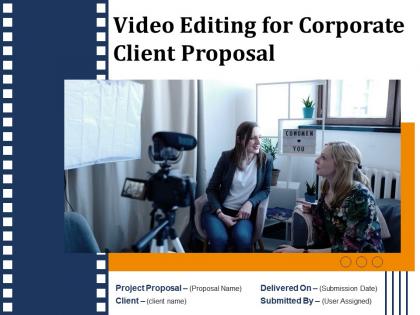
Slide 1: This slide introduces Video Editing for Corporate Client Proposal. State Client name, Submission date, User assigned.
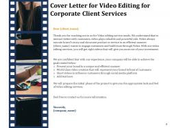
Slide 2: This slide displays Cover Letter for Video Editing for Corporate Client.
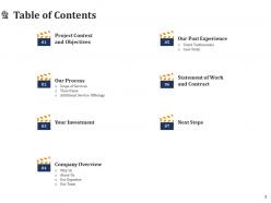
Slide 3: This slide showcases Table of Contents.
Slide 4: This slide shows Table of Contents of the presentation.
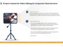
Slide 5: This slide describes Project Context and Objectives for Video Editing for Corporate Client.
Slide 6: This slide depicts Table of Contents.
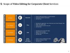
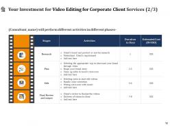
Slide 7: This slide shows Scope of Video Editing Services.
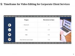
Slide 8: This slide showcases Timeframe for Video Editing for Company Promotion.
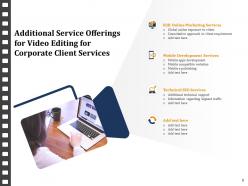
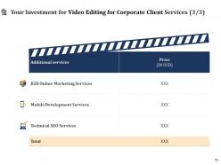
Slide 9: This slide displays Additional Service Offerings for Video Editing for Corporate Client.
Slide 10: This slide depicts Table of Contents.
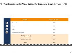
Slide 11: This slide presents Investment details for Video Editing for Corporate Client.
Slide 12: This slide represents Investment details for Video Editing for Corporate Client.
Slide 13: This slide represents Investment details for Video Editing for Corporate Client.
Slide 14: This slide shows Table of Contents.
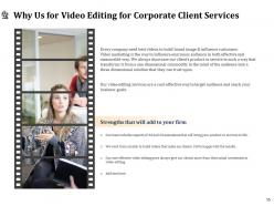
Slide 15: This slide depicts reasons for choosing us for Video Editing for Corporate Client.
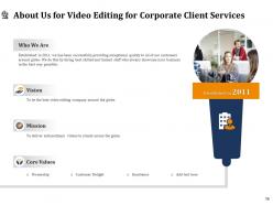
Slide 16: This is About Us slide to showcase Company specifications.
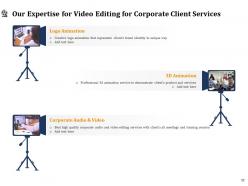
Slide 17: This slide represents Our Expertise for Video Editing for Corporate Client.
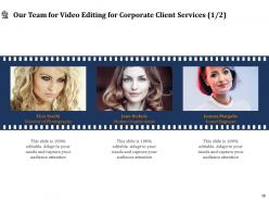
Slide 18: This slide shows Our Team for Video Editing for Corporate Client.
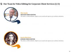
Slide 19: This is Our Team slide with Names and Designations.
Slide 20: This slide shows Table of Contents.
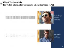
Slide 21: This slide displays Client Testimonials for Video Editing for Corporate Client.
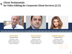
Slide 22: This slide displays Client Testimonials for Video Editing for Corporate Client.
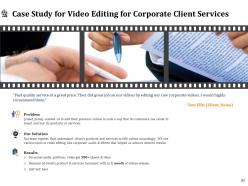
Slide 23: This slide describes Case Study for Video Editing for Corporate Client.
Slide 24: This slide showcases Table of Contents.
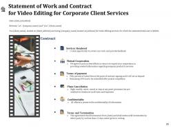
Slide 25: This slide describes Terms and Termination.
Slide 26: This slide shows Table of Contents.
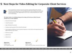
Slide 27: This slide depicts Next Steps for Video Editing for Corporate Client.
Slide 28: This is Contact Us slide with Address, Email Address and Contact number.
Slide 29: This is Icons Slide for Video Editing for Corporate Client.
Slide 30: This slide is titled as Additional Slides for moving forward.
Slide 31: This is About Us slide to showcase Company specifications.
Slide 32: This slide displays Organization Mission and Vision Statement.
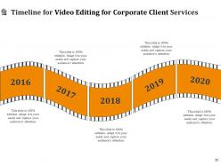
Slide 33: This slide depicts Timeline process.
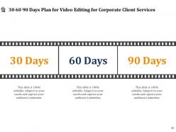
Slide 34: This is 30 60 90 Days Plan slide.
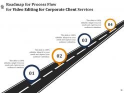
Slide 35: This slide showcases Roadmap for Process Flow.
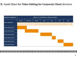
Slide 36: This slide displays Gantt Chart.
Video Editing For Corporate Client Proposal Powerpoint Presentation Slides with all 36 slides:
Use our Video Editing For Corporate Client Proposal Powerpoint Presentation Slides to effectively help you save your valuable time. They are readymade to fit into any presentation structure.
FAQs for Video Editing For Corporate Client Proposal
Start with something that grabs them in the first 15 seconds - that's crucial. Then lay out the problem you're solving and your solution with actual benefits they care about. Social proof works wonders, so throw in testimonials or case studies if you have them. People always want timeline and budget info upfront, so don't make them guess. Keep it branded but not overly promotional - nobody likes feeling sold to. Honestly, 3-5 minutes is perfect because people's attention spans are terrible now. Oh, and your call-to-action better be strong with contact info that's impossible to miss at the end.
Dude, editing is what makes your proposal actually watchable instead of a snoozefest. Build tension with pacing - show the problem, then BAM, hit them with your solution. Good transitions keep everything flowing smooth, and throw in some B-roll so people aren't staring at talking heads the whole time. Most proposals are painfully boring (I've sat through way too many). Graphics can punch up your key points, music sets the vibe, and you'll definitely want to cut out rambling sections. Oh, and map out your story first before diving into the software - trust me on that one.
Get a brand style guide first - logo, colors, fonts, the works. Then don't abandon it halfway through (seriously, this happens more than you'd think). Make templates for your lower thirds and transitions so everything looks like it belongs together. Your brand colors should show up in graphics and backgrounds consistently. Oh, and keep the same tone in your voiceover too. Use visual stuff your audience already knows from your other content. I always do a final check before exporting to catch any branding mess-ups. It's way easier to fix before you render everything.
Dude, stick to 2-4 minutes tops. Seriously, people's attention spans are shot these days - I learned this the hard way with my last pitch. Around 3 minutes hits the sweet spot because you've got time to show the problem, your solution, and what you want them to do next. But honestly? If you can crush it in 90 seconds, do that instead. Executives are probably watching between meetings on their phones anyway. My boss always says shorter wins, and I've never seen him wrong about this stuff. Test different lengths if you can, but when you're unsure, just cut more out.
Honestly, I'd try DaVinci Resolve first - it's completely free but weirdly powerful for proposal videos. Like, I was shocked how much you get without spending a dime. Adobe Premiere Pro is great too and plays nice with other Adobe stuff you might already have. Both will give you that polished, corporate look you want. DaVinci handles color correction really well, which makes a huge difference. If you end up needing fancy team features later, you can always switch to Premiere. But seriously, start with DaVinci and see how it goes.
Honestly, background music makes a huge difference in proposal videos - way more than you'd think. Keep it subtle though, nothing too dramatic or it'll compete with your voice. Upbeat stuff works great if you're pitching something innovative, but go with more serious orchestral vibes for traditional corporate clients. I always browse Epidemic Sound or AudioJungle for royalty-free tracks. Pro tip: test a few options against your rough cut first. Volume should be low enough that it just supports what you're saying. Trust me, it really does set the whole emotional tone and keeps people watching.
Don't just slap visuals everywhere - timing is everything. I'd focus on your 3-4 biggest data points first and build custom graphics around those. Infographics work way better than those bullet-heavy slides that put everyone to sleep (learned that the hard way lol). Make sure your colors match your brand, and actually give people time to read what's on screen before jumping to the next thing. Less really is more here. Oh, and sync your graphics to pop up right when you're talking about that specific point - it makes such a difference in how people follow along.
Dude, the biggest thing is length - anything over 3 minutes and people bounce. Those cheesy stock music tracks make everything feel so corporate and fake. Don't dump your entire company history in there either, nobody cares about your 50-year legacy story honestly. Skip the awkward talking head thing where someone stares at the camera reading off a teleprompter. Focus on the actual problem you're solving instead. Real footage beats stock photos every time. Keep transitions clean, nothing fancy. Oh and add captions - most people scroll with sound off anyway. Your client's pain point should be the star, not your awards wall.
Animated charts and step-by-step reveals are your best friend here - way better than throwing everything at people all at once. I'd start with your messiest, most confusing section and test different techniques there. Split screens work amazing for before/after stuff. Simple transitions help guide people through your logic too, which honestly makes such a difference. The trick is matching your editing pace to how complex each part is. Oh, and callouts are clutch for highlighting key points without overwhelming anyone. Visual layering basically turns that overwhelming firehose into something actually manageable.
Honestly, animated charts are your best friend for corporate stuff - they make boring numbers actually interesting. Skip static screenshots, they're dead on arrival. Screen recordings showing your software doing its thing? Way more powerful. Throw in some professional headshots or quick talking segments because execs eat that personal connection up. Match their brand colors if you can swing it, and use animations that guide eyes without being annoying. Here's the thing though - you've got maybe 10 seconds to grab them with one amazing visual right off the bat. After that, let your data tell the story. Trust me on this one.
Don't just dump all your testimonials at the end - that's what everyone does and it's boring. Open strong with a killer client quote in the first 30 seconds, then scatter shorter clips throughout when you're explaining benefits. Those 15-second sound bites work way better than long rambling ones. Pick testimonials with actual numbers or results, not just "they're amazing!" fluff. Oh, and throw their company logo on screen while they're talking - makes it look legit. Just make sure you get permission first or you'll have angry clients later.
Here's the thing - make your story about THEIR problem, not how amazing you are (seriously, everyone messes this up). Lead with their actual pain point, then walk through exactly how you'd fix it. Show real results they'll see. Think of it like... they're the hero, you're just the helpful sidekick guiding them to success. Keep everything flowing logically: problem → your solution → proof it works → what happens next. Oh, and transition smoothly between each part so people aren't sitting there confused about where you're going with this whole thing.
Oh man, color grading totally makes or breaks the vibe. Warm tones? Your company looks friendly and trustworthy. Blues feel more professional but - ugh, learned this one the hard way - go too far and it's "sterile" (direct client feedback, super fun). Keep your grading consistent so everything looks intentional instead of like you grabbed footage from wherever. Honestly, for corporate stuff I'd stick with subtle tweaks that don't make people look weird and match your brand colors. Also definitely run different versions by a couple people first because what looks good to you at 2am might not actually work.
Okay so tech companies are all about that fast, sleek editing - quick cuts, smooth animations, basically screaming "look how innovative we are!" Non-profits? Totally different game. Slower pacing works better, warmer colors, and you gotta let the emotional moments actually land. Like, people aren't gonna cry over your new software feature, you know? Focus on real human stories instead. Give those moments space to breathe. Oh and honestly, the color grading makes a huge difference - warmer tones just hit different for charity work. Match your editing style to what actually moves people.
Honestly, captions are a lifesaver for proposal videos. Half the people watching will have their sound off anyway - you know how it is in those back-to-back Zoom calls. When viewers can read AND hear your message, they actually remember the important stuff. This is huge for technical details or budget numbers that might otherwise go in one ear and out the other. I'd start with basic captions for accessibility. Then get strategic about it - add text overlays to punch up your best selling points right when they hit. It's like having a highlighter for video.
-
Topic best represented with attractive design.
-
Unique design & color.
-
Presentation Design is very nice, good work with the content as well.