


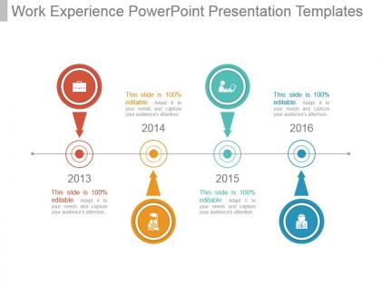
Work experience powerpoint presentation templates




Try Before you Buy Download Free Sample Product
 Impress Your
 Audience
 100%
100% Editable
 Save Hours
 of Time


Our Work Experience Powerpoint Presentation Templates work in all conditions. They possess a very adjustable nature.
People who downloaded this PowerPoint presentation also viewed the following :
Work experience powerpoint presentation templates with all 7 slides:
Initiate action to control costs with our Work Experience Powerpoint Presentation Templates. Inflation figures are bound to drop.
FAQs for Work experience
So for each job, put the title, company, dates, and location (just city/state - full addresses look weird). Then do 3-5 bullets about what you actually accomplished, not just your boring daily tasks. Numbers are your friend here - hiring managers eat that stuff up. Like "increased sales by 30%" instead of "responsible for sales growth." Start with your newest job and go backwards. Oh, and honestly? Skip anything older than 10-15 years unless it's super relevant. Nobody cares that you were a cashier in high school if you're applying for marketing roles now.
Honestly, visuals are a game changer for making your work stuff actually interesting to read. Nobody's gonna sit through walls of text about your achievements - trust me on that one. Charts showing your impact work great, or before/after screenshots if you've got them. Even basic icons help break things up. I've seen people use timeline graphics instead of boring bullet points to show career progression, which looks way cooler. Photos from team events add some personality too, though don't go overboard. The trick is picking visuals that actually tell your story rather than just looking pretty.
Dude, visual stuff on resumes actually works really well. Instead of boring bullet points, you can throw in a simple chart showing like 40% revenue growth or whatever numbers you've got. Way more eye-catching than paragraphs nobody reads anyway. I mean, recruiters are skimming these things in like 10 seconds max. Bar charts work great for sales increases, timelines for project management, that kind of thing. Just don't get crazy with it - maybe 2-3 of your best wins that have real data behind them. Keep it simple though, you're not designing an infographic here.
Definitely switch up the jargon for each field you're targeting. Tech wants to see programming languages and projects you've built. Healthcare? Focus on patient care and your certifications. Creative fields are honestly way more interested in your actual work - like campaigns or portfolio pieces - than some fancy company name. Finance and conservative places still want that clean, traditional look, but startups might dig something with more flair. Oh, and spend time reading job posts in whatever industry you're going for. You'll start noticing the same keywords popping up everywhere - that's your cheat sheet right there.
Ugh, the worst thing you can do is make those tiny cramped boxes that don't actually fit real accomplishments. I've seen so many templates like that and they're useless. Also skip the boring "describe your responsibilities" prompts - people just copy-paste job descriptions and it's awful to read. Focus on actual results instead. Give them space for specific examples and numbers that matter. Oh, and make sure the sections flow in a logical order. Honestly though? Test it out yourself first with your own experience before you hand it to anyone else.
Honestly, just treat each job like you're telling a story. Pick the juicy stuff - that time you saved a dying project or won over an impossible client. Don't just rattle off your job duties, nobody cares about that. Structure it like: here's the mess I walked into, here's what I did about it, boom here's how it turned out. The STAR method works if you're into frameworks. But really, people remember stories way better than boring bullet points. I'd pick maybe 2-3 good ones that show off different skills and practice keeping them short. Makes interviews way more interesting too.
Okay so definitely use headings and bullet points - makes it way easier to scan. Bold your big achievements and any numbers you've got since that's what catches their eye. I always throw in a tiny bit of color but don't go crazy with it. Pick a normal font, nothing weird or fancy. Put your contact stuff right at the top where they can't miss it. Those little icons for different sections? Actually pretty helpful and look decent. Oh and this is huge - save it as a PDF or your formatting will get totally messed up when you email it.
Ugh, colors can totally tank your resume if you're not careful. I stick with safe stuff like navy or dark gray - anything that won't make hiring managers' eyes hurt. Bright colors are usually a no-go (learned that one the hard way with an awful orange template once). You really want maybe 2-3 colors tops. The goal is guiding people to the important stuff without being all flashy about it. Oh, and definitely check how it prints in black and white! Some old-school companies still do that, which is kinda annoying but whatever.
Honestly, templates are a lifesaver. They give you a structure that actually works instead of staring at a blank page forever. No more wondering if you forgot something important - everything's already mapped out. Most are made by people who know what hiring managers want anyway. Why start from scratch when you don't have to? You'll still need to customize it for your experience and the job though. Oh, and pro tip: focus your time on writing killer bullet points rather than messing around with fonts and spacing. That's where you'll really stand out.
Honestly, formatting can make or break your template. I've watched people give up on poorly designed ones - it's painful to see. You'll want clear sections and consistent fonts, obviously. But here's what really matters: white space. Cramped layouts are the worst. Put yourself in a job hunter's shoes - they're already stressed, so don't make them decode your messy layout on top of everything else. Bullet points help tons. Make headings super obvious. Leave actual room for people to write stuff! Oh, and definitely test it yourself first. If it annoys you, it'll annoy them.
Numbers are your best friend here - put actual percentages and dollar amounts instead of fluffy descriptions. Start bullets with action words like "increased" or "launched" but skip the corporate jargon that makes people want to nap. I'd use STAR format (situation, task, action, result) but keep it tight. Your biggest wins go first since hiring managers scan fast. Oh, and match what they actually care about - if it's a sales role, lead with revenue stuff. Cost savings work great for operations roles. Don't overthink it though, just show real impact you made.
Oh definitely use bullet points - they're way easier to scan than paragraphs. Start with action verbs like "managed" or "developed" instead of boring stuff like "responsible for." Each bullet should focus on one thing you did, and throw in numbers whenever you can. Like "increased sales by 30%" sounds way better than just "boosted sales." I usually do 3-5 bullets per job. Oh and here's something I learned the hard way - rearrange them so your most relevant stuff for that specific job is at the top. Makes a huge difference.
Honestly, infographics are a game-changer for resumes. They make everything way easier to scan quickly - your achievements, career timeline, all that stuff jumps out immediately. Picture some poor hiring manager going through 50 boring text resumes... yours would actually stand out! You can show your career growth and results in a format people actually remember. The visual layout naturally draws attention to your best accomplishments first. Just don't get too crazy with the design - I've seen some that look like a nightclub flyer lol. Keep it clean so your experience stays the focus.
Honestly, getting other people to look at your template is a game changer. They'll catch stuff you totally missed and tell you if something sounds weird or confusing. Your coworkers know what skills employers actually want - sometimes we're way too in our own heads about this stuff. They might suggest better ways to word things or share what worked when they were job hunting. I always ask 2-3 people because everyone notices different things. Just be specific when you ask - like "does this section make sense?" instead of just "what do you think?"
Dude, you absolutely have to customize that thing! Generic templates are so obvious and honestly kind of cringe. Research what people in your field actually use - like, a graphic designer's resume should look way different than an accountant's, you know? Switch up the colors, fonts, headers, whatever fits your industry. Recruiters can spot a basic template from a mile away. When you actually tailor it to match the role and your personal style, it shows you're taking the job seriously. Plus it just looks so much more professional when everything aligns with what they're expecting to see.
-
Colors used are bright and distinctive.
-
Great quality product.