

Présentation du bilan de l'année Présentation Powerpoint






Try Before you Buy Download Free Sample Product
 Impress Your
Audience
 100%
Editable
 Save Hours
of Time


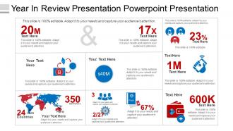
Tout ce dont vous avez besoin est notre présentation PowerPoint de présentation de l'année en revue pour analyser la production annuelle de votre entreprise. Cette diapositive a été largement utilisée par des entrepreneurs, des chefs de projet ou des chefs de service du monde entier pour présenter un résumé de leurs performances annuelles qui reflète invariablement les performances globales d'une entreprise. Cette revue annuelle PPT a été divisée en 6 paramètres dont les nombres décident de la performance d'une entreprise. Dans les options proposées, vous pouvez compléter le chiffre d'affaires annuel de votre entreprise par rapport aux années précédentes, le nombre total de téléchargements d'applications sur Google Play/App Store, les témoignages, les avis de sites tels que GoodFirms et Clutch, les abonnés sur les plateformes de médias sociaux, le trafic de sites Web/d'applications informations, projets en cours et livrés, récompenses et reconnaissances, etc. Les graphiques sont là pour compléter les performances de votre entreprise ; il vous suffit d'ajouter les statistiques annuelles de votre entreprise. De plus, la diapositive répondra si les objectifs annuels sont toujours valables, si les objectifs de vente ont été atteints, et jettera un coup d'œil sur les plans de l'année prochaine. Donnez aux gens les moyens de lutter contre les bactéries grâce à notre présentation Powerpoint de présentation du bilan de l'année. Identifiez les causes de l'infection.
People who downloaded this PowerPoint presentation also viewed the following :
Contenu de cette présentation Powerpoint
Présentation du bilan de l'année Présentation Powerpoint avec les 5 diapositives :
Assurez-vous que vos idées soient incluses dans la discussion avec notre présentation Powerpoint de présentation de l'année en revue. Être capable d'influencer l'ordre du jour.
FAQs for Year in review
Honestly, minimalist stuff with chunky fonts dominated this year. Plus those soft gradient backgrounds were literally everywhere - kind of overdone if you ask me, but clients loved them. Data storytelling layouts got huge too. Instead of random charts scattered around, these actually walk people through the insights logically. Dark mode finally caught on (thank god), and hand-drawn illustrations made everything feel less corporate. The whole vibe shifted toward more human, approachable designs rather than that sterile business look. For next quarter, I'd definitely snag some clean minimalist templates with solid data viz sections - they're not going anywhere.
Honestly, user feedback was a game-changer for our template updates this year. People kept asking for more flexible layouts and better mobile stuff, so we ended up redesigning like 70% of our templates to be more modular. The font readability complaints were brutal - some of our old templates were genuinely terrible to look at. Color contrast issues too. After everyone begged for faster setup, we finally added those quick-start wizard things. Oh, and definitely keep using the feedback portal because that's literally what drives our roadmap decisions.
Oh man, the AI suggestions are seriously where it's at now - they actually recommend templates based on what you're making and your brand stuff. Game changer. Real-time editing is huge too since your whole team can jump in without creating like 50 different versions (you know how that goes). Most platforms threw in better stock photo libraries right in the templates which is pretty convenient. Stock photos are hit or miss but whatever. Start with the AI thing first though - I'm not even kidding, it'll cut your browsing time in half instead of endlessly scrolling through options.
Oh man, remote work totally flipped everything this year! We got swamped with requests for virtual meeting agendas and digital whiteboard stuff. Plus tons of async project templates since everyone's working different hours now. Had to ditch most of our in-person workshop designs - they just didn't translate well to Zoom life. Virtual brainstorming and remote retrospectives became our biggest hits by far. Honestly, those new async planning templates are pretty solid if you haven't tried them yet. Your distributed team will probably love them, especially if you're dealing with multiple time zones like we are.
Dude, the presentations that killed it this year? All about the visuals. Clean charts that actually told a story instead of just barfing data everywhere. Interactive stuff was huge - people loved being able to click around and explore things themselves. Honestly, I'm still amazed how many people mess up basic chart selection. Pick the right type for what you're trying to say, keep it simple, and for the love of god test it on different screens first. Oh, and skip the cluttered mess graphs - nobody's got time for that. The teams who got this right had way better engagement.
So sustainability really changed how we design this year. Gone are those cluttered, animation-heavy presentations - now it's all about clean, minimal layouts that don't overwhelm people. Earth tones everywhere, plus organic shapes instead of harsh geometry. Data viz actually tells environmental stories now rather than just being eye candy (which honestly makes way more sense). Template systems became huge too since you can reuse them instead of starting from scratch every time. Saves hours of work, not gonna lie. Quick tip: audit your current templates and you'll probably find you can ditch 30% of the visual elements without losing any real impact.
Oh man, storytelling totally flipped presentation design on its head! We went from those awful bullet-point slides to actually engaging narrative layouts. Now you see hero sections, visual story elements, and designs that guide people through an actual journey instead of just dumping data on them. Templates started including story arcs and emotional beats - honestly felt like designing movie storyboards sometimes. The whole focus shifted to connecting with your audience emotionally rather than cramming in information. Definitely grab a narrative template when you're updating presentations next year. Way more engaging than the old boring stuff.
Honestly, AI templates were everywhere this year - chatbot flows, prompt libraries, ML frameworks, you name it. Healthcare compliance stuff blew up too since everyone's panicking about new regs. Remote work templates are still huge somehow. People just want ready-made solutions that handle the boring stuff. Can't blame them really. If you're trying to spot what's next, scroll through what industry people are posting on LinkedIn - that's where trends usually start. Takes like 5 minutes and you'll see patterns pretty quick.
Dude, AI totally changed template design this year. These tools now suggest layouts automatically and pick color schemes that actually match your content. Pretty wild stuff. Machine learning made templates way smarter too - they adapt to different data without you constantly fiddling with settings. The algorithms learn from performance data, so templates get better at connecting with your audience over time. Honestly, I was skeptical at first but the time savings are insane. You should definitely try some AI design tools if you haven't yet. They'll generate copy variations and everything.
So basically everyone went full minimalist in 2023 - think earth tones, tons of white space, nature vibes. Dark mode templates were huge too since we're all still working from home half the time. Mental health awareness crept into designs with lots of calming blues and greens, which I actually loved. The whole aesthetic shifted toward "authentic over polished" after years of that sterile corporate look. Organic shapes and muted colors were everywhere because people got really into sustainability messaging. If you're updating templates now, go for stuff with natural elements and breathing room. Way more engaging than cluttered slides, trust me.
So younger people are way more into the flashy stuff - bold graphics, interactive elements, all that visual content. Meanwhile older audiences? They want it clean and straightforward with clear text hierarchies. Millennials and Gen Z totally eat up those story-style formats that work great on social media too. Honestly, this stuff shifts constantly so take any "rules" with a grain of salt. But professionals always respond well to minimalist templates that showcase key metrics. Consumer-facing reviews though - those need more personality and brand voice to really land. I'd start by testing a visual-heavy version against something more metric-focused and see what your specific audience prefers.
Honestly, AI disruption hit designers hard this year. Everyone's panicking about staying relevant while also scrambling to meet those new WCAG accessibility standards. Color contrast overhauls everywhere - you've probably seen it too. Mobile-first got way more complicated with all these random new screen sizes dropping. The whole "AI-proof" design thing is exhausting but kinda necessary? Try auditing your current templates for accessibility issues first. Then maybe mess around with some AI tools - they're actually pretty helpful if you use them right instead of fighting them.
Oh nice timing! We just rolled out new templates this year and accessibility was huge for us from the start. Better color contrast, proper headings, alt text spots already built in. Screen readers work great now too, plus you can navigate everything with just your keyboard. Honestly should've happened years ago but whatever - at least it's done now. The best part? All this stuff is automatic when you build your deck. No extra steps or anything. Way more people can actually use your presentations now without you doing any extra work.
So healthcare and tech startups totally crushed it this year with presentations. Interactive storytelling replaced those awful bullet-point slides (thank god). Modular templates became the thing - you can swap pieces for different audiences which is pretty smart. Healthcare companies started using these patient journey templates that actually show results instead of just features. Meanwhile tech went super minimal with data-heavy designs that don't overwhelm investors. Oh and speaking of templates, I was just looking at some yesterday - the modular systems are honestly worth checking out if you're redoing your deck. Makes customization way easier.
Honestly, don't just fill in those template blanks and call it done. Switch up the colors and fonts to match your vibe first. Those generic stock photos? Trash them. Use real screenshots or team pics instead - way more authentic. Here's the thing though: you don't need every single slide the template gives you. Delete what doesn't work for your story. I'd start by rearranging sections to flow better, then build out from there. The whole point is making it yours, not looking like everyone else's year-end deck.
-
Professional and unique presentations.
-
Great product with highly impressive and engaging designs.