


Year in review business powerpoint ideas





Try Before you Buy Download Free Sample Product
 Impress Your
 Audience
 100%
100% Editable
 Save Hours
 of Time


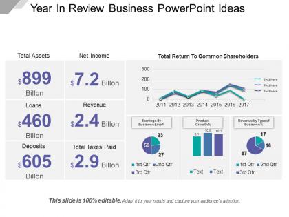
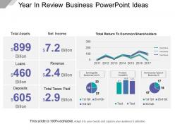
Get this Year In Review Business PowerPoint template and evaluate the activities of your organisation done in the last year. With this template, you can have a complete overview of your business and can quickly know where your business is heading towards. Know about the number of assets your company had, in the previous year just by having a glance at this PPT template. Use this professionally designed PPT slide and know about the net income of the company and identify the areas you need to tackle. You just need to add your organization’s actual figures in place of the sample text, and your presentation will be ready in a couple of minutes. Deliver a precise presentation and inform your audience about the total taxes paid and last year’s revenue of your organization. Having an overview of the business will help you in developing the strategies for the upcoming years.
People who downloaded this PowerPoint presentation also viewed the following :
Year in review business powerpoint ideas with all 5 slides:
Highlight courageous deeds with our Year In Review Business Powerpoint Ideas. Be able to appreciate the brave.
FAQs for Year in review
Start with the numbers - revenue, key metrics, big wins and losses. Yeah, include the failures too because honestly that's what makes it real instead of just corporate fluff. Talk about your customers and team wins, plus any major pivots you made. Operational stuff matters but don't go crazy with details. Show off individual team members with photos if you can - people eat that up. Market position changes are worth mentioning. Oh, and definitely end with next year's goals so it doesn't feel like you're just patting yourself on the back.
Start with your biggest wins - revenue jumps, major clients, successful launches. Numbers are your friend here, percentages make everything sound more impressive. Skip the boring bullet points that make people zone out! Try visual timelines instead, show month-by-month progress or before/after shots. Employee spotlights work great too, honestly people love seeing faces. One achievement per slide hits harder than cramming everything together. Oh, and definitely end with lessons learned plus next year's goals - shows you're actually thinking ahead instead of just bragging about what already happened.
Oh nice! Bold data visualizations are your friend here - interactive charts, progress bars, those before/after comparisons that really show off your wins. I've been loving animated timeline designs lately, they're perfect for quarterly stuff. Dark mode themes look super clean with data too. Keep your colors consistent (obviously) and try starting with a template that already has animations built in - saves you so much time. Actually, minimalist layouts with tons of white space make your key numbers really pop. Just make sure whatever vibe you pick matches your brand.
Focus on three main things: revenue growth, how many new customers you got, and market share. Those are what really matter. If you hired more people, definitely include headcount growth - everyone eats that stuff up. Customer retention and bigger deal sizes are good backup numbers too. Honestly, the biggest mistake I see is cramming every single metric onto slides. Pick maybe 4-5 numbers that actually show you're moving up and to the right. Let those tell the story instead of drowning people in data they won't remember anyway.
Think of it like telling your year's story to a friend over drinks. Start with where you were in January, then hit the big plot twists - wins AND the messy stuff. That supply chain disaster in Q2? Perfect drama. Show how your team pulled through, maybe throw in some actual numbers alongside the personal victories. Honestly, people connect more with the struggles than just the highlights anyway. Build up to your biggest moments, then wrap with a "so here's what we're thinking for next year" teaser. Makes it way more engaging than just rattling off quarterly reports.
Get stakeholder input before you even start building slides. Quick surveys work great - ask what wins they want spotlighted, biggest challenges, key metrics that matter to them. Honestly, their answers are always way better than what I would've guessed. Brief feedback sessions help too if you need more detail. Then use their actual words in your presentation. Quote them directly when you can. Makes people feel heard and your year-end review will actually land instead of just being your version of events. Oh and don't forget to weave their priorities throughout - not just tacked on at the end.
Honestly, aim for like 70% visuals, 30% text. Big bold numbers for your key stats work great. Then back those up with actual charts or photos that make sense - not random stock images, you know? Don't make people read paragraphs during your talk. We've all sat through those painful slide decks. Stick to bullet points or short phrases you can elaborate on while presenting. Your slides should just be visual reminders for what you're saying, not your entire script. Oh, and here's the test: if someone in the back row can't read it, there's way too much text or it's too tiny.
Dude, infographics totally save your Year in Review from being boring as hell. Nobody wants to scroll through endless spreadsheets – your audience will bounce immediately. Bar charts work great for comparing stuff, line graphs show trends, pie charts for percentages. Keep it simple though, like one main point per graphic or people get confused. I actually love using them for revenue growth or customer satisfaction because the visual impact is so much stronger than just listing numbers. Way more engaging than bullet points, trust me.
Definitely set aside some slides for the tough stuff, but spin it as "what we learned" instead of just listing problems. For each big challenge, show what you actually did about it and how your team grew from it. Honestly, those slides usually get the best reactions - people connect with the messy parts way more than the victories sometimes. Focus on how those roadblocks led to better processes or stronger teamwork. Then tie those lessons into next year's goals so it doesn't feel like you're just complaining about past issues. Makes the whole thing feel more like progress than dwelling on setbacks.
Here's what works best: create a timeline showing how your wins naturally lead into future goals. Makes the whole thing feel like one story instead of two random parts. I'm obsessed with split-screen slides for this - they look clean and make the connection super obvious. You could also try the "lessons learned" angle where past successes reveal your strategy for what's next. Oh, and actual team quotes are gold if you have them. People love hearing real voices talking about both wins and upcoming challenges. The trick is avoiding that awkward "okay now we're switching topics" moment.
Honestly, Year in Review presentations are gold for team morale. Celebrate the wins – both big and small ones that maybe got overlooked during busy periods. Call out specific people and show how their work tied into company wins. There's something about looking back at all the crazy stuff you survived together that just hits different, you know? Include some funny behind-the-scenes moments if you can. Personal shoutouts work way better than generic "great job team" stuff. Wrap it up with next year's goals so everyone walks out actually excited about what's ahead.
Canva's probably your best bet for making stuff look actually professional - way better than those tired PowerPoint templates. If you're dealing with data, Tableau will blow your mind with how clean the charts come out. Adobe Creative Suite is solid too but honestly might be overkill unless you're doing this regularly. For team stuff, Figma's pretty sweet for bouncing ideas around. Oh, and grab photos from Unsplash or Pexels so you don't end up with those awful generic stock images everyone's seen a million times. Just pick one tool to start with though - don't go crazy trying everything at once.
Open with your biggest wins - that's what grabs people right away. Then tell the actual stories behind your data because honestly, spreadsheets put everyone to sleep. Make your visuals count, not just random pie charts everywhere. I like breaking things into "wins," "challenges," and "next steps" so people don't get lost. Throw in some interaction if you can - quick polls work great. The whole thing should feel like you're all talking through this journey together, not like you're just dumping numbers on them. Wrap up with clear action items everyone can actually get behind.
Don't cram everything onto your slides - seriously, nobody wants to decode 50 charts at once. Pick the metrics that actually matter and tell a real story about what happened this year. Vanity metrics are tempting but they're basically useless. Mix in some challenges with your wins too, makes you look way more honest. One main point per slide works best. Oh and always tie your data back to what you're gonna do differently next year, otherwise what's the point? People zone out fast when there's no clear takeaway.
Make two totally different versions. Investors want the boring stuff - ROI, market growth, financial wins that boost their returns. Super dry is fine if the numbers rock. But employees? That's where you need the good stuff - team wins, culture moments, how their work mattered. They want to feel valued and pumped about what's next. Honestly, I'd start by dumping all your wins into buckets based on who cares about what. Then just flip the messaging. Way easier than trying to make one presentation work for everyone.
-
Very unique, user-friendly presentation interface.
-
Amazing product with appealing content and design.