

0115 circular banner diagram with multiple options powerpoint template




Try Before you Buy Download Free Sample Product
 Impress Your
 Audience
 100%
100% Editable
 Save Hours
 of Time


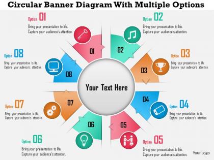
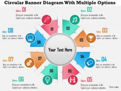
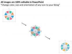
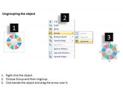
Make an everlasting impression on your audience by inserting circular banner diagram with multiple options PowerPoint template in your presentation. The eight stages PPT design has been quite useful for the business presenters as they are able to make an impact with it. The colors and icons are wonderfully used in the designing of this slide. Getting the options available is always better for the business as it enables to select the appropriate one. This PowerPoint slide made it possible for the individuals to show the creative and engaging design to the audience. The template is editable and can be changed as per your interest. You are allowed to edit it and share it as you would like to. Downloading this useful PPT visual will give you a chance to let your team understand the importance of creating the multiple options so that it makes it easier for them to go for the right one as and whenever required. The design is valuable for business and marketing related presentations. Brilliance finds a friend in our 0115 Circular Banner Diagram With Multiple Options PowerPoint Template. They are an exceptional companion.
People who downloaded this PowerPoint presentation also viewed the following :
0115 circular banner diagram with multiple options powerpoint template with all 5 slides:
Whatever the domain our 0115 Circular Banner Diagram With Multiple Options PowerPoint Template can assist you. Get a good grasp of the basics.
FAQs for 0115 circular banner diagram with multiple
Oh, circular banners are perfect for stuff that loops back around - like workflows or customer journeys that don't really have a hard stopping point. Way better than just listing things out in boring bullet points, honestly. They guide people's eyes naturally around the whole thing, which makes complicated processes way easier to follow. I use them all the time for project cycles where each step feeds into the next one. Plus they just look more interesting than regular diagrams? Next time you're trying to explain something that's more of a continuous cycle than a straight line, definitely try one out.
Dude, circular banner diagrams are honestly a game-changer for presentations. They're perfect when you need to show stuff that repeats or flows into itself - like customer journeys or project cycles. Way better than those boring bullet point lists everyone uses. Your audience can actually *see* how each step connects back to the beginning. I always use different colors for each section (makes it pop), but don't go crazy with the text or it'll look messy. They just look so much more professional than regular flowcharts. Trust me, people stay way more engaged when there's something visual to follow.
Honestly, I'd just start with Canva - it's got a bunch of circular templates and you can literally drag stuff around until it looks good. Super easy. Adobe Illustrator is way more powerful if you want to get fancy with custom curves and shapes, but man, that thing has a learning curve. I spent like two hours just figuring out the pen tool when I first tried it lol. Figma works too if you're already using it for other stuff. But yeah, Canva first for quick stuff, then maybe graduate to Illustrator later when you hate yourself enough to learn it properly.
Dude, circular banners are way better for keeping people engaged. With linear ones, people just scan left to right and bounce - it's like a boring to-do list. But circles? Your eye naturally follows the flow around and around. People actually stick around longer studying how everything connects. I'm probably biased because I love good design, but I've seen this work so many times. The visual rhythm just pulls you in differently than straight lines do. You should test it out - pick one of your linear processes and make it circular. I bet you'll get more people asking questions about it.
Oh dude, marketing agencies and consulting firms are obsessed with these things! Tech companies too. They're great for showing stuff that cycles - like customer journeys or product development loops. Honestly way better than regular flowcharts when there's no real "start" or "end" point. I've seen them in every business presentation lately (maybe I'm just noticing them more?). Perfect for continuous improvement workflows or showing how different stakeholders connect. Try one next time you're mapping out processes that circle back on themselves!
Yeah, they totally work! Circular banners are great for stuff that loops - like project cycles or customer journeys. Percentages look pretty slick in them too. Honestly, they're way more eye-catching than regular bar charts (which can be mind-numbing). Just watch out for readability since curved text is harder on the eyes. Oh, and don't force your data into a circle if it doesn't make sense. I've seen people do that and it looks awkward. They're best when your data actually has some cyclical flow to it.
Start with your main message front and center - that's what people see first. Then arrange everything else so it flows naturally clockwise around the circle. I'm obsessed with color coding for this stuff, it makes categorizing sections so much easier. Don't cram too much text in there though. White space still matters, even in circles. Mix up your text sizes to show what's important vs supporting details. The whole thing should feel logical when someone's eye moves around it. Test it out - can people follow along without getting confused? Short sentences work. So do longer ones that actually breathe.
Honestly, color psychology is pretty powerful when you use it right. Red and orange work great for urgent stuff or when you want people to click something. Blues and greens are better for data sections since they're more calming. Make sure adjacent sections have enough contrast so people can actually tell them apart - nobody wants to squint at your presentation. Oh, and different cultures see colors differently, so think about your audience. I'd stick to maybe 3-4 colors total so it doesn't look like a rainbow exploded. Start by figuring out what vibe you want each section to have, then pick colors that match.
Honestly, white text on dark backgrounds is your best bet for readability. Don't try to force horizontal lines - following the circle's curve looks way more natural anyway. Make your font big enough that people can actually read it from wherever they'll be viewing it. Arial or Helvetica work great since they're clean and simple. If you've got longer text, break it up into chunks around the circle instead of shoving it all in one spot. Oh, and definitely step back from your design (or zoom out) to check if it's still legible from a distance - you'd be surprised how often that reveals problems you missed up close.
Honestly, circular banner diagrams work great for brainstorming sessions. Put your main topic dead center, then scatter related ideas around it on separate banners. People can actually see everything at once instead of squinting at some tiny whiteboard. The flow keeps everyone thinking in loops rather than straight lines - way better than those boring bullet lists we usually get stuck with. Oh, and there's something about the circle shape that makes it feel less formal? Like, people aren't afraid to throw out weird ideas. Start with maybe 4-6 sections and just fill them as stuff comes up.
Ugh, don't cram a novel into each section - nobody can read that mess. Make your segments different sizes if they actually represent different data (this one drives me nuts when people ignore it). Stick with clockwise flow unless you're being artistic or whatever. Colors shouldn't clash or make your text invisible - seems obvious but you'd be surprised. Oh, and please don't use microscopic fonts that require squinting. I always zoom out to check how it'll actually look during presentations. Simple beats fancy every time.
Colors are tricky - red screams "danger!" to Americans but means good luck in China. Reading patterns matter too since some cultures go right-to-left, so design your flow accordingly. Keep text super minimal and ditch idioms that'll confuse people. Icons can backfire too - thumbs up isn't positive everywhere, which honestly surprised me when I first learned that. My advice? Don't try making one perfect global version. Create a few cultural variants instead. Way less headache and you'll actually connect with people rather than accidentally offending them.
Honestly, circular banner diagrams are perfect when you've got complex stuff that connects in a loop - like customer journeys or project cycles. Way better than boring bullet points, trust me. They show how everything flows together without needing a "start here" point. Your audience gets the big picture but can still focus on individual pieces. I use them whenever traditional charts make things feel overwhelming or too linear. Oh, and they just look cooler too - people actually pay attention instead of zoning out. Try one next time you're presenting layered info that doesn't fit neatly into steps.
Hotspots are your best friend here - make them clickable so people can hover or tap for more details. Animated transitions look super smooth when switching between data sets too. I'd definitely add interactive filters so viewers can toggle time periods or categories. Some of the coolest ones I've seen actually rotate the whole thing! Pop-up modals work well, or you could do drill-down stuff where clicking opens a mini breakdown. Figma and Adobe XD handle this pretty easily, though honestly even PowerPoint's animation tools aren't terrible for basic stuff. Start with simple hover effects first.
Honestly, circular banners are way cooler now than they used to be. You're seeing tons of animated stuff and gradient fills instead of those boring flat designs. The asymmetrical thing is huge - like, sections don't have to be perfectly divided anymore which looks way more interesting. Everyone's doing these layered effects with semi-transparent overlays that actually make them pop. Brand colors are getting more creative too, not just the basic palette stuff. Oh and interactive hover effects are everywhere now. You should definitely check out some recent PowerPoint templates on design sites to see what's trending in your field specifically.
-
Easy to edit slides with easy to understand instructions.
-
Much better than the original! Thanks for the quick turnaround.