

0115 iceberg diagram with text representation powerpoint template




Try Before you Buy Download Free Sample Product
 Impress Your
 Audience
 100%
100% Editable
 Save Hours
 of Time


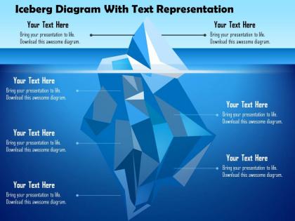
Get access to iceberg diagram with text representation PowerPoint template. This presentation slide can assist you to highlight the concept that you would like to show to your audience. Usually, whenever we see an iceberg, the part that is visible above water in reality is only a tiny piece of a very large whole. Likewise, individuals often think of values as the various observable features of a group that we can perceive with our senses be it their dances, music, food, arts or welcome customs. Our PPT diagram enables you to make an impact on your audience by showing the information related to your trade in the most innovative manner. Presentation design can be easily download and edit according to the business need as it is completely editable. You can present it any form and then present it among the people that attend the session. We have assortment of more useful designs that you can check and download for your presentation. Take a look and then decide accordingly. Our 0115 Iceberg Diagram With Text Representation Powerpoint Template enjoy being of greater benefit to you. Affordability is a factor for them.
People who downloaded this PowerPoint presentation also viewed the following :
0115 iceberg diagram with text representation powerpoint template with all 5 slides:
Get the cake and eat it too. Our 0115 Iceberg Diagram With Text Representation Powerpoint Template will ensure you do.
FAQs for 0115 iceberg diagram with text
So basically it's about showing what people can see vs. all the stuff that's actually causing problems underneath. Like a real iceberg - you only see the tip, but there's this massive chunk below that'll sink the Titanic, you know? Super useful for work stuff when everyone's focused on obvious issues but missing the real causes. Top part = symptoms and surface problems. Bottom = the actual root causes, beliefs, assumptions driving everything. Honestly works for personal stuff too - why you procrastinate, team conflicts, whatever. Just grab one of those templates and start brain-dumping. Gets people thinking past the obvious pretty quick.
So basically, iceberg diagrams show what's obvious on top versus all the hidden stuff underneath. You map the surface-level symptoms or behaviors at the tip, then dig into the real causes below the waterline. I've found it pretty useful for figuring out why things actually happen instead of just what you can see. Works great for analyzing problems, understanding company culture, customer behavior - whatever. You'll probably start noticing connections you missed before. The whole point is getting past your first impression and thinking about the deeper systems at play. Pretty simple concept but surprisingly effective once you get the hang of it.
So you'll want three sections for your iceberg thing. The tip shows what everyone can see - symptoms, obvious behaviors, surface stuff. Then there's the waterline dividing everything. But honestly, the underwater part is where the magic happens. That's your root causes, hidden beliefs, systemic problems - all the messy stuff that's actually causing what shows up on top. Make this section huge compared to the tip, because that's how it works in real life. Oh, and throw in some questions for each layer so your team knows what they're supposed to dig into. Way more useful than just staring at a blank template.
You know how most of an iceberg is underwater? Same concept here. What people see on top - the behaviors, fights, symptoms - that's just the tip. All the real stuff is hidden below the waterline. Like when you're arguing about dishes but you're actually mad about feeling unappreciated, you know? The underwater part should be way bigger since that's where the root causes live. I always start with the obvious surface stuff first, then keep asking "but why is this really happening?" until you hit the deeper beliefs and assumptions driving everything. Works for pretty much any problem.
So basically healthcare, consulting, and tech companies use iceberg diagrams all the time. They're perfect when you need to show there's way more going on under the surface - like root causes or hidden problems your audience doesn't see. Finance and education love them too. Honestly, I've probably sat through a hundred presentations with these things. Any industry dealing with messy, complex systems will benefit. The visual just clicks with people immediately. If you're trying to explain why quick fixes won't work and there's deeper stuff happening, definitely use one in your next presentation.
Yeah, iceberg diagrams are actually super useful! I use them all the time for workplace stuff - like showing how toxic behavior you can see is just covering up deeper problems with company values. Project failures are perfect for this too. Everyone focuses on the technical mess, but usually it's terrible communication and fuzzy requirements that actually killed it. Same with customer complaints - they're mad about one thing, but the real issue is probably bad training or broken processes. Honestly, they're kind of a lifesaver when you need to show people there's more going on than meets the eye.
Honestly? Make it about *them*. Swap out those boring placeholder examples for stuff they actually deal with every day. Use their company colors if it's internal. The whole point is getting people to think "oh shit, that's exactly our situation" when they see the tip part. Generic templates are just... meh. Nobody cares. But when you throw in their industry lingo and real scenarios they'd recognize? They'll actually pay attention instead of zoning out. I always think the language matters too - don't make it sound like a textbook. Your audience should see themselves in it, you know?
Honestly, just go with Canva - you can search "iceberg template" and boom, you're done. If you need something fancier, Lucidchart's pretty solid for diagrams. PowerPoint works too if you're already using it for other stuff. Oh, and Miro's amazing if you're working with other people on it - like, actually game-changing for brainstorming. Figma's there if you want to get all designer-y about it. Draw.io exists too but eh, might be overkill. Start simple though - Canva will probably do everything you need.
Okay so iceberg diagrams are actually pretty cool for this kind of stuff. You put the obvious problem at the top, then dig deeper into what's really causing it underneath. Most people just see surface-level issues and try to fix those, but the real culprits are buried way down in the system. Think of it like - why does your car keep breaking down? Sure, maybe it needs oil, but maybe the real issue is you bought a lemon. The visual part makes it way easier to see how everything connects. Your team can finally address the actual root causes instead of constantly firefighting. Honestly wish more people used these things.
Okay so the biggest thing - don't cram a million bullet points into each layer. People's eyes will glaze over instantly. Stick to maybe 3-5 max per section. The flow between levels matters too. You can't go from basic stuff straight into PhD-level complexity - has to feel natural as you go deeper. Skip the boring generic labels like "challenges" and "factors." Be specific to whatever you're actually talking about. Oh and definitely run through it out loud first! I learned this the hard way. If you can't explain it smoothly to someone else, your audience won't get it either.
Honestly, iceberg diagrams are way more powerful when you mix them with other stuff. Flowcharts work really well - they'll show how those surface problems actually connect to the deeper processes underneath. I've had good luck with timelines too, especially when you're trying to show how the root issues built up over time. Mind maps are probably my favorite combo though... you can just branch out from each level and explore all the related factors. Oh, and cause-and-effect charts are clutch for root cause analysis. Just use the iceberg as your main thing, then add other visuals to dig into whatever sections need more detail.
Okay so with colors, you really want contrast between the tip and underwater parts - that's what makes the whole thing work. Don't go overboard though (I've definitely been guilty of this). Two or three colors max, seriously. Light blue for surface stuff, darker blue for the deeper causes - something like that makes sense. The main thing is your audience should immediately see the difference between levels. Oh and here's a quick test: squint at it. If everything blurs together, you need to adjust. Trust me, simple beats fancy every time with these diagrams.
So for colors, go dark blue underwater and lighter shades on top - creates good contrast. Label everything clearly with the same font sizes. Here's where I always screw up: make the hidden part way bigger than what shows above water! Short phrases work better than long text blocks. Don't cram everything together either. When you present it, start at the top and work down, explaining why each buried layer actually matters. Honestly, the spacing thing makes a huge difference in how professional it looks. Oh and definitely test it on someone first - they'll spot the confusing bits you missed.
The iceberg thing is actually pretty clever for strategy sessions. Basically you put the obvious problems above the water line, then dig into what's really causing them underneath. Most teams just keep fixing surface stuff without getting to the root issues - drives me crazy honestly. Your whole group can suddenly see patterns they'd miss otherwise since it's all visual. Short sentences work great for the visible problems. Then when you map out the deeper systemic stuff below, you're naturally building solutions from the ground up instead of just slapping band-aids on everything.
Honestly, just do quick polls while you're presenting - "does this make sense?" or "want me to go deeper here?" Works every time. Send out surveys after asking what was valuable and what confused people. But here's the thing - body language tells you everything. If faces look blank when you reveal the next layer, you're going too fast. Have someone review your diagram first to catch weird logic jumps between levels. The whole point is making sure people can actually follow how you get from surface symptoms down to the real root causes. Sometimes I overthink this stuff, but those basics never fail me.
-
Informative presentations that are easily editable.
-
Very unique and reliable designs.