


0115 three arrows for text representation powerpoint template





Try Before you Buy Download Free Sample Product
 Impress Your
 Audience
 100%
100% Editable
 Save Hours
 of Time


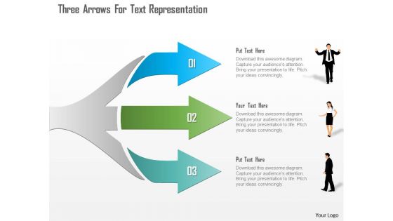
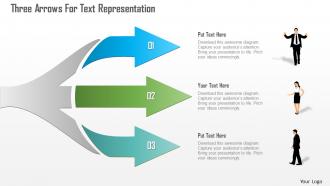
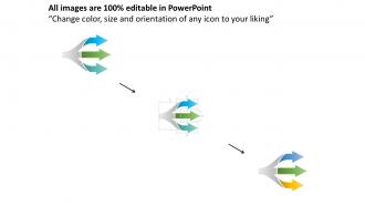
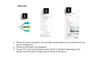
Download our three arrows for text representation PowerPoint template to mark your presentation unique among your audience. Present three arrows for text representation PowerPoint template design. A well conceptualized presentation slide helps you to leave a lasting impression on your viewers. Considering this, we are offering text representation PPT illustration to demonstrate business aspects in the professional manner. Our designing experts have crafted this masterpiece after complete research and analysis, the reason is to provide you an access to the appealing presentation visual that allows you to share the message. You may use this PowerPoint slide to lay emphasis on important business meetings, conferences, events etc. Additionally, you can select this presentation image in order to show the roles and responsibilities of the business professionals. Also, you can download and use this PPT slideshow to data related to individual growth as well. This presentation graphic is easily amendable so you may present it as you want to. The elements can be edited or replaced depending upon the business requirement. Give a glimpse to other sections of our website where you will find relative designs for your presentation. Make use of our 0115 Three Arrows For Text Representation Powerpoint Template to create presentations that leave lasting impressions. Here we present our well conceptualized three arrows for text representation PowerPoint templates. This text representation layout contains creatively designed three arrows to show the business aspects of your organization in a professional way. You may use text representation models with visuals that allow laying emphasis on important business meetings, conferences, events etc. Besides that, you can choose our three arrows representation PPT to showcase the roles and responsibilities of your team members. You can use this PPT slideshow to present the roles and responsibilities of your business professionals. The presentation graphics can be easily modified the way you want to present. You can easily add, remove or replace the other elements such as text color, font color, font size as per your convenience. Our three arrows text representation classification contains a different color background for each section to highlight the text in a professional manner. Download our three arrows for text representation PowerPoint template to mark your presentation unique among your audience. Present three arrows for text representation PowerPoint template design. A well conceptualized presentation slide helps you to leave a lasting impression on your viewers. Considering this, we are offering text representation PPT illustration to demonstrate business aspects in the professional manner. Our designing experts have crafted this masterpiece after complete research and analysis, the reason is to provide you an access to the appealing presentation visual that allows you to share the message. You may use this PowerPoint slide to lay emphasis on important business meetings, conferences, events etc. Additionally, you can select this presentation image in order to show the roles and responsibilities of the business professionals. Also, you can download and use this PPT slideshow to data related to individual growth as well. This presentation graphic is easily amendable so you may present it as you want to. The elements can be edited or replaced depending upon the business requirement. Give a glimpse to other sections of our website where you will find relative designs for your presentation. Make use of our 0115 Three Arrows For Text Representation Powerpoint Template to create presentations that leave lasting impressions.
People who downloaded this PowerPoint presentation also viewed the following :
0115 three arrows for text representation powerpoint template with all 5 slides:
Folks express complete agreement with our 0115 Three Arrows For Text Representation Powerpoint Template. They find your conclusions extremely convincing.
FAQs for 0115 three arrows for text
So you want a clear title and different sections for whatever content you're making. Add some placeholder text - think Mad Libs but less fun, more professional. Consistent formatting is huge here. Don't forget metadata stuff like dates and tags or you'll hate yourself later when trying to find anything. Honestly, the trick is making it structured enough that people can't completely mess it up, but flexible so they don't feel trapped. Start simple with one template and see how your team actually uses it before going crazy with features.
Okay so contrast is everything - dark text on light backgrounds, readable fonts that people can actually see from way back there. I always test my slides on the actual screen first because what looks good on my laptop usually doesn't translate. Keep it simple with maybe 2 fonts max? White space is your friend here. Don't be that person with rainbow slides that hurt everyone's eyes lol. Bullet points help but don't go crazy. Make sure your headers look different from body text - hierarchy matters. Pick a basic color scheme and stick with it.
Honestly, color choices can make or break whether people actually read your stuff. High contrast is your best friend - dark text on light backgrounds works every time. Use maybe 2-3 colors tops for text, otherwise it looks like a kindergarten art project (learned that one the hard way). Colors help create hierarchy too, so people know what to look at first. Oh, and don't forget about colorblind folks - it's like 8% of guys who struggle with certain combos. I'd definitely test it on your phone and laptop before you finalize anything. Maybe get someone else to look at it real quick?
Oh this is actually pretty interesting stuff! Sans-serif fonts (Arial, Helvetica) are way better for screens - they're just cleaner and easier to scan. For printed stuff though? Serif fonts like Times New Roman win every time, even if most people don't really notice. Here's the thing that drives me crazy: people go overboard with fancy script fonts and completely kill readability. Your users end up focusing on decoding the letters instead of actually reading your content. Honestly, just pick 2-3 solid fonts and test them out with real people.
Okay so for messy complex data, go with structured stuff - tables, hierarchical lists, comparison charts. Tables are clutch when you've got tons of data points spread across different categories. Makes everything way easier to scan. Hierarchical templates work best for layered info where the relationships actually matter. I swear, people always try cramming everything into paragraph form and wonder why it looks terrible. Comparison matrices? Perfect for showing differences between options. Oh and don't force your data into whatever template looks prettiest - match the structure to what you're actually working with.
Start by thinking about different user needs right from the beginning. Clear language beats jargon every time - seriously, nobody wants to decode corporate speak when they're trying to get stuff done. Make sure you've got good contrast for visual elements and don't forget alt text for images and icons. Screen readers can be pretty finicky about this stuff. Your text should scale nicely across devices too. Oh, and consider reading levels - not everyone processes information the same way. Some folks love bullet points, others need everything in paragraph form. Test with real people before you launch anything though, that's where you'll catch the issues you didn't see coming.
So basically you want your text and images to play nice together instead of fighting each other. Match your alignment - like if images go left, keep text blocks left too. Give everything room to breathe because cramped stuff looks awful (learned that the hard way). Your biggest headline should go with your most eye-catching visual. Put related text near its matching image so people connect them automatically. I'd sketch the layout first, then dump in your content and mess with spacing until it feels right. White space is your friend here - don't be scared of it.
Dude, slide length is huge for keeping people awake. I swear, the second you cram too much text on there, everyone's phones come out. Stick to like 20-30 words max per slide - bullet points work great. There's this 6x6 thing where you do 6 bullets with 6 words each, which honestly sounds super rigid but it actually works. People should be listening to YOU, not squinting at paragraphs. Oh and pro tip - dump all the extra details in your notes or make a handout. Way better than losing your audience halfway through.
Oh man, don't pack your slides with massive paragraphs - I've sat through too many presentations where I'm basically reading a textbook. Stick to bullet points or short phrases. Make your font big enough so people in the back can actually see it without binoculars lol. Break up text with some spacing or headers so it's not just one giant block. And honestly? Skip the fancy fonts - they look cool but are usually impossible to read. I always think about whether I'd want to stare at whatever I'm putting up there.
So instead of just dumping facts in your templates, try building them like mini-stories. Use that whole problem-struggle-solution thing, or go with before/during/after scenarios. People's brains are wired to follow narratives anyway - might as well work with that. Map out what emotional journey you want readers to take first. Then structure your template sections around that flow. Like, what's the conflict your audience faces? How do they transform by the end? I know it sounds kinda cheesy, but giving your content that story backbone makes people actually want to keep reading instead of skimming through boring bullet points.
So there's tons of options for text templates. Jinja2 is honestly amazing if you're using Python - super flexible and the docs are solid. JavaScript? Go with Handlebars. Mustache works across different languages which is pretty neat. These all handle variables, loops, conditional stuff - the works. Actually, hold up - what's your use case like? If it's just basic text swapping, Python's f-strings might be overkill territory. Don't overcomplicate things if you just need simple substitution. But yeah, figure out how complex your templates need to be first, then pick accordingly.
Oh man, this stuff is trickier than you'd think! Some cultures read right-to-left or top-to-bottom, so your whole layout gets flipped. Font choices can come across as too aggressive or too casual depending on where you're presenting. Colors are huge too - red screams "danger" here but means good luck in China. Plus some audiences want every detail spelled out while others just want bullet points. Honestly, I'd research your specific audience first and maybe run it by someone from that culture if you know anyone. Way better than guessing and looking clueless up there.
Dude, bullet points are a lifesaver for text-heavy slides. Nobody wants to stare at paragraph after paragraph - it's brutal. Your audience will actually read bullets instead of just zoning out. They can scan quickly and catch the main points without their brains shutting off. I learned this the hard way after watching people's faces go blank during my early presentations lol. Break stuff into chunks. Use bullets as your talking points so you're not just reading word-for-word. Honestly, if I've got more than 3-4 lines of regular text, I'm switching to bullets every time.
Start with flexible layouts that work for both screen and print. Big fonts, plenty of white space, and high-contrast colors are your friends—they'll look decent even in grayscale. Honestly, I've watched so many gorgeous digital designs turn into complete disasters when people hit print. Test early and test often, seriously. Line spacing needs to be generous because what looks fine on your monitor might be cramped on paper. Oh, and always do real test prints, not just the preview thing. You can create separate print stylesheets if you're feeling fancy, but the main thing is avoiding tiny text that becomes impossible to read.
Contextual embeddings are where it's at now - BERT, GPT, all those transformer models basically killed off static word vectors. They're insane at picking up context, so sarcasm and weird ambiguous stuff actually makes sense to them. Multi-modal is blowing up too, mixing text with images or audio in one representation. Oh and everyone's obsessed with smaller models you can run locally without your electricity bill going crazy. Static embeddings are pretty much dead at this point. I'd definitely focus on the contextual stuff if you're learning.
-
Very well designed and informative templates.
-
Great product with highly impressive and engaging designs.