


1 year timeline activity good ppt example




Try Before you Buy Download Free Sample Product
 Impress Your
 Audience
 100%
100% Editable
 Save Hours
 of Time


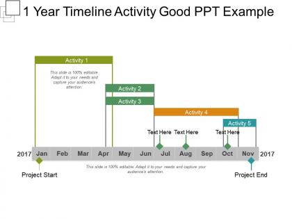
Get this 1 Year Timeline Activity Good PPT template and plan your activities in an organized manner. Planning activities using our PPT template will allow your audience to understand how the activities need to be done and how much of the work remains undone. The main purpose of using the timeline template is to summarize all the necessary information that will be required by any employee in achieving the goals of the organization. It will allow you to keep track of the achievements and the date of completion of the activities. It is 12 month timeline slide where you can plan the activities for 1 year. Use the creative timeline template to provide correct visibility of the current and future state of the business. When you want to tell your audience a story that involves many events across time, this 1-year timeline slide can be used at such places. With visual support, the users will be able to map the sequence clearly in a well-defined manner. Use this timeline activity template, to provide an overview to the audience for the activities set for the organization.
People who downloaded this PowerPoint presentation also viewed the following :
1 year timeline activity good ppt example with all 5 slides:
Our 1 Year Timeline Activity Good Ppt Example ensure they are content with their explanation. They allow you to give heed to their demands.
FAQs for 1 year timeline activity
Okay so first thing - work backwards from your big deliverables to figure out realistic deadlines. Map out which tasks depend on others finishing first. You'll want to assign resources and identify key people for each phase. Trust me, add buffer time because stuff always goes sideways. Use colors or symbols to track different workstreams - makes it way easier to scan. Flag anything on the critical path and external risks that could mess things up. Oh and definitely set up quarterly check-ins. Your perfect plan won't survive contact with reality, so you need those review points to pivot when needed.
Honestly, visuals are a game-changer for timelines. Icons and color coding beat boring text blocks every time. I like using different colors for each project phase - makes everything pop. Add some milestone markers too, maybe even mini progress charts. Dependencies? Show them with arrows or connecting lines. Your audience won't get lost that way. Oh, and group similar stuff with matching visual elements - keeps things clean. A timeline that actually tells a story instead of just listing dates? That's the sweet spot. People remember visual stuff way better than walls of text anyway.
Honestly, just start with PowerPoint or Google Slides since you probably already have them. Their timeline templates are decent enough. Canva's where it's at though if you want something that actually looks good - their timeline stuff is pretty sleek and you don't need to be a designer. There's fancier options like Lucidchart or Visme but they're kinda overkill unless you're doing something super detailed. I'd stick with what you know best. The real trick is keeping it clean and only highlighting the milestones that actually matter. Nobody wants to read every tiny detail anyway.
You've gotta totally switch up your approach for each group. Stakeholders want the big picture stuff - ROI numbers, major milestones, what it means for the bottom line. They don't care how the sausage gets made, just whether it tastes good. Employees need the opposite though. Tell them exactly what they'll be doing, how it helps their career, why their piece matters. I swear, nothing's more painful than watching someone pitch the same presentation to both audiences. It never works. Quick tip - before you start, just ask yourself what each group actually needs to hear to either approve your project or do their job better.
Honestly, chunk it into quarters so you don't lose people right away. Visuals are your friend here - timelines, progress bars, that kind of stuff. I've watched so many presentations where someone dumps everything onto dense slides and everyone's checked out by slide 3. Pick your biggest wins and turning points with actual dates. Color code different phases consistently. Maybe add some interactive bits? Clickable sections work well, or just pause for quick questions. The real trick though - explain WHY things shifted when they did. People want the story behind the timeline, not just a bunch of dates thrown at them.
Grab your project management tools and quarterly reports first - that's where the good internal stuff lives. Meeting notes are gold too. For external data, hit up industry reports and competitor announcements. Economic events or seasonal trends that affected your timeline? Those actually make great story elements. Different departments probably have random data you haven't seen yet, so ask around. Oh, and regulatory changes if they apply to your space. I'd dump everything into a spreadsheet with dates and impact levels - makes filtering way easier when you're building the presentation.
Figure out your must-hit deadlines first - the stuff that'll tank other projects if it slips. Color-coding helps a ton (I'm obsessed with swim lanes honestly). Only put things on there that either block other work or have external deadlines you can't budge. Resource conflicts are huge too, so map those out. Don't go crazy trying to fit everything - maybe 3-5 key things per project max. Your timeline should tell the story of what actually matters, not be a massive brain dump. Keep a detailed doc somewhere else for all the smaller stuff you're tempted to squeeze in.
So basically, nobody wants to sit through a boring timeline that's just dates and bullet points. Instead, think about it like you're telling your friend what happened over this crazy year. Start with where you were, then walk through the messy parts, the wins, the "oh shit" moments - all of it. People remember stories way better than spreadsheets anyway. Your stakeholders need to see how everything connects, not just a random list of stuff that happened. Find your main thread first (like "how we pivoted when everything went sideways"), then hang all your data and milestones onto that story. Makes it actually stick in people's heads.
Honestly, feedback is like your cheat sheet for nailing it next time. Pay attention to what keeps coming up - maybe everyone wanted more Q3 details or your milestones were confusing? People are weirdly predictable about what trips them up. I'd keep a simple log after each presentation (sounds nerdy but trust me). Was your dependency mapping too complex? Goals too vague? The real trick isn't just collecting all these comments - you've got to actually use them to fix your template. Otherwise you'll just keep making the same presentation mistakes over and over.
Honestly, just go with blues and grays as your main colors - they look professional without being boring. Then pick one bright accent color (orange or green work great) for your important dates and milestones. I've made the mistake before of using too many colors and it looked terrible lol. If you're showing different phases, try using the same color family but in different shades, like light blue to dark blue. Oh, and definitely check that your text is readable against whatever background you pick - sounds obvious but you'd be surprised how easy it is to mess that up.
Here's what I'd do - throw those potential roadblocks right onto your main timeline slides with little warning icons or red flags. Super visual, can't miss them. Don't just list the problems though - put your backup plan right there too so everyone sees you're not winging it. Honestly, I've seen too many people bury this stuff in appendix slides that nobody ever reads. Way better to be upfront about what might go sideways. Your timeline looks way more legit when you're calling out risks yourself instead of pretending everything will go perfectly. Shows you actually know what you're talking about.
Honestly, just go with PDF or PowerPoint - they work on everything and won't mess up your formatting. PDF's great if you want it locked down and viewable by anyone. PowerPoint's better when people need to edit stuff. Google Slides is decent too, especially if your team already uses Google everything (which, let's be real, most do now). You could get fancy with Prezi or those interactive timeline things, but that might be way more than you need. I'd probably do PDF for anything final and PowerPoint when you want feedback.
Pick 3-5 big wins and group everything else under those. People's eyes glaze over when you list every tiny thing you did - learned that the hard way! Show the stuff that actually mattered with some visuals to connect the dots. Spend maybe 2 minutes max on each milestone, then tie it back to what it accomplished. Oh, and practice those transitions so you don't sound robotic moving between sections. Honestly, save the detailed timeline stuff for a handout. Nobody wants to sit through that during your actual presentation.
Dude, don't cram every tiny detail on there - people's eyes will glaze over instantly. Stick to the big milestones that actually matter. Your project probably isn't perfectly linear either, so show those overlapping phases instead of pretending everything happens in neat little boxes. Make your dates realistic too (I've seen way too many timelines that implode by month two because someone was being way too optimistic). Build in buffer time and flag your major dependencies right upfront. That way stakeholders know what could mess things up before it happens.
Quarterly milestones are way better than trying to cram in monthly stuff - trust me on this one. Pick 3-4 big wins or phases for each quarter, then connect them with arrows or whatever timeline format works. Nobody wants to stare at every tiny deliverable on one slide, honestly. Group similar things under bigger themes like "Foundation Building" or "Market Expansion." Stay high-level for the main presentation. You can always stick the detailed stuff in backup slides if someone asks. Oh, and wrap up each quarter with the key result or metric - it gives people that satisfying sense of progress.
-
Use of different colors is good. It's simple and attractive.
-
Qualitative and comprehensive slides.