
Timeline ppt summary design templates


Try Before you Buy Download Free Sample Product
 Impress Your
 Audience
Editable
of Time


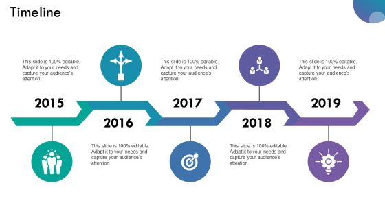
Avoid errors of judgement with our Timeline Ppt Summary Design Templates. Carry out in depth investigation of individual inputs.
People who downloaded this PowerPoint presentation also viewed the following :
Timeline ppt summary design templates with all 5 slides:
Be assured our Timeline Ppt Summary Design Templates will grab you. Feel astounded by their amazing brilliance.

FAQs for Timeline ppt
First, nail down your key dates - that's your foundation. Flow should go left to right or top to bottom, whatever feels natural. Use consistent date formatting throughout (seriously, mixed formats look messy). For colors, stick to 3-4 max - I've seen way too many that look like someone threw up skittles on them! Different font sizes help create hierarchy. Icons can work if they actually add something. Oh, and make sure your descriptions are clear but not too wordy. Nobody wants to read a novel on each milestone. Sketch the dates first, then build everything else around those.
Honestly, visuals are a game-changer for timelines. Icons work great for showing different phases, and color coding helps people track themes. Progress bars are clutch for visualizing growth too. Photos hit different though - like showing your team celebrating beats just writing "Q3: 50% growth" any day. Charts can display the actual impact of each event. Oh, and keep your visual style consistent so everything flows together. The trick is matching your visuals to whatever emotional vibe you're going for. Makes it way more memorable than just listing dates.
Honestly, everyone's going super minimal this year - tons of white space, chunky fonts, maybe some subtle animations but nothing crazy. It's like we're all wannabe Apple designers lol. Instead of boring bullet points, try progress bars or those little milestone icons for your data. Makes everything way more scannable. Interactive stuff is huge too if your presentation allows it. The whole vibe is clean and modern but still polished enough that you don't look amateur. Canva and Slidesgo have some solid examples if you want inspiration - I was browsing there yesterday actually.
Honestly, it's pretty straightforward - just swap out the content for your stuff. Change the colors to match your brand (obviously), and replace those generic icons with ones that make sense for your industry. A basic project timeline works great for construction milestones, product launches, whatever. You might need different time scales though - like quarterly instead of monthly. Oh, and add your industry-specific phases. Pharma companies always need that "regulatory approval" step, you know? Start with your key milestones, then find a template layout that won't confuse your audience. Pretty flexible once you get the hang of it.
Honestly, templates are a lifesaver - all the design work's already handled so you just drop in your info. The spacing and colors look way more polished than anything I could create from scratch (I'm definitely not winning any design awards). You get consistency throughout your whole presentation, plus most come with different slide options to pick from. Way better than trying to build something with those basic PowerPoint shapes - that always looks janky. Just switch up the colors to match your company and you're set. Saves hours of frustration too.
Honestly, timeline templates are lifesavers for project stuff. They make everything visual so your team actually gets what's happening instead of staring at confusing charts. Milestones and deadlines become super clear. Stakeholders eat this up too - way better than those messy Gantt charts that nobody wants to look at. Updates are easy when things change (and they always do, right?). Just grab a template that fits how complex your project is. Oh, and actually use it in meetings to keep people focused. Sounds obvious but you'd be surprised how many people forget that part.
Timelines are perfect for project milestones, product launches, company histories - basically anything that happened in sequence over time. I use them all the time for roadmaps and campaign phases. Research findings work well too if they're chronological. Just make sure you've got clear start/end points with actual meaningful events between them. Don't go crazy though - stick to maybe 5-8 major milestones tops. More than that and it gets messy real quick. Oh, and they work whether you're talking weeks, months, or years. Pretty flexible format honestly.
Entrance animations are your best friend for timelines – fade in or fly in from left work perfectly. Your audience won't read ahead and get distracted. Set everything to "on click" so you control the pace. Between timeline sections, go with subtle transitions like push or morph (if you've got newer PowerPoint). Honestly though, don't go overboard. Nobody wants flashy animations that scream 2003 business presentation vibes. Keep it purposeful, not just pretty. Less really is more with this stuff – I learned that the hard way after watching people zone out during overly animated slides.
Just use PowerPoint honestly - you've probably already got it and it does everything you need. Shape editing, colors, text formatting, the works. Canva's pretty solid too with all the drag-and-drop stuff, way easier to use actually. Free version's kinda limited though. Adobe Illustrator exists if you're feeling fancy, but that's total overkill for timelines. Google Slides works fine too, especially if you're sharing it with people. My advice? Start with whatever's already on your computer. Most timeline tweaks are super basic anyway - you don't need some expensive design program for moving boxes around and changing colors.
You can drop charts and graphs right onto your timeline slides to show trends with your milestones. Progress bars work great for completion rates at each phase. Line graphs tracking KPIs over time look solid too. Most timeline templates let you add data callouts or mini-charts directly in the flow - honestly way better than boring dates and text. Color-coding helps separate different data categories or performance levels. Just don't go overboard with it. Your audience needs to follow both the timeline story and data without their heads spinning. Oh, and those mini-charts? They're surprisingly easy to customize once you mess around with them.
Ugh, don't cram paragraphs of text into each point - people want to scan quickly, not read a novel. Clean fonts only (maybe two max) because rainbow timelines look like a middle schooler made them lol. Jump around chronologically and you'll confuse everyone. Those 3D effects from 2014? Skip them entirely. I'm telling you, white space is your friend here. Linear flow beats fancy graphics every time. Keep it simple and people will actually follow along instead of giving up halfway through.
Colors can totally make or break your timeline! You need good contrast so people can actually read the text. I'd stick to maybe 3-4 colors tops - otherwise it gets messy fast. Use your darker shades for the big milestones and lighter ones for smaller stuff. Group related things with the same colors so it makes sense visually. Oh, and definitely test how it looks on a projector first because I learned the hard way that what looks great on your laptop screen can look completely washed out when you're presenting. Trust me on that one!
Honestly, consistency is everything. Pick your fonts, colors, and spacing at the start and don't budge. I can't tell you how many timelines I've seen where someone starts clean and minimal, then halfway through decides to throw in some random clipart - it's painful to look at. Your audience wants one smooth story, not like they're bouncing between three different presentations. The spacing thing is huge too, by the way. Stick to your visual rules from slide one to the end. Trust me, it's way better than getting that vague "something feels off" feedback later when you can't figure out what went wrong.
So basically just swap out their default stuff with your actual curriculum content - dates, events, descriptions, whatever you need. Most templates let you throw in images or color-code different periods which looks way better than plain text. The chronological setup is perfect for showing how events connect or track changes over time. One thing though - don't overload each point with tons of text or kids will mentally check out. I learned that the hard way! Keep it simple with key dates and short descriptions, then you can expand on everything when you're actually presenting.
Don't cram a million bullet points on there - people's eyes just glaze over. Keep it clean with consistent colors so it actually looks decent. But honestly? The timeline itself is just your framework. What matters is how you walk through it. Tell mini-stories at each major point instead of just rattling off dates. Like, explain WHY that milestone happened, not just when. Oh, and definitely practice your pacing beforehand - I've seen too many people sprint through 20 years in like 10 seconds. You'll want to pause at the big moments.
-
Excellent Designs.
-
Commendable slides with attractive designs. Extremely pleased with the fact that they are easy to modify. Great work!