


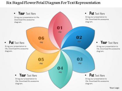
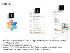
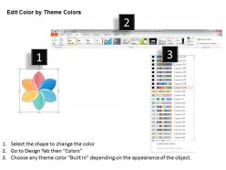
1114 six staged flower petal diagram for text representation powerpoint template




Try Before you Buy Download Free Sample Product
 Impress Your
 Audience
 100%
100% Editable
 Save Hours
 of Time


Our 1114 Six Staged Flower Petal Diagram For Text Representation Powerpoint Template are delivery experts. They bring fresh ideas to your doorstep.
People who downloaded this PowerPoint presentation also viewed the following :
1114 six staged flower petal diagram for text representation powerpoint template with all 5 slides:
Helping hands come forward with our 1114 Six Staged Flower Petal Diagram For Text Representation Powerpoint Template. Folks agree to make effective contributions.
FAQs for 1114 six staged flower petal diagram for text
So basically you draw a circle in the middle with your main idea, then add "petals" around it for different parts of that topic. Each petal covers one specific aspect - like if your center was "starting a business," you'd have petals for funding, marketing, legal stuff, etc. I honestly think it beats regular brainstorming because it's so visual. You can even add smaller petals off the main ones if you need more detail. Usually 4-6 petals works best, but whatever makes sense for your topic. It's also pretty solid for presentations since people can actually see how everything connects.
Put your main topic in the center circle, then give each team member a petal to work on different angles. Way better than those chaotic meetings where nobody listens. Each petal becomes its own focused area - so for marketing brainstorming, you'd have social media on one petal, partnerships on another, etc. The whole visual thing actually keeps people from wandering off topic (which happens more than I'd like to admit). Give everyone ownership of one petal to start with. Honestly works really well for covering all your bases without missing obvious stuff.
Oh, flower petal diagrams are great for when you've got one main problem and need to explore all the different angles. Each petal becomes a separate category or factor - way better than Venn diagrams if you're not worried about overlaps. I use them constantly in those root cause meetings at work (honestly, people seem less stressed by them than other formats). Perfect for brainstorming too since everyone can just throw ideas onto different petals. The visual aspect really helps - you'll see connections you might've missed otherwise. Next complex topic you're tackling? Give one a shot.
Honestly, I'd just use PowerPoint if you've got it - the shape tools are pretty solid and you can crank one out in like 10 minutes. Canva's also really good, especially if you're feeling lazy and want to use their templates (no judgment lol). Google Drawings is free and gets the job done for basic stuff. Oh, and Lucidchart is nice if multiple people need to work on it together. I mean, there's probably fancier options out there, but these will definitely do what you need without making you want to throw your computer out the window.
Yeah totally! Use your brand colors for sure - I'd put your main color in the center, then do complementary shades or different tones for each petal. Just don't make adjacent ones too similar or people will be squinting trying to read it (learned that the hard way). Your brand fonts work great too, plus any borders or shadows that match your style guide. Oh and definitely test it at different sizes first - what looks perfect on your screen might be tiny and unreadable when you actually print it out.
Ugh, the worst thing you can do is cram tons of text into each petal. People will check out immediately. Stick to one key point per section, maybe just a short phrase. Also don't go crazy with like 10+ petals - it gets messy fast and nobody can follow it. Your center concept needs to be super clear since that's where everything flows from. Oh, and resist the urge to shrink your font just to squeeze more stuff in. That's missing the whole point of making it visual in the first place! Start with your main message in the middle, then build out from there.
Honestly, those flower petal diagrams work so well because our brains just eat up organized info like that. Breaking everything into chunks around one main idea? Your audience will actually follow along instead of zoning out. The visual part is clutch too - people remember pictures way better than boring text blocks. I've seen trainings where they let people fill in their own petals during the session, which keeps everyone awake at least. Oh, and use different colors for each petal if you can. Sounds cheesy but it actually helps concepts stick in people's heads way better.
Oh totally! Kids love the visual aspect - way better than staring at boring lists all day. Put your main topic in the center, then each petal becomes a different angle or example. Works amazing for brainstorming or when you want groups to tackle different sections. I've seen it work really well with younger kids especially, though honestly any age gets into it. Students actually start seeing how ideas connect instead of just cramming random facts. I'd probably start simple first time around so they get the hang of it.
Honestly, placement is everything with these diagrams. Put your main points at the top where people look first. Your labels need to be super clear too - I can't tell you how many times I've seen gorgeous flower charts that make zero sense because the text is either too vague or there's way too much of it. Make sure there's a logical flow between your petals and that everything actually connects back to your center concept. Oh, and definitely run it by someone else first - you'll be surprised what doesn't land the way you think it will.
Flower petal diagrams are perfect for one main idea with a bunch of related stuff branching out. Like customer personas with their different traits, or product features spreading from your core thing. Honestly, they're just prettier mind maps if we're being real. Use them when everything connects to the center but isn't ranked in importance - so skip them if you've got strict hierarchies or step-by-step processes. They work best for associative relationships, not parent-child stuff. Next time you need to show how different pieces tie back to one theme, try sketching one out.
Dude, flower petal diagrams are actually genius for presentations! You put your main point in the center, then each petal shows a different factor that connects to it. Way better than boring bullet points that make everyone's eyes glaze over. Like if you're explaining why a project failed, each petal could be budget issues, timeline problems, staffing drama, etc. People can visually see how everything ties together instead of trying to keep track in their heads. I started using them last month and honestly? My boss actually stayed awake during my whole presentation for once.
Hover effects work really well - just reveal more details when someone mouses over each petal. Or make them clickable to expand with extra content. Sequential blooming animations look amazing, especially if the colors shift based on your data. I've seen some where you can actually drag petals around to reorder them, which is pretty slick. Search functionality helps too - highlight specific petals when users type. Oh, and category toggles are clutch for keeping things clean. Honestly, don't overthink it though. Start with one feature and see what clicks with people before adding more bells and whistles.
Definitely get someone else to look at it! Fresh eyes always catch stuff you missed. They'll tell you if your labels are confusing or if the connections between petals don't make sense. Like, I've had people ask "what's this section even supposed to mean?" - super helpful reality check. Also they can see if your colors are working or if you should group things differently. One round of feedback usually makes these diagrams way clearer, honestly. Just share it early and ask specific stuff like "does this flow logically?" Then actually use their suggestions instead of getting defensive about it.
Your brain is basically hardwired to love radial patterns - it's why flower diagrams work so well. They break info into these neat little chunks that radiate out from the center, which is exactly how we naturally process stuff. Way better than boring bullet points, honestly. Each petal feels bite-sized and manageable. The circular design also tricks your mind into seeing everything as connected and complete. I started using them instead of regular charts and people actually retain the information better. Something about that organic flow just clicks with how our brains work.
Honestly, visuals make such a huge difference! People scan images way faster than text, so throw in some icons for each petal - maybe a lightbulb for brainstorming or whatever fits your topic. Your audience will get the gist instantly without squinting at paragraphs. I swear I've watched people's faces change when they see a diagram with actual visual elements instead of just boring text blocks. Plus you'll stick in their memory better since our brains are wired for visual stuff. Just keep the icons simple and on-brand. Your next presentation will hit so much harder.
-
Very well designed and informative templates.
-
Very well designed and informative templates.