


1114 spiral diagrams for powerpoint powerpoint presentation





Try Before you Buy Download Free Sample Product
 Impress Your
 Audience
 100%
100% Editable
 Save Hours
 of Time


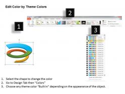
Managing the business process in the efficient manner is important from the growth perspective. Considering this, our team has designed spiral diagrams for PowerPoint presentation design. This PPT slide is quite valuable in showing the information related to the business process flow management as you can display the information about its importance and how it makes an impact on the overall development process. Using this slide you can enrich your presentation and take it to the next level. Having multicolored spiral diagram in your presentation will ensure that each and every individual will be able to understand the concept in the right manner. The PowerPoint template helps you to show the details related to business, sales, finance and other sectors of the industry you are working in. So go ahead, download this PPT slide and climb the ladder to triumph. This presentation design contains the concept of business process flow but can be used for displaying other concepts of your trade easily as per your need. Explore every avenue with our 1114 Spiral Diagrams For Powerpoint Powerpoint Presentation. You will make a fabulous discovery.
People who downloaded this PowerPoint presentation also viewed the following :
1114 spiral diagrams for powerpoint powerpoint presentation with all 5 slides:
Dovetail our 1114 Spiral Diagrams For Powerpoint Powerpoint Presentation into your creative ideas. They will ensure an artistic combination.
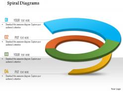
FAQs for 1114 spiral diagrams for
Oh those are perfect for showing processes that loop back on themselves! Like when you're presenting agile workflows or product development stuff. Way more interesting than those straight-line flowcharts that make everything look so rigid. The 1114 format gives you four solid stages with that spiral thing going on - honestly looks pretty slick in presentations. Use them when your process involves learning and tweaking as you go, not just Point A to Point B. They're great for strategic planning decks too. I actually used one last month for a client project and it totally changed how they saw their workflow.
So spiral diagrams are actually pretty cool for spotting patterns you'd totally miss with regular line charts. They group similar time periods together naturally, which makes seasonal stuff and cycles way more obvious. Plus they're weirdly satisfying to look at - something about that swirl just draws people in. You can fit tons of data without it looking cluttered too. Honestly, I was skeptical at first but they really do reveal hidden trends in time-series data. Next time you've got a boring line chart, try spiraling it and see what jumps out.
Dude, spiral diagrams are seriously underrated for tackling overwhelming info. Starting from the center, you can trace through complex stuff step-by-step without your brain melting. Way better than those confusing flowcharts everyone loves. What's cool is how they show concepts building on each other - like when you're mapping out skill development or project phases that keep circling back. Your eye just naturally follows the flow. People can see both the tiny details and the bigger picture without getting totally lost. Honestly, I started sketching explanations this way last month and it's been a game changer.
Honestly, skip the basic design stuff like Photoshop for this - you'll just fight with it the whole time. MATLAB or Mathematica are probably your safest bet since they're made for this kind of mathematical work. Python with matplotlib is really solid too if you don't mind coding a bit. I've been using it more lately and it's pretty flexible. GeoGebra's nice if you want something more visual and less code-heavy. The math precision matters way more than I initially thought it would. Just pick whatever feels comfortable with your current setup and you should be good to go.
Dude, spiral diagrams are actually amazing for keeping people hooked. There's something about curves that just draws your eye in - way better than those stiff rectangular charts everyone uses. Your audience will naturally follow the spiral path instead of zoning out halfway through. I've noticed people ask way better questions when I use them for process flows or showing data over time. They make everything look more polished too, which is a nice bonus. Honestly, straight lines are so overrated. Try it next time you're presenting something step-by-step - you'll see people actually paying attention for once.
Yeah totally! Spirals actually work great with other chart types. I'd treat it like the main attraction and build around it - maybe put bar charts or timelines on the sides. Color coordination is pretty crucial though, otherwise it'll look messy. What works well is using the spiral for your process flow, then having regular charts show the hard numbers. Oh and definitely sketch it out first - I learned that the hard way after spending forever rearranging stuff digitally. The spiral usually looks best in the center with everything else supporting it around the edges.
So 1114 spiral diagrams basically show your data flowing over time in this continuous spiral shape, while pie charts are just static slices and bar graphs compare stuff at one moment. Spirals are honestly pretty cool because you can actually follow trends and see patterns repeat - like if you're tracking seasonal sales or something cyclical. They're weirdly satisfying to look at too, not gonna lie. Regular charts give you snapshots, but spirals show the whole journey of how things change and cycle back around. Way better than jamming a bunch of bar charts together when you've got recurring data patterns.
Honestly, color choice is huge for spiral diagrams - it'll completely change how readable your data is. Similar colors make people miss key patterns or transitions. Go with high contrast between categories, but be careful with gradients since they can get messy fast. Skip red-green combos obviously (colorblind folks will hate you). I'd probably test a few different palettes with real users before settling on one. Stick with colorblind-friendly options that keep things visually clear as the spiral moves outward. Makes such a difference in the end.
Start with your main concept right in the center, then work outward with your primary categories on each spiral arm. After that, add subcategories as you move further out. Here's the thing though - don't make your outer text microscopic! I've made that mistake before and nobody could read anything. Keep your formatting consistent throughout and avoid squishing text into weird tight spots. The whole point is that someone should be able to follow the spiral's logic easily. Oh, and definitely step back from your screen when you're done to check if everything's actually readable from a normal distance.
Spiral diagrams are perfect for this! Start from the center and work outward, placing your events along the curve. The flow naturally shows progression over time. Honestly, I'm obsessed with these for project timelines - so much better than those stale linear charts everyone uses. Color gradients work great too, or try varying the line thickness to show different phases. Oh, and you can totally reverse it if that fits your story better - sometimes outside-in makes more sense. Next time you're mapping project milestones, give spirals a shot. You'll be surprised how much clearer everything becomes.
Honestly, the biggest mistake is cramming way too much data into one spiral - I've done this myself and it's a nightmare to read. Space your points evenly as you go outward, otherwise it looks messy. Label where you start and which way it rotates because people get confused super easily. Simple colors work better than fancy gradients (trust me on this one). Oh and start with less data than you think - you can always add more later but fixing an overcrowded mess is way harder.
So basically you just keep adding new data points as the spiral keeps going outward - pretty straightforward actually. Each full loop around can be whatever time period makes sense (years, months, whatever). The cool thing is you literally can't run out of room like those boring linear timelines. Plus related time periods end up close together visually, which honestly makes spotting patterns way easier than I expected. Just figure out your time intervals first so everything stays consistent. Oh and the whole thing expands naturally as new data comes in - no weird formatting issues to deal with.
Spiral diagrams are super handy for manufacturing, software dev, and project management stuff. Healthcare uses them a lot too for patient workflows. They're perfect when you've got processes that circle back - like agile sprints, lean manufacturing, or quality systems. Consulting firms are obsessed with them right now (probably because they look fancy in presentations). But honestly? They work best for complex workflows that aren't just straight lines from A to B. Next time you need to map out something cyclical, definitely give one a shot. Way better than trying to force everything into boring flowcharts.
Dude, spiral diagrams are actually pretty solid for fighting cognitive biases in your presentations. People won't just focus on the last data point they see (recency bias) since spirals don't have that linear "end." Also helps with anchoring - you know how viewers usually fixate on whatever number hits them first? The spiral keeps them moving through everything instead. Honestly, they're way more interesting than basic bar charts too. Forces people to look at the whole pattern instead of cherry-picking random values. Perfect for time-series stuff where you want them seeing cycles and trends. Give it a shot!
Each spiral layer becomes its own chapter - start with your main problem in the center, then work outward. New complications and plot points unfold naturally as you move through each ring. Color-code different characters or themes so people can follow along easier. The whole thing basically becomes a storyboard (which is honestly pretty cool). Make your annotations sound conversational instead of all technical and boring. Oh, and try framing it as a "journey" - people eat that stuff up. The visual flow does half the work for you since everyone instinctively follows spirals from inside out.
-
Innovative and Colorful designs.
-
Appreciate the research and its presentable format.