

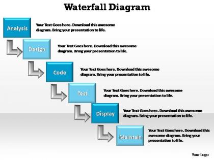
Waterfall diagram editable powerpoint templates




Try Before you Buy Download Free Sample Product
 Impress Your
 Audience
 100%
100% Editable
 Save Hours
 of Time


Our waterfall diagram editable powerpoint templates will cover any cracks. Your thoughts will get that smooth shiny finish.
People who downloaded this PowerPoint presentation also viewed the following :
Waterfall diagram editable powerpoint templates with all 10 slides:
Out of ideas for your next presentation? With our thousands of waterfall diagram editable powerpoint templates to choose from inspiration is at your fingertips.
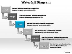
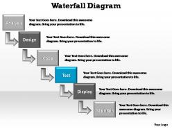
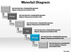
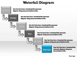
FAQs for Waterfall diagram
Honestly, waterfall diagrams are lifesavers for tracking budget and timeline changes. You'll see exactly where things went sideways - like when that "small" scope change destroyed your contingency fund. Been there! Templates are clutch because building these in Excel is such a headache every single time. Executives eat this stuff up too since they can see how all their decisions add up in one neat chart. My advice? Start simple with a basic template, then tweak it for whatever metrics matter most to your project. Way easier than overthinking it.
Honestly, waterfall charts are a game-changer for presentations. They show the step-by-step journey from your starting point to where you ended up - perfect for revenue changes, cost cuts, whatever. People can actually follow along instead of getting lost in a sea of numbers (which happens way too often, trust me). Your team sees how their work connects to the big picture. Stakeholders instantly spot the biggest drivers. I started using them instead of boring spreadsheets in meetings and wow, so much better engagement. Way fewer "wait, can you explain that again?" questions afterward too.
Waterfall works great when your requirements are rock solid and won't shift every week. Construction projects, manufacturing - stuff where you literally can't pour concrete before the foundation is done, you know? Regulatory work too since compliance doesn't really allow for "oops, let's pivot." But honestly? It's awful for creative projects or software where things change constantly. Your stakeholders need to want detailed upfront planning and predictable timelines. Got lots of unknowns or need flexibility? Just go agile and save yourself the headache.
Ok so you need a starting value, then bars showing your ups and downs, plus the final number. Label everything clearly! Use green for gains, red for losses - basic but it works. Add gridlines so people can actually read the values, and please write a title that's not completely useless. "Q3 Revenue Breakdown" beats "Revenue Analysis" any day. Oh and make sure your formatting stays consistent throughout or it'll look messy. Honestly, nail these basics first then you can get fancy later.
Honestly, customizing your waterfall template is a game changer. You can swap out those boring "increase/decrease" labels for stuff that actually matters - like "Q1 sales bump" or "marketing spend." Way more useful when you're presenting to people who care about real metrics, not generic buckets. Colors and branding? Sure, tweak them if you want. Sometimes I just stick with defaults though - depends how fancy you need to get. The real win is matching your categories to how your team actually thinks about the business. Just start by listing the specific drivers you want to track, then build around those. Makes the whole thing way more relevant.
Honestly, just start with Excel if you have it - handles basic waterfall charts pretty well. Google Sheets works too if you're more of a Google person. PowerBI and Tableau are amazing for live data stuff, but might be overkill depending on what you're doing. Oh, and PowerPoint actually isn't terrible for this if you're presenting anyway. Lucidchart's really clean but costs money. Visio too, though that's more if your company already pays for it. I'd probably go Excel first, then see if you need something fancier later.
Pick intuitive colors for your waterfall chart - green for gains, red for losses, blue/gray for start and end points. People get this instantly because of traffic lights and finance stuff. Don't go crazy with rainbow colors; it looks messy and confuses everyone. Three or four colors tops. Make sure there's decent contrast so colorblind folks can read it too. I learned this the hard way after my boss squinted at my chart for like five minutes straight. The whole point is making data super obvious at first glance, not winning a design award.
Yeah totally! Just don't use them the old-school way. Break those waterfall templates into sprint-sized pieces instead of one giant timeline. Mini-waterfalls work great for 2-4 week cycles. You get that visual clarity (which stakeholders love, honestly) without killing your team's flexibility. Update them after each sprint to show how features actually evolved. I've seen teams get stuck trying to map out everything upfront - that defeats the whole point. Keep tweaking them as you go. They're surprisingly useful for showing progress within individual sprints too.
Okay so first thing - CHECK YOUR MATH. Seriously, one mistake and you'll look like an idiot when your boss points it out. Don't cram everything into one chart either, it gets impossible to read. Your categories can't overlap or you'll double-count stuff. I always mess up the color coding so pick a system and stick with it. Oh and label everything clearly - your axes, data sources, all that. Honestly the worst ones I see are just too busy. Simple beats fancy every time. Also make sure it actually tells the story you want, not just dumps numbers everywhere.
Honestly, waterfall diagrams are amazing for project tracking. Think of them like a visual ledger - you can see exactly where you gained or lost ground at each milestone. The bars show which phases actually added value vs the ones that totally murdered your timeline (been there). I'm obsessed with using them for quarterly reviews because stakeholders get it instantly. No one wants to dig through boring spreadsheets, right? Just set up monthly check-ins to update the thing and everyone stays on the same page about real progress. Way better than those endless status meetings where nobody knows what's actually happening.
Honestly, finance and consulting people are obsessed with these things - they're always showing clients how revenue shifts or where costs went wrong. Manufacturing teams use them constantly for tracking production expenses (they love finding inefficiencies, it's like a sport to them). Retail's big on them too for profit breakdowns and figuring out what drove sales changes each quarter. Pretty much any job where you're explaining step-by-step changes to your boss or clients, you'll want them. Just grab a basic template and tweak it for whatever numbers you're tracking.
Oh totally, design makes a huge difference! You want clean layouts with obvious color coding - green for gains, red for losses, that kind of thing. Cluttered templates are the worst because they just create visual chaos. Make sure your font size is readable too (nobody wants to squint at tiny labels). Honestly, I've seen so many presentations fail because people picked overly fancy graphics instead of focusing on clarity. Match what your audience expects, but keep it simple. Pro tip: show it to someone else first - if they don't get it right away, you need to simplify more.
Tell the story, not just the numbers. Waterfall charts show how you get from point A to B step by step. Use green for gains, red for losses - sounds obvious but you'd be surprised how often people mess this up. Walk through each bar and call out the big movers. Ditch the jargon (nobody cares about "variance analysis"). I always throw in a summary slide after because execs want that "so what" moment handed to them. Oh, and practice your walkthrough beforehand - you'll sound way more confident than just reading numbers. Focus on what it means for the business.
Move those waterfall templates to something cloud-based - Miro, Lucidchart, or honestly even Google Slides works. That way everyone can jump in and edit at the same time. Set up shared permissions so people can drop comments right on the diagram. Way better than endless email chains, trust me. You'll need some basic rules about who handles what sections though. Oh and schedule quick sync calls to walk through changes together - like 15 minutes max. Your team can actually see the flow happening live instead of trying to figure out blurry screenshots later.
Honestly, just start with whatever Microsoft stuff you already have - PowerPoint and Excel both do waterfall charts pretty well. If those feel too basic, sites like SlideModel or PresentationGo have way nicer looking templates. Canva's business section is actually decent too, way less boring than the usual corporate spreadsheet vibe. Oh, and if you're already using Tableau or Power BI for other stuff, they've got waterfall charts built in. I'd probably mess around with PowerPoint first though - save yourself the rabbit hole of browsing templates for three hours.
-
Great experience, I would definitely use your services further.
-
Easy to edit slides with easy to understand instructions.