
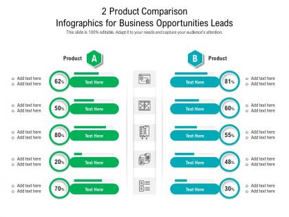
2 product comparison for business opportunities leads infographic template


Try Before you Buy Download Free Sample Product
 Impress Your
 Audience
Editable
of Time


Our 2 Product Comparison For Business Opportunities Leads Infographic Template are topically designed to provide an attractive backdrop to any subject. Use them to look like a presentation pro.
People who downloaded this PowerPoint presentation also viewed the following :
2 product comparison for business opportunities leads infographic template with all 2 slides:
Use our 2 Product Comparison For Business Opportunities Leads Infographic Template to effectively help you save your valuable time. They are readymade to fit into any presentation structure.
FAQs for 2 product comparison for business opportunities
Oh nice! So you'll want the obvious stuff first - product names, pricing, main specs, pros and cons. A rating system is clutch for quick comparisons. Put your evaluation criteria up front so people know what you're judging on. Side-by-side layout beats stacked every time, trust me on this one. Add a "best for" section too - like "best for startups" or whatever. Just don't compare random stuff together, and keep it scannable. People's attention spans are terrible these days, so make it easy to skim through fast.
Honestly, design is everything with comparison templates. People will literally bounce if you cram too much into tiny rows - like, who wants to squint at specs all day? I always go for clean layouts with good visual hierarchy so users can scan fast. You'd be shocked how many templates bury the important stuff in random middle sections. So frustrating. I use lots of whitespace and highlight key differences with color or bold text. Oh, and organize by priority, not alphabetically - that's huge. If someone can't scan it in 10 seconds, you've lost them.
Honestly, clean layouts are everything here. Stick with consistent colors and icons so people can scan quickly without getting confused. I'd skip cramming everything into one massive table - that's just overwhelming. Bold headers help a ton, plus white space prevents that wall-of-text feeling. Star ratings and progress bars make specs way easier to digest than plain numbers. Charts work really well for price trends too. Oh, and definitely test this with someone first! I learned this the hard way - what makes sense to you might be totally confusing to everyone else.
Honestly, just focus on what your audience actually cares about when they're shopping around. Budget shoppers? Hit them with price breakdowns and bang-for-your-buck stuff. Tech people want all the specs and performance data. Business buyers are gonna want ROI numbers and how it plays with their existing systems. Figure out what's stressing them most about buying. Then match your language to theirs - don't get too technical with regular folks, but don't dumb it down for industry people either (they'll notice). Oh, and definitely ask some current customers what made them choose you. That's pure gold right there.
You'll want product comparison templates for anything where people actually shop around before buying. SaaS tools, electronics, insurance - you know, the expensive stuff nobody impulse purchases. Your customers are definitely googling "X vs Y" already, so might as well give them what they want. These work when buyers need to see features and pricing side-by-side to make sense of everything. A regular product page just doesn't cut it for complex purchases. I mean, subscription services are perfect for this too since there's usually multiple tiers to compare. Bottom line: if the decision-making process is complicated, you need one.
Oh totally! Colors mess with people's heads way more than you'd think. Red and orange make stuff feel urgent or fancy, while blues and greens scream "trustworthy." I've watched people gravitate toward the gold-highlighted "recommended" option even when it wasn't the best deal - honestly kind of manipulative but it works. Cool colors suggest reliability. Gray just makes everything look bleh though, even good products. My advice? Pick one bright accent color for your top choice and keep the rest clean. Don't overthink it, but man, the psychology is real.
Testimonials are basically your proof that products actually work like they claim. I'd throw in 1-2 short ones per product that match whatever you're comparing - like if you're looking at battery life, find reviews mentioning that specifically. They're super useful when products seem identical on paper (which happens more than you'd think). People trust other buyers way more than marketing copy. Oh, and make sure the testimonials actually relate to your comparison points - random 5-star reviews don't help much. I've watched friends completely change their minds after reading one good testimonial that addressed their exact concern.
Honestly, comparison templates are a game changer. You just dump all the specs, prices, and features side-by-side instead of frantically switching between tabs trying to remember what had the better warranty or whatever. Makes it so much easier to spot which ones are actually worth it vs just fancy marketing. I usually pick like 3-4 things that really matter to me first - otherwise you'll get lost in a million tiny details that don't actually affect your daily use. It keeps you from making dumb impulse decisions too. Way less mental gymnastics involved.
Honestly, I'd stick to the basics that actually matter - price, main features, user ratings, and how easy it is to set up. Speed and reliability benchmarks are super important too, depending on what you're comparing. But seriously, don't go crazy with it. I've seen people create these massive spreadsheets with like 30 different criteria that just sit there unused. Five to seven metrics max. Put any absolute deal-breakers right at the top so people can cross stuff off quickly. Best approach? Ask your team what their top three priorities are first, then build everything around those answers.
Dude, definitely add images to your comparison template. People scan visuals way faster than reading through specs - like 60,000 times faster or something crazy like that. You can show size differences, design details, all that stuff instantly instead of writing paragraphs nobody wants to read anyway. Plus it just looks more legit when people can actually see what they're comparing, you know? I'd put a photo or diagram next to each major difference you're highlighting. Start with your biggest selling points first - that's where the visuals will hit hardest.
Don't jam everything onto your slides - nobody can process that much info at once. I've sat through way too many presentations where someone cherry-picked data to push their favorite option (so obvious and annoying). Compare things fairly using the same criteria. Think about who you're presenting to - executives care about different stuff than the people actually using the product. Charts beat walls of text every time. Here's the thing though: you HAVE to include downsides for each option or you'll look biased. Shows you actually did your homework instead of just going through the motions.
Okay so Google Sheets or Notion are lifesavers for this - you'll see everyone's changes in real time plus there's revision history if someone screws something up. Have one person own the master doc while others work on copies or specific sections. Naming conventions matter too, trust me on this one. Set up who can actually edit vs just leave comments. Schedule check-ins to merge everyone's feedback because otherwise you'll get those nightmare conflicts where two people changed the same thing. Oh and definitely save a backup before any big group editing session - learned that the hard way!
I'd go with Airtable or Notion for organizing all your data - Notion's database views are honestly so satisfying to look at. Canva works well for making things pretty, or Figma if you're feeling fancy. Google Sheets is solid too, especially since everyone can jump in and edit. Oh, and if you get into this stuff, Zapier can automatically pull product info so you don't have to type everything manually. Just pick whatever you'll actually keep updated - I learned the hard way that having 20 outdated templates is worse than having none.
Start with your basic comparison structure, then tweak it for each platform. Web's great because you can add interactive stuff - sortable columns, expandable sections, all that. Print has to be way more condensed though. Just hit the key differences in summary tables. Mobile's honestly the hardest since there's barely any room to work with. I'd go with cards that people can swipe through, or maybe collapsible sections. Actually, mobile usually works better if you just focus on your top 2-3 products instead of cramming everything in there. Keep your comparison criteria the same everywhere, just change how you show it. And definitely test each version with real people - you'll be surprised what doesn't work like you thought it would.
So tech companies - especially SaaS and B2B ones - need the best comparison templates since their buyers are doing crazy amounts of research. Same goes for e-commerce. Healthcare and finance too, honestly, because those purchases require serious justification. Even automotive (fleet stuff mainly). Here's the thing though - your template can't just dump all the data on people. Break it into clear categories and put your biggest advantages right at the top. I've seen too many companies bury their best features halfway down the page. Short answer: make it detailed but scannable, or you'll lose them.
-
Presentation Design is very nice, good work with the content as well.
-
The content is very helpful from business point of view.
-
Qualitative and comprehensive slides.
-
Visually stunning presentation, love the content.
-
Very unique, user-friendly presentation interface.
-
Awesomely designed templates, Easy to understand.
-
Wonderful templates design to use in business meetings.