


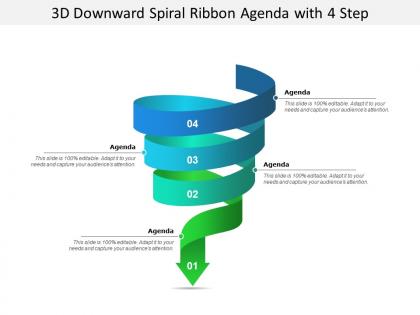
3d downward spiral ribbon agenda with 4 step




Try Before you Buy Download Free Sample Product
 Impress Your
 Audience
 100%
100% Editable
 Save Hours
 of Time


Continue to advance in the desired direction with our 3d Downward Spiral Ribbon Agenda With 4 Step. Don't allow the focus to drift.
People who downloaded this PowerPoint presentation also viewed the following :
3d downward spiral ribbon agenda with 4 step with all 5 slides:
Develop an elegant attitude with our 3d Downward Spiral Ribbon Agenda With 4 Step. They will be drawn by your demeanour.
FAQs for 3d downward spiral ribbon agenda
So you basically put your 4-6 main agenda items along this 3D spiral ribbon that curves down through the slide. Each point gets its own colored section on the ribbon - way better than those snooze-fest bullet points, trust me. The spiral creates this nice flow that pulls people through your presentation naturally. What's cool is you can animate each section to light up as you go, so everyone stays on track. Honestly the downward curve just feels more dynamic than flat layouts. Makes the whole structure feel like it's actually moving somewhere instead of just... existing.
So this 3D spiral thing is actually pretty smart - it turns your boring timeline into something people actually want to follow. You place content along each curve instead of just listing bullet points. People naturally track the downward flow, which honestly makes even complicated stuff way easier to understand. Works great for project phases or showing how problems build up. Oh, and don't cram too much text into each section or it gets messy. Keep it clean and you'll have that nice visual flow going.
Blender's probably your best bet - it's free and the helix modifier works great for spiral paths. Then just extrude it into a ribbon. Cinema 4D is amazing too but costs money. The learning curve's kinda brutal if you're starting from zero, but YouTube has solid tutorials for ribbon effects. I'd search "spiral text paths" first - gets you most of the way there. PowerPoint actually has decent 3D features now for basic stuff. Fusion 360 works too if you want something more technical. Honestly, I spent way too much time figuring this out last year.
That 3D spiral thing actually works because your eye follows it naturally from top to bottom - way better than those boring bullet point lists everyone uses. Makes the whole agenda feel like it's moving somewhere instead of just sitting there. Plus it shows how your topics connect and build off each other, which is pretty smart if you think about it. I mean, anything's better than another Times New Roman death trap, right? Definitely try it next time you've got a presentation where you actually want people to stay awake during the agenda part.
So basically, 3D designs grab attention way better than flat layouts. Your brain processes depth differently - makes even dull agenda stuff seem more interesting, honestly. People remember visual info better too. That downward spiral thing you mentioned? Perfect for guiding eyes through the flow without making people work too hard to follow along. Plus it just looks more professional overall. One thing though - don't get carried away with fancy effects or it becomes distracting. I've seen presentations where the 3D was so over-the-top you couldn't focus on what they were actually saying. Keep it clean and purposeful.
Okay so basically you want those transition phrases that guide people down each level - stuff like "diving deeper" or "let's get into the weedy details now." I always do a quick recap before going to the next layer because people get confused otherwise. Oh and if you're doing this live, gesturing downward actually helps more than you'd think! The spiral thing can feel abstract without visual cues. Practice those bridges beforehand though - nothing worse than stumbling over a transition and losing everyone. Short version: clear signposts + brief recaps = people won't get lost in your spiral.
Use that 3D spiral thing when you're showing how stuff connects and flows downward - like financial disasters, project risks going sideways, or workflows where each step affects the next. People actually pay attention because it looks cool, which is half the battle honestly. Works great for hierarchical stuff where you need folks to see how things cascade through different stages. Just don't go crazy with it - stick to maybe 3-5 levels tops. I've seen people try to cram like 8 levels in there and everyone just gets confused trying to follow the damn thing around.
Keep your spiral clean - ditch the crazy textures and busy backgrounds that'll just confuse people. High contrast is your friend here. Don't make ribbon segments too skinny either, since spirals already mess with depth perception. I swear everyone thinks more drop shadows = better design, but honestly? It just looks messy. Make sure your text stays readable by not angling the ribbon faces too steep. Oh, and don't spiral too tight or people can't tell the levels apart. Stick with simple typography and you're golden.
Try a gradient that goes warm to cool as it spirals down - reds and oranges at the top shifting to blues and purples at the bottom. Your eye naturally wants to follow that color journey, which is perfect for guiding people through your hierarchy. Stick with colors that flow together smoothly rather than jarring jumps. I always think this sounds overly complicated when I explain it, but it really does work once you see it. The warm colors feel more urgent at the top, then it gets calmer as you move down. Makes the whole spiral feel intentional instead of random.
Don't make the spiral too steep or people will get dizzy trying to follow it. Also learned this one the hard way - my boss literally called my presentation "nauseating" because I went overboard with colors and animations lol. Keep your text sections pretty minimal since the 3D angle already makes reading tough. Font size needs to stay consistent, and make sure there's good contrast with your background. Honestly, just start simple with a basic template first. Test out the viewing angle before you dump all your content in there - saves so much time later.
Honestly, the spiral thing just works better because people actually follow along instead of zoning out. Each layer builds on the last one, so they're mentally engaged the whole time. Regular agendas? Total snoozefest - everyone knows what's coming next and half the room checks out. With spirals, there's this natural curiosity about where you're headed next. Plus the topics actually connect to each other instead of feeling like random bullet points. I started sketching my meetings this way last month and wow, what a difference. People stay way more focused when ideas flow downward like that.
Honestly, people are super split on those 3D spiral things. They definitely catch attention, but some folks find them way too distracting. Like, imagine doing spirals while talking about layoffs - kinda weird, right? They're apparently too "dramatic" for serious stuff. Works well for creative pitches or big announcements though. Just feels gimmicky in boardroom settings. I'd probably test it with a small group first. You don't want your slides stealing the show from whatever you're actually trying to say.
So basically you'd structure your spiral layers by priority - put the critical stuff at the top, then let secondary issues flow down through each tier. Kind of like a waterfall effect where problems cascade through different org levels. Strategic decisions happen in your top layer, operational details get handled in the lower spirals. Honestly sounds way more complicated than it actually is! The trick is making sure each spiral level has clear decision-making power and knows their scope. I'd start by mapping what you have now against spiral positions, then just assign specific responsibilities to each tier going downward. That's probably your best bet for getting it to actually work.
So for text, you'll want high contrast - white or yellow on dark ribbons works great. Put your important stuff at the top where it's wider. Short phrases beat long sentences here, trust me. Simple icons are your friend since anything complex gets weird with the curve. The spiral's already doing the heavy lifting visually, so don't go overboard. Oh, and definitely check how it looks when people actually scroll through it - sometimes what looks good static falls apart in motion. Keep it clean and it'll work perfectly.
Oh man, transitions are everything with spiral presentations. You gotta tell people when you're going deeper - like "let's drill down" or "getting into specifics now." I've watched so many people just hop around and completely lose their audience halfway through, it's painful. Visual stuff helps too - maybe switch up your slide colors or add some kind of depth marker. Short version: your audience needs to know where they are at all times. Those verbal breadcrumbs will save you from having everyone sitting there totally confused and spinning.
No Reviews