


4m checklist powerpoint layout






Try Before you Buy Download Free Sample Product
 Impress Your
 Audience
 100%
100% Editable
 Save Hours
 of Time


Figure out alternatives with our 4m Checklist Powerpoint Layout. They help build consensus for change.
People who downloaded this PowerPoint presentation also viewed the following :
Content of this Powerpoint Presentation
Description:
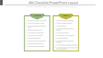
The PowerPoint slide titled "4M Checklist PowerPoint Layout" serves as a valuable tool for process improvement and quality control by highlighting two critical components of the 4M checklist: Material and Method. This slide is fully editable, allowing users to customize it according to their specific needs. Here's an in-depth overview of the material and method sections:
Material:
In this section, the checklist focuses on evaluating the materials used in a particular process or operation. It raises essential questions to ensure the accuracy, quality, and integrity of materials, including:
1. Volume, Grade, and Brand: Are the materials correctly identified with the right volume, grade, and brand?
2. Impurities: Are there any impurities or contaminants mixed in with the materials?
3. Inventory Management: Are inventory levels adequately maintained to avoid shortages or excess?
4. Handling and Storage: Are materials handled and stored following best practices and guidelines?
The material section aims to identify and rectify any material-related issues that may impact the quality and efficiency of the process.
Method:
The method section of the checklist delves into the processes and procedures used in operations. It covers a range of crucial aspects, including:
1. Work Standards: Are established work standards being followed?
2. Safety: Is the work environment and process safe for all involved?
3. Efficiency: Is the method efficient in terms of resource utilization and time management?
4. Product Quality: Does the method ensure the production of a high-quality end product?
5. Work Sequence: Is the work sequence appropriate and optimized?
6. Setup: Are equipment and tools correctly set up?
7. Environmental Conditions: Is the temperature, humidity, lighting, and ventilation suitable for the operation?
8. Communication: Is there effective communication with preceding and subsequent processes?
The method section focuses on evaluating the overall effectiveness and adherence to established standards and best practices in the operational processes.
Use Cases:
The 4M checklist is a versatile tool applicable across various industries where process analysis and improvement are essential. Here are the industries where this type of analysis is generally applicable, along with specific use cases, presenters, and audiences:
1. Manufacturing:
Use: Optimizing production quality and efficiency.
Presenter: Quality Manager.
Audience: Production Staff and Management.
2. Healthcare:
Use: Ensuring patient safety and treatment effectiveness.
Presenter: Clinical Operations Manager.
Audience: Medical Staff and Healthcare Administrators.
3. Construction:
Use: Maintaining building standards and project management.
Presenter: Construction Manager.
Audience: Construction Workers and Project Stakeholders.
4. Automotive:
Use: Quality control in vehicle production.
Presenter: Quality Assurance Specialist.
Audience: Automotive Engineers and Production Line Workers.
5. Food and Beverage:
Use: Guaranteeing food safety and process efficiency.
Presenter: Food Safety Officer.
Audience: Quality Control Team and Production Staff.
6. Software Development:
Use: Streamlining development processes and ensuring product quality.
Presenter: Lead Developer or Project Manager.
Audience: Development Team and Quality Assurance Analysts.
7. Aerospace:
Use: Ensuring compliance with stringent quality standards and methods.
Presenter: Compliance Manager.
Audience: Engineers and Assembly Technicians.
4m checklist powerpoint layout with all 7 slides:
Counter inhibiting factors with our 4m Checklist Powerpoint Layout. Allow for increased freedom of action.

FAQs for 4m
So you've got your four main sections - Man, Machine, Method, Material. Structure each one with clear headers and bullet points for the actual check items. Icons really do make a difference for engagement, even though it sounds cheesy. Keep everything short and punchy - like "verify calibration" instead of some wordy version. Oh, and definitely add checkboxes so people can actually use the thing as a working document. White space between sections prevents it from looking like a mess, and maybe pick consistent colors for each M category. The formatting matters more than you'd think.
Honestly, the 4M thing is a game changer for presentations. You just break everything into Man, Machine, Material, Method - covers all your bases without looking like you're winging it. Stakeholders actually get what's happening with staffing, equipment, supplies, and processes instead of you jumping around randomly. No more panic when someone asks about budget stuff and you can't find the right slide (been there). I started using these four as my main sections and it makes me look way more put-together than I actually am. Try it for your next project review.
Keep your 4M checklist super clean and scannable - consistent icons for each M category help a ton. Use lots of white space so it doesn't look cramped (I've seriously seen too many messy checklists that just get ignored). Color coding or borders work great to separate sections. Bullet points beat long paragraphs every time. Make sure your font's big enough for presentations, and if it's digital, add checkboxes people can actually click. Oh, and honestly? The whole thing should feel like a useful tool, not some boring assignment they have to slog through.
Color psychology actually works really well for 4M checklists! Blue's perfect for Methods since it screams reliability. Go green for Materials - gives off that quality/growth vibe. Manpower needs energy, so red or orange hits different. Purple works for Machines because it feels innovative. Most people don't realize how much colors mess with attention during presentations, but they totally do. Stick to 3-4 colors max though - any more and it's just chaos. Keep backgrounds neutral so your colors actually pop. Oh, and definitely test it on whatever screen you'll actually be using. Colors look way different on my laptop versus the conference room projector.
Don't cram everything onto one slide - that's the worst thing you can do. Your 4M checklist needs to be scannable, not some dense wall of text. Bullet points work best for each section (Man, Machine, Material, Method). White space is your friend here. Avoid tiny fonts too - you'll hate yourself when you're actually trying to use it. Make it specific to your process, not some generic template that applies to nothing. Oh, and skip the fancy animations. I learned that one the hard way. You just want to get through it quickly when you're working.
Your font choice can totally make or break a 4M checklist. Stick with clean, readable fonts - Arial, Calibri, or Segoe UI work great. Trust me, decorative fonts are the worst for this stuff. Nobody wants to decode fancy lettering when they're actually trying to get work done. Go with at least 12pt for regular text, bigger for headers. Oh, and here's a trick my old supervisor taught me - print it out and read it from arm's length. If you can't read it clearly, your coworkers definitely won't be able to either. The whole point is quick reference during real tasks, so boring but readable beats pretty every time.
Hey! So icons work really well for each M - gears for Machine, little people for Man, that sort of thing. Process flow diagrams are clutch since they actually show how everything connects. If you've got data, throw in some charts too. Color-coding each section is honestly underrated - it just makes everything click better in people's heads. Oh, and keep the visuals simple. You don't want people staring at some fancy graphic instead of listening to what you're saying. The whole point is making your checklist easier to follow, not turning it into art class.
Just swap out the categories for whatever makes sense in your field. Manufacturing? Stick with the original Man, Machine, Material, Method. Healthcare teams I know use Patient, Personnel, Procedures, Equipment instead. Software folks do People, Process, Platform, Product - kinda ruins the alliteration but whatever works, right? Pick the four things your team deals with most when stuff goes wrong. Like, what do you actually troubleshoot day-to-day? Those become your categories. Make sure they cover the big variables that mess with your results, then structure your presentation around those. Pretty straightforward once you think about what really matters for your specific situation.
Dude, you absolutely need to get people actually *doing* stuff during your 4M session. Like, have them check boxes and discuss what they're finding right then and there. Otherwise everyone just zones out - I've sat through way too many of those dead-silent checklist meetings where people are basically asleep with their eyes open. Try polls or breakout discussions for each M category. Maybe even let teams input their observations live on screen? The whole point is collaborative problem-solving, so don't just click through slides talking at people. Get messy with it and make them participate.
Getting team feedback on your 4M checklist is a game changer. They'll spot stuff you totally missed - like when your color coding makes zero sense to anyone else. Sarah from my last project saved me from using microscopic font that nobody could read from the back row. Different people process info differently too, so you'll end up with something that actually works for everyone. Honestly, I always cringe looking at my first drafts now. Get their input early and don't be stubborn about changes - trust me, iterating a few times before the final presentation is worth it.
Honestly, the best 4M presentations I've seen tackle real problems head-on. Toyota does this brilliantly in their production meetings - they'll walk through Man, Machine, Material, and Method for every quality issue that pops up. Manufacturing companies eat this stuff up for root cause analysis. Consulting firms have started using it for project retrospectives too, which is pretty smart. But here's the thing - don't just make four bullet points and call it done. You need specific examples under each category that actually connect to results. Think of it more like being a detective than checking boxes. Start with your problem, then systematically dig into each M with real evidence.
Okay so basically you want to reveal each M one at a time instead of showing everything upfront. Fade-ins work great, or you could do slide effects - whatever feels right. Your audience won't get distracted reading ahead that way. Then animate the actual checklist items under each category as you talk through them. Makes the whole thing feel way more professional too, which is nice. I'd avoid anything too flashy though - like don't make text spin around or bounce everywhere because that's just annoying. Keep the timing consistent between reveals and you'll be good. Trust me, it's so much better than static slides.
Honestly, PowerPoint's way better for this than you'd think. Start with a basic table for your 4M categories (Man, Machine, Method, Material) - tables are boring but they work. SmartArt's decent if you want something fancier, though I usually just stick with text boxes since you can move stuff around easier. The drawing tools are actually pretty solid for adding lines between sections. Oh, and use different colors for each M - makes it way less confusing when you're actually using the thing. If you're making multiple checklists, definitely set up the formatting in slide master first. Saves you from doing the same styling over and over.
Just focus on what'll actually break your operation, not every tiny thing that could go wrong. For Man, nail the big skill gaps. Your most temperamental equipment goes under Machine. Material is about the quality stuff that really bites you. Method should hit those process steps that always seem to blow up - you know the ones I'm talking about. I'd stick to maybe 3-5 points per category so people don't zone out. One line each, max. The real question is "what would shut us down tomorrow?" not "what's theoretically possible." Way more useful that way.
SlideModel's probably your best bet - just search "4M checklist" and you'll find some decent templates. PresentationGo and SlideHunter have good stuff too. Pinterest actually has some useful layouts mixed in with all the random content. Your company might already have templates sitting in shared drives somewhere, so worth checking there first. ASQ.org and Lean.org are solid if you want something more professional looking. Honestly, I'd just grab a few different ones and frankenstein them together - that's what I usually do anyway.
-
Content of slide is easy to understand and edit.
-
Best Representation of topics, really appreciable.