


Best practice checklist


Try Before you Buy Download Free Sample Product
 Impress Your
 Audience
Editable
of Time


Enhance your grace with our Best Practice Checklist. You will acquire added charm.
People who downloaded this PowerPoint presentation also viewed the following :
Content of this Powerpoint Presentation
Description:
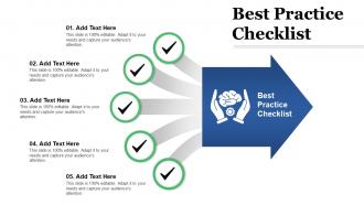
The image depicts a PowerPoint slide themed around a 'Best Practice Checklist'. The main title to the right indicates the central topic of the presentation, whereas the left side of the slide shows a numbered list from 01 to 05, each with the placeholder text "Add Text Here". Each item is paired with a green circle with a check mark symbol, suggesting these are steps or items to be confirmed or completed. Below the title, there is a subtitle space and a graphic of hands cradling a cog within a gear, which is commonly associated with care, maintenance, or essential processes. The checkmarks emphasize the checklist nature of the slide, prompting the presenter to fill in specific best practices related to their presentation's subject.
Use Cases:
This slide template is versatile and can be adapted for a variety of industry applications where outlining best practices, procedures, or compliance checklists are necessary.
1. Software Development:
Use: Outlining coding standards and development workflows
Presenter: Lead Developer or Software Architect
Audience: Development Team
2. Healthcare:
Use: Presenting patient care protocols or treatment checklists
Presenter: Medical Professional or Healthcare Administrator
Audience: Medical Staff or Hospital Management
3. Education:
Use: Detailing classroom management techniques or educational strategies
Presenter: Educator or Educational Consultant
Audience: Teachers or Administrators
4. Finance:
Use: Discussing financial controls, compliance requirements or audit processes
Presenter: Chief Financial Officer or Compliance Officer
Audience: Finance Team or Auditors
5. Manufacturing:
Use: Illustrating safety protocols or quality control measures
Presenter: Safety Officer or Quality Assurance Manager
Audience: Factory Workers or Operations Staff
6. Hospitality:
Use: Listing customer service excellence standards or operational procedures
Presenter: Service Trainer or Operations Manager
Audience: Hotel Staff or Management
7. Marketing:
Use: Describing content marketing guidelines or campaign best practices
Presenter: Marketing Director or Content Strategist
Audience: Marketing Team or Advertising Staff
Best practice checklist with all 5 slides:
Our Best Practice Checklist help do it with ease. They assist the smooth passage of your thoughts.
FAQs for
So for slide design, start with a clean layout and pick maybe 2-3 fonts tops. I swear some presentations look like ransom notes with all the random fonts! Your color scheme should match your brand obviously. Don't cram everything together - white space is your friend. Good images beat cheesy stock photos every time, and make sure there's enough contrast so people can actually read your text. Oh and test it on a big screen first! Colors look way different on a projector than your laptop. Keep headers and footers in the same spots throughout so it doesn't look messy.
Templates keep your audience focused on what you're actually saying instead of getting distracted by wonky design choices. Good ones have built-in sections for problem-solution stuff or before-and-after comparisons - basically storytelling guardrails that prevent you from going off the rails. The flow between slides feels way more natural too. Pick templates that match your story's vibe, then map out your main points to fit their structure before you start writing. Honestly, I used to skip this step and always regretted it later. Templates aren't just about looking professional - they genuinely help with narrative pacing.
Honestly, just grab templates where you can easily switch up colors and fonts to match your vibe. Different slide layouts are clutch - you'll need variety for titles, content, image dumps, whatever. Master slide customization is huge (trust me on this one, it'll save you hours later). Graphics and icons should be simple to recolor without the whole thing falling apart. Oh, and definitely test how easy it is to actually add your content first. I've seen templates that look incredible but are absolute hell to work with. You want something flexible that won't make you feel like you need a design degree just to change basic stuff.
Oh totally, colors make a huge difference! Dark backgrounds with white text work great - way easier on the eyes. But avoid those barely-there contrasts or people will mentally check out. I used to go crazy with bright colors until I gave a presentation that looked like a highlighter factory explosion lol. Blues and greens feel more professional, while reds and oranges pump up the energy (just don't overdo it). Stick to maybe 3 colors tops. Also definitely test your slides on the actual projector first - colors look totally different up there than on your laptop.
Put your best stuff at the top since people just skim anyway. Break things up with headings and don't be afraid of white space - cramped text looks awful. Short paragraphs work way better, especially on phones. Your call-to-action buttons need to pop, not get lost in paragraphs. Bullet points are perfect for lists or steps. Here's a trick that actually works: read everything out loud. If you're gasping for air mid-sentence, it's too long. Oh, and group similar info together - sounds obvious but you'd be surprised how often people scatter related stuff everywhere.
Honestly, just swap out all that generic stuff with what actually matters to their industry. Healthcare? Throw in HIPAA requirements. Tech company? Focus on their data security frameworks instead. First thing I'd do is dig into what keeps that industry up at night - regulations, buzzwords, whatever they're stressed about. Then work that directly into the template structure. The whole point is making them think "wow, this person gets our world" instead of feeling like you just slapped their company name on some cookie-cutter document. Way more effective than the lazy approach most people take.
Dude, typography can totally make or break your whole presentation. I've watched so many good talks get destroyed by terrible font choices - like seriously, Comic Sans should be illegal for work stuff. Stick with something clean like Helvetica or Calibri, and make your text big enough that people in the back can actually read it without glasses. Oh, and don't go crazy with fonts - two max, or it'll look like a ransom note. Test everything from across the room first. Trust me, squinting audiences aren't engaged audiences, and you'll lose them fast.
Okay so three big things to focus on: visual stuff, how you organize content, and making sure the tech actually works for everyone. Go with high contrast - dark text on light backgrounds is your safest bet. Arial or Calibri fonts, and bump that text up to at least 18pt. Keep slides clean with clear headings and bullet points. Honestly, I'm always surprised how much better presentations look when you just remove half the stuff on each slide. Don't forget alt text for images, and never use only color to show important info. If you can test with screen readers, do it. Oh, and always have your content available in different formats. Start with just one feature though - don't overwhelm yourself trying to fix everything at once.
Ugh, the worst thing you can do is just dump your text into a template and call it done. Those text boxes aren't meant for entire paragraphs - I've seen so many cramped, ugly slides because of this. You gotta actually customize the colors and fonts to match your brand. Don't leave those cheesy stock photos either. Templates are just your starting point, not the final product. Oh, and honestly? Most people try to fit way too much content on each slide anyway. Adjust the layout so it actually works for what you're saying.
Honestly, multimedia is a game changer for templates. Videos show complex stuff way better than writing it out ever could. Plus people learn differently - some need visuals, others want to hear explanations. I mean, who actually wants to read through giant text blocks? Nobody. Interactive elements and infographics make data so much easier to digest too. Just don't go crazy with random stock photos (we've all seen those terrible ones). Each thing you add should actually help your message. Oh and retention goes way up when you mix different formats. Trust me on this one.
Okay so first thing - lots of white space and clean layouts are your best friend. Don't go crazy with colors either, keep it simple. Your headings need clear hierarchy so people can follow along. Charts should have room to breathe because cramped stuff just looks awful, honestly. Stick with boring fonts that are actually readable (I know, I know, but trust me). Navigation needs to be obvious - like, grandma-could-figure-it-out obvious. Oh and sketch your data flow first before diving into any design tools. Design for your actual audience, not what you think looks impressive.
Make a brand style guide first - fonts, colors, logo spots, the whole thing. Anyone grabbing your templates will know exactly what to use. Trust me, I've watched brands turn into hot messes when people just improvise everything! Your header styles need to be locked down, same with color palettes and photo filters. Oh, and actually give your team easy access to these assets (seems obvious but you'd be surprised). Short sentences work. Longer ones help with flow when you're explaining the trickier stuff. Quick checklist before they finalize designs saves you headaches later.
Honestly, make everything super flexible with placeholder text and generic layouts. Don't hardcode dates or company names into the actual design - I made that mistake and rebuilt the same template like 5 times lol. Modular sections are your friend since you can just swap them around for different audiences. Stick with neutral colors and graphics that won't look terrible in a year. Oh, and definitely create a basic style guide so your teammates don't accidentally mess up the formatting when they're updating stuff. Trust me on this one.
Oh absolutely! Your audience will clock that mismatch right away and think you don't know what you're doing. Picture this: you're presenting quarterly losses with a template that screams "kids' birthday party" - people won't take you seriously. I bombed a budget presentation once because my slides looked way too cheerful for the grim numbers I was sharing. Match your design to your content. Formal stuff needs clean, professional templates. Brainstorming sessions can handle fun colors. Data dumps work best with minimal distractions. Honestly, just pause before you start and ask yourself: does this template actually support what I'm saying?
Honestly, templates are a lifesaver for getting stuff done quickly. They follow design patterns that actually work, so you won't be reinventing the wheel. But if you need something super specific to your brand or weird functionality requirements, custom's the way to go. What I do is grab a decent template first, then modify whatever doesn't fit. Way easier than building from nothing - learned that the hard way on a project last year. Just see how much tweaking you actually need before deciding if it's worth going fully custom. Most of the time you can make templates work pretty well.
-
Professional and unique presentations.
-
Very well designed and informative templates.