

4x4 Grid Powerpoint Ppt Template Bundles





Try Before you Buy Download Free Sample Product
 Impress Your
Audience
 100%
Editable
 Save Hours
of Time


Our 4x4 Grid Powerpoint Ppt Template Bundles are topically designed to provide an attractive backdrop to any subject. Use them to look like a presentation pro.
People who downloaded this PowerPoint presentation also viewed the following :
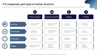
4x4 Grid Powerpoint Ppt Template Bundles with all 12 slides:
Use our 4x4 Grid Powerpoint Ppt Template Bundles to effectively help you save your valuable time. They are readymade to fit into any presentation structure.







FAQs for 4x4 Grid Powerpoint
So for 4x4 grids, spacing is everything - nobody wants cramped content. I'd go with subtle borders or different background colors to separate each section. Font sizes should match across all 16 boxes, and honestly? People always try stuffing way too much text in there. Don't do that. Keep it readable with good contrast. Your template needs to flex between text, icons, maybe small images too. Oh, and start neutral with colors - makes customizing later way easier. Trust me on the spacing thing though, it'll make or break the whole design.
Honestly, 4x4 grids are a game-changer for presenting data. You're basically turning overwhelming info into 16 digestible pieces instead of those brutal walls of text nobody reads. Think Instagram feed vs a dense research paper – way easier to scan. The grid keeps everything balanced and lets you compare stuff side-by-side really cleanly. Perfect for showing KPIs or before/after scenarios. I always group related data points within each section. Makes such a difference when people can actually process what you're showing them instead of just glazing over. Your audience will thank you for it.
I'm obsessed with 4x4 grids honestly - they're perfect when you've got like 8-16 things to organize. Great for product comparisons, team bios, process breakdowns, that sort of stuff. Before/after scenarios work really well too. The trick is making sure each box has enough space to breathe, otherwise it looks cramped and weird. I probably overuse this layout but whatever, it just looks so clean! Works best when your content naturally breaks into chunks that are roughly the same importance level. Don't force it though - if you only have 6 items, maybe try something else.
So first things first - swap out the colors and fonts to match your brand. That's gonna give you the biggest bang for your buck visually. Then replace those stock photos with your actual images and throw your logo in there somewhere. Oh, and don't forget about the spacing between cells! I swear that's what separates amateur designs from professional ones. You can usually adjust that in most templates. Just make sure all 16 cells look cohesive together and your text isn't all squished. Start with colors though - everything else flows from there.
Oh man, the worst thing you can do is cram everything into each cell like you're writing a novel. People's eyes just glaze over. I cringe whenever I see tiny text squeezed in there - honestly looks so unprofessional. Focus one key point per section instead. White space is your friend here, trust me. And don't go crazy with fonts and colors thinking it'll look "creative." Stick to your brand colors and maybe two font sizes tops. Consistent formatting across all 16 cells makes such a difference too.
Okay so the 4x4 thing works because people's brains just handle chunks better than walls of text - trust me on this one. You can reveal each section as you go, which gives natural spots for questions. Plus our eyes automatically follow grid layouts anyway, it's weird but true. Each box forces you to keep things tight instead of going on forever (which I definitely do sometimes). You could tell your story piece by piece through each quadrant, or just group similar stuff together. Way less overwhelming than cramming everything onto one slide.
Consulting firms are obsessed with 4x4 grids - they use them for everything from competitive analysis to strategic frameworks. Finance teams love them too, especially for risk matrices and portfolio stuff. Tech companies throw feature comparisons into these grids all the time. Honestly, any industry dealing with comparative data finds them useful. The format just works when you've got 16 data points to organize cleanly. Oh, and put your most important info in the top-left corner since that's where people look first. I learned that the hard way after making terrible layouts for years.
Animate each cell separately instead of the whole grid - makes a huge difference. I'd go with "Appear" or "Fade In" with like 0.2-0.3 second delays between cells, starting top-left and going across. The wave effect actually looks really smooth if your content works for it. Between slides though? Keep it basic with "Push" or "Fade" so people focus on your grid. Timing's everything here - too fast feels weird, too slow and you'll lose them. Oh and definitely test with real content loaded, not just those generic placeholder boxes. Makes timing feel completely different once actual text is in there.
Microsoft's template gallery is probably your best starting point - they've got some decent grid stuff already there. SlideModel and Envato Elements have way more polished options if you don't mind spending a little cash. Canva's really easy to use too, honestly might be overkill for what you need but whatever works. You could always just make your own with PowerPoint's table tools - takes maybe 10 minutes and you'll feel accomplished lol. I'd grab a few free samples first to figure out what vibe you're going for. GraphicRiver's another option but their interface is kinda clunky.
Oh man, don't try to cram all 16 things on one slide - it's a nightmare on phones. Split that 4x4 grid into maybe 3-4 slides instead, like 4-6 items each. Or flip it vertical since phone screens are tall anyway. I made the font way too small once and nobody could read anything (awkward). Go at least 24pt and give everything more breathing room. Actually, you could do this cool thing where you show the full grid first, then zoom into each section on separate slides. Definitely check it on your actual phone beforehand though!
Honestly, 4x4 grids are perfect for this stuff. Each quadrant can be a different product, then just drop your key details in the cells - price, features, whatever matters most. Before/after comparisons work great too if you split it down the middle. I've also seen people use them as decision matrices where you put options on one side and your criteria on the other, then color-code how each stacks up. Way more engaging than those endless bullet point lists everyone does. Just don't cram too much text in each box or it gets messy real quick.
Okay so color theory is huge for 4x4 grids - you've got 16 sections that could easily turn into visual chaos. Pick one dominant color for your main stuff, then use analogous colors for everything else. Trust me, I made this horrific rainbow grid once and it was... not good. Keep it to 3-4 colors tops with neutral backgrounds so things don't compete. Here's the thing though - what looks fine on one slide gets amplified across 16 boxes. Test your whole palette first because colors hit differently when they're repeated that much. Your viewers need to know where to look without getting overwhelmed.
Honestly, less is more with these things. Stick to 1-2 bullet points max per box or it gets messy fast. Pick one font, one color scheme - trust me on this. I've seen slides that look like a kindergarten art project gone wrong. White space actually helps people focus instead of getting overwhelmed. Your headers need to make sense too - people should instantly get what each section is about. Oh, and here's a weird trick: stand at the back of whatever room you're presenting in. Can't read it from there? Neither can anyone else. Learned that one the embarrassing way during a pitch last year.
Don't just scatter your data randomly across those 16 cells - group similar stuff together. I'd break everything into 4 main themes and dedicate each quadrant to one theme. Then put 4 supporting points under each one. Way less overwhelming that way. Put your strongest insights in the top-left since people read that first. Also keep your formatting consistent within each section - makes it way easier to scan through. Honestly, think of it like sorting your junk drawer but for data. Similar things belong together, and it'll actually make sense when people look at it.
Check out the Arrange menu first - it'll align your grid elements perfectly. Turn on gridlines too (View > Gridlines) for consistent spacing. The Shape Format tools are great for customizing colors and borders on each cell. Drawing guides are honestly so underrated but they're clutch for keeping everything even. If PowerPoint's native stuff isn't cutting it, there are add-ins like Office Timeline, or you could always use Canva and export it over. But honestly? Start with what PowerPoint already has - most people don't even scratch the surface of what it can do.
-
No second thoughts when I’m looking for excellent templates. SlideTeam is definitely my go-to website for well-designed slides.
-
It’s really cool, and you can find pretty much everything you could need for your work or school.