


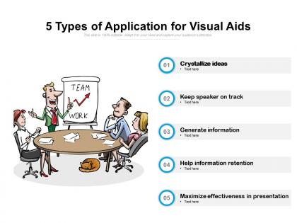
5 types of application for visual aids




Try Before you Buy Download Free Sample Product
 Impress Your
 Audience
 100%
100% Editable
 Save Hours
 of Time


Deal confidently with the big boys. Our 5 Types Of Application For Visual Aids assure you equal footing.
People who downloaded this PowerPoint presentation also viewed the following :
5 types of application for visual aids with all 2 slides:
Our 5 Types Of Application For Visual Aids ensure equal footing. They create an even field.
FAQs for 5 types of application
Honestly, keep it simple with clean charts and good images that actually relate to what you're saying. Those text-heavy slides are the worst - I've sat through way too many where people just read everything word for word. Videos are perfect if you need to show how something works. For data stuff, infographics make everything way easier to understand quickly. Make sure there's enough white space so it doesn't look cramped. Oh, and definitely check that people in the back can actually read your slides beforehand. Each visual should have a real purpose, not just be there because you felt like you needed more slides.
Look, your template choice literally sets the vibe before you open your mouth. Clean, minimal designs make you look legit and professional. Messy or dated ones? They'll tank your credibility even with amazing content. Blues work great for corporate stuff since they feel trustworthy. Bright colors scream creative energy but might be too casual depending on your audience. I've watched solid presentations bomb just because the template looked cheap. People judge you in like 3 seconds, so match your design to both your message and the impression you want. Oh, and definitely check how it looks in presentation mode first!
Colors totally make or break your slides, honestly. Bright, contrasting ones grab attention and keep people from zoning out on boring beige backgrounds. Use them smart though - red for urgent stuff, green when things are going well. That kind of thing. But don't go overboard with some crazy rainbow mess that'll hurt everyone's eyes. I learned that the hard way once. Stick to 2-3 colors max, make sure there's good contrast so people can actually read your text, and definitely test how everything looks on the screen beforehand.
Honestly, infographics are just a way to turn boring spreadsheet data into something people will actually look at. You're basically translating numbers into visual stories using charts and icons. The key is picking your main point first - don't try cramming everything in or it'll look like a mess. I'd start with something free like Canva (though Piktochart works too). Focus on what matters most and build around that. Your brain processes visuals way faster than rows of data anyway. Trust me, your audience won't miss having to decode another confusing spreadsheet.
Dude, one insight per slide max - cramming everything together just makes people's eyes glaze over. Big fonts are your friend, and make sure there's actual contrast between your colors. I swear half the presentations I sit through have charts you literally can't read from the back row. Give people a beat to look at your visual before jumping into explanations. Oh, and use arrows or callouts to point out the important stuff - saves everyone time. If you can swing it, definitely test your slides on the real projector first. Those colors that look great on your laptop? They might look like garbage projected.
Mix up your formats so you hit different learning styles. Diagrams and charts work great for visual people. Audio narration helps auditory learners - honestly, even just background music can make a difference. Interactive stuff like clickable hotspots keeps the hands-on folks engaged. Don't forget text-heavy slides for people who learn by reading, though those can turn into PowerPoint hell real quick! I'd layer everything together - maybe do a clean infographic with some audio explanation and a quick demo. That covers everyone without being too much. Short answer: give people options for how they want to absorb the info.
Okay so animations can totally make or break your presentation. Use them sparingly and they'll guide people's attention really well. Go overboard though? Everyone's just watching your text bounce around instead of actually listening to what you're saying. I learned this the hard way after making way too many slides with those spinning transitions - looked ridiculous. Keep it simple with subtle fades or basic slide-ins when you want to reveal info step by step. Skip the flashy rainbow effects. Stick to maybe 2-3 transition types max, and definitely test the timing beforehand so nothing feels weird or rushed.
Oh man, don't cram your slides with tons of text - makes people's eyes glaze over instantly. Use big enough fonts so the person in the back can actually see. Pick colors that don't make everyone squint. Never just read off your slides word for word (seriously, we can all read). Keep animations to a minimum since they're usually annoying anyway. Your visuals should actually relate to what you're talking about, not just random stock photos. Test everything beforehand! Projectors love to break at the worst possible moment, so have a backup ready.
Biggest things to hit are visual, audio, and motor stuff. Make your text bigger - like 24pt minimum - and use high contrast colors. I made this mistake once with tiny white text on yellow slides and literally half the room couldn't see anything, so embarrassing! Alt text on images is clutch, plus captions or transcripts for videos. Oh and don't make people do super precise mouse stuff since that's hard for some folks. Honestly though? The simplest hack is just narrating what's on your slides as you go. Takes zero prep and helps everyone follow along way better.
Dude, you won't believe how much clearer visuals help people remember stuff - like 30-40% better retention when your images are sharp and fonts are readable. People's brains get overworked trying to decode blurry text instead of actually absorbing what you're saying. I've literally watched entire rooms of people just zone out when they can't read the slides. It's brutal. Short sentences work. But here's what I always do - test everything from the back row first. Also, never go smaller than 24pt font or you'll lose half your audience immediately. Trust me on this one.
Okay so first thing - map out your story's big moments, then pick visuals that actually punch up those beats. Like dramatic before/after shots for transformation stuff, or tight shots on faces when things get emotional. I swear, half the presentations I sit through just have slides repeating exactly what the speaker's saying (so boring). Your visuals should do the heavy lifting while you narrate. Timing matters too - let powerful images breathe for a second. Oh, and build each slide around one story beat instead of throwing everything on there at once.
Honestly, templates are like your company's style police - they keep everyone using the same fonts, colors, and logos so you don't look like a hot mess. Because trust me, without them you'll definitely get Bob from accounting throwing Comic Sans everywhere while Sarah's going wild with neon green backgrounds. Nobody wants that chaos. Plus they're huge time savers since you're not starting blank or digging around for the right logo file. Just make sure your templates actually match your current brand stuff and that people can actually find them when they need to.
Honestly, just watch people's faces while you're presenting - that'll tell you everything. Are they leaning forward or zoning out? After you're done, ask them straight up which slides helped and which ones sucked. I usually send a quick survey too, but the real-time stuff is gold. Pay attention to questions afterward - if someone's asking about something you swear you covered visually, your slide probably wasn't as clear as you thought. Take notes on what worked so you don't forget for next time.
Dude, interactive stuff is everywhere right now - clickable infographics, animated charts, those AR overlays where people can actually dig into the data themselves. Minimalist design is having a major moment too (which honestly makes sense, less mess = better focus). Real-time polling during presentations is pretty cool. Micro-animations and personalized dashboards are solid bets. Oh, and video backgrounds or cinemagraphs work great for grabbing attention without being annoying. Don't go crazy though - try one interactive thing first and see how it lands before you turn your next presentation into some sci-fi experience.
Honestly, AR is a game-changer for presentations. Your audience can actually interact with 3D models and animations instead of just staring at boring slides. I've watched people literally try to reach out and touch the AR stuff - it's crazy how much more engaged they get. You can do rotating product demos, build processes step-by-step right in front of them, or let people manipulate data visualizations themselves. The trick is being smart about it though - don't just throw in AR because it looks cool. Maybe start with something simple like a 3D chart or basic model to see how your crowd reacts first.
No Reviews