


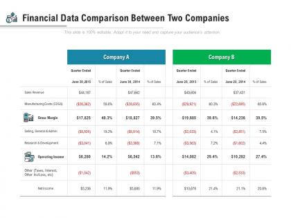
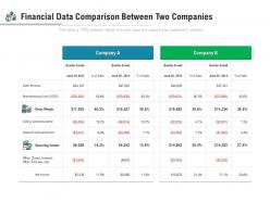
Financial data comparison between two companies




Try Before you Buy Download Free Sample Product
 Impress Your
 Audience
 100%
100% Editable
 Save Hours
 of Time


Our Financial Data Comparison Between Two Companies create a congenial environment. Ensure the all enjoy the event.
People who downloaded this PowerPoint presentation also viewed the following :
Financial data comparison between two companies with all 5 slides:
Our Financial Data Comparison Between Two Companies bring out the genius in you. Your exceptional aspects come to the fore.




FAQs for Financial data comparison
Start with profit margins - gross and net - since they're basically everything when it comes to how well a company actually makes money. Current and quick ratios show if they can cover their bills (super important). Debt-to-equity is huge too, especially when the economy gets weird. I always check revenue growth and EPS trends next. ROE and ROA are great for seeing how smart management is with their resources. Oh, and don't get stuck analyzing forever - pick a few companies and just start comparing these basics first.
You can't compare companies across different industries - it's like comparing totally different animals. Tech startups look nothing like manufacturing companies financially, even at similar sizes. Each industry has its own capital needs, expected margins, seasonal quirks, all that stuff. A SaaS company might pull 80% gross margins while grocery stores survive on like 2-3% (which honestly still blows my mind). Neither's doing it wrong though - that's just how their industries work. Always benchmark against similar companies in the same sector, otherwise your analysis won't mean much.
Looking at historical performance helps you understand trends and see how stuff has performed before - kind of like checking reviews before buying something. But here's the thing: past results don't predict the future, so don't bank on them alone. I learned this the hard way with a few stocks that had great five-year runs but then tanked. You can spot patterns and get a feel for volatility, which is helpful. Just make sure you're also looking at what's happening now - current fundamentals, market conditions, your own situation. Historical data is one piece of the puzzle, not the whole picture.
Ratios are your best friend here, not the raw dollar amounts. Current ratio (current assets divided by current liabilities) shows who can actually pay their bills. Debt-to-equity tells you which company's taking bigger risks financially. Asset turnover and return on assets? Those show efficiency. Raw numbers can totally fool you if one company's massive and the other's tiny. Oh, and make sure you're comparing similar industries - like, don't pit a tech startup against a utility company. Same time periods too, obviously. The ratios will give you the real story about performance.
The biggest problem is they're just a snapshot - doesn't tell you where the company's heading. Also, you can't really compare a tech startup to like a grocery store because their margins are completely different worlds. Companies can mess with the numbers through accounting stuff too, which is honestly pretty annoying when you're trying to get real info. Cash flow timing gets ignored, and future growth potential? Forget about it. These ratios miss all that. Stick to comparing companies in the same industry, and definitely use other metrics alongside them. Otherwise you're kind of flying blind.
Look at operating cash flow first - that's where you see if companies actually make money from their main business, not just on paper. I always check for steady positive trends rather than crazy ups and downs. Investing flows tell you how much they're spending on growth vs selling stuff off. Then there's financing flows for debt and dividends. Cash flow statements are honestly way better than earnings reports since they're harder to fudge with accounting tricks. Free cash flow is what I focus on most - just operating cash minus what they spend on equipment and facilities. That's your best apples-to-apples comparison between companies.
So basically you're checking how much debt companies have compared to what they own or make - debt-to-equity ratios and stuff like that. Higher debt usually means bigger potential gains but way more risk too. You can figure out which companies might tank when the economy gets rough, or which ones are actually smart about borrowing money. I always check industry standards first though, since tech companies and utilities have totally different "normal" debt levels. Short version: it helps you avoid investing in companies that are drowning in debt they can't handle.
Oh man, external economic stuff really messes with company comparisons. Interest rates, inflation, currency changes - they hit companies totally different depending on their debt, where they operate, all that. You might look at Company A crushing Company B, but maybe A just lucked out with current conditions while B is actually stronger long-term. I hate when this happens because it's so sneaky! Best bet is comparing them during similar economic times or adjusting for those macro factors. Otherwise you're basically comparing apples to... well, different apples in completely different weather.
Honestly, I'd just stick with Excel first - you can whip up decent models and pivot tables without much hassle. Power BI or Tableau are game-changers though if you're juggling multiple data sources (the visualization stuff is so much cleaner). Python with pandas is where it gets fun if you're into automation and heavy number crunching. Oh, and don't sleep on QuickBooks - their comparison features are actually pretty solid for standard financial statements. Really depends on what you've got access to already. Start there, then figure out what's driving you crazy and upgrade accordingly.
Dude, charts are a game changer for financial stuff. Your brain just gets visuals way faster than staring at endless spreadsheet rows - trust me on this one. I used to dread budget meetings until I started graphing everything first. You'll spot trends and weird outliers instantly that would take forever to catch otherwise. Bar charts especially help when you're showing seasonal patterns or trying to explain stuff to people who hate numbers. Honestly, even a simple line graph beats raw data every time. Just throw your figures into a chart before diving deep - you'll be surprised what jumps out.
Basically, public companies have to spill everything - quarterly reports, annual filings, all that standardized stuff that makes comparing them pretty straightforward. Private companies though? They can keep their cards close to their chest since there's no legal requirement to share much beyond basic revenue. Their accounting methods are all over the place too, which makes things messy. You'll end up having to get creative - hitting up industry contacts, using estimates, or paying for third-party data (which honestly gets expensive fast). My advice? Start building relationships with people who actually work at these private companies if you want the real scoop.
Oh man, international comparisons are such a pain! Exchange rates will mess with your numbers big time - I've seen profitable companies look like disasters just because of when the data got pulled. Different accounting rules don't help either. US companies use GAAP, but most others follow IFRS, so the same stuff gets reported totally differently. Tax rates and inflation vary like crazy between countries too. You'll want to convert everything to the same currency and timeframe first. Also check which accounting standards each company uses before you make any calls.
Oh man, biggest mistake is mixing different time periods or accounting methods when you're comparing stuff. Like, don't get excited about 50% growth if it's only on $1000 vs $100k - the actual dollars matter way more than percentages sometimes. Watch for random one-off events messing with your data too. Honestly? I've seen people get so obsessed with the math they forget basic context like market conditions or company size. Always worth having someone else eyeball your work because we all miss obvious stuff when we're in the weeds.
Make a simple framework that covers both sides. List your hard numbers first - ROI, margins, growth rates, that stuff. Then score the softer factors on a 1-5 scale: management quality, brand strength, market position, competitive advantages. Basic but it actually works. The real trick is figuring out how much weight each category gets based on your timeline. Long-term decisions? Those qualitative factors usually matter way more than the immediate spreadsheet shows. Don't let perfect numbers blind you to obvious red flags - learned that one the hard way.
Okay so industry benchmarks are basically your reality check - they show you if your numbers actually mean anything or if you're just fooling yourself. Like, you might think your 15% profit margin rocks, but then you find out everyone else is hitting 25%. Ouch. I've watched people make really dumb moves because they skipped this step. These benchmarks help you spot real opportunities and set goals that aren't totally unrealistic. Oh, and they're great for finding your weak spots too. Bottom line: grab that industry data before you either celebrate or freak out about your performance.
No Reviews