


Comparing 2 companies income statement ppt sample file


Try Before you Buy Download Free Sample Product
 Impress Your
 Audience
Editable
of Time


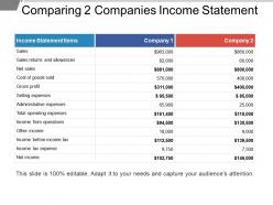
Assess your business's ability to generate earnings relative to its associated expenses by Comparing 2 Companies Income Statement PPT Sample. With the comparative income statement PPT slide, compare income statement accounts and categories. Help investors and creditors to judge your company’s return on investment based on its relative level of resources and assets. Use this income statement PPT template to compare the gross margin of your business to the net sales. A company with a high gross margin ratio means that the company will have more money to pay operating expenses like salaries, utilities, and rent. Calculate gross profit and show it to your audience in an effective income statement PowerPoint presentation. Provide your team members, investors, managers with relevant comparative data. Compare financial statements between businesses to know where do you stand in front of your competitor company. With comparative income statement PPT layout, measure the profitability the 2 different companies make. Invest less time to prepare an effective presentation with ready to use, high-quality PPT template.
People who downloaded this PowerPoint presentation also viewed the following :
Comparing 2 companies income statement ppt sample file with all 5 slides:
Fire on all cylinders with our Comparing 2 Companies Income Statement Ppt Sample File. Your thoughts will start to accelerate away.


FAQs for Comparing 2 companies income statement
Look at revenue first - that's your money coming in. Then check cost of goods sold (basically what it costs to make your stuff), operating expenses for everything else, and net income at the bottom. I always convert these to percentages of revenue too, not just raw numbers - makes it way easier to spot trends. You can catch scary stuff like revenue going up but profits getting squeezed. Actually had a client miss that for months! Compare these across different periods and you'll see if you're getting more efficient or if something's going wrong.
Looking at income statements from different periods is honestly a game-changer. You'll catch revenue trends, see if expenses are getting out of hand, and spot whether profit margins are actually improving. Way better than just staring at one quarter's numbers! I always calculate the year-over-year percentage changes - makes the patterns super obvious. Don't get distracted by random spikes though, focus on what's happening consistently over time. It's basically like watching how a company's story unfolds instead of just seeing one chapter.
Gross profit margin is honestly the first thing I check when comparing companies. It tells you who's better at turning sales into profit before all the overhead kicks in. Better margins usually mean stronger pricing power or cheaper production costs - basically whose business model actually works. I'm always looking for consistent trends rather than just one quarter though. Compare companies in the same industry since a 20% margin might be amazing for groceries but terrible for software. Higher margins over time? That company probably has some real competitive edge going for it.
Oh man, seasonality messes with income statements big time. Think about it - retail stores kill it in Q4 because of holidays, but ice cream places are probably struggling then while summer was their goldmine. You can't just compare Q1 to Q3 for these businesses or you'll think they're tanking when it's totally normal. The trick is sticking to year-over-year comparisons instead. Like Q4 2024 vs Q4 2023, not Q4 vs Q1 - that's where you'll see what's actually happening. Makes way more sense that way.
Dude, the worst thing you can do is compare companies that use totally different accounting methods. Like, one might depreciate equipment over 5 years while another does 10 years - that'll mess up everything. Don't just stare at percentages either, actual dollar amounts matter way more than you'd think. Watch out for one-time stuff too, those random charges always throw people off. Oh and seasonal businesses are brutal - never compare a retailer's holiday quarter to January, you'll get completely bonkers numbers. The footnotes are boring but that's where the real story is.
Honestly, you really need benchmarks to make sense of your income statement numbers. Like, is a 15% profit margin good? Could be amazing, could be trash - totally depends on your industry. I'd grab data from industry associations or financial databases and compare your gross margins, operating expenses, net profit ratios against similar companies. You'll catch problems early that way. Plus you can see where you're crushing it vs. where competitors are beating you. Maybe check this stuff during your next quarterly review? Without benchmarks you're just guessing if your numbers are actually decent.
Yeah, non-operating income can definitely mess with your comparisons. Asset sales, investment gains, random one-off stuff - it's all noise that makes companies look way more profitable than they actually are. I always strip that out first when I'm analyzing anything. Compare operating income instead, that's the real meat of how the business is doing. Then just make a note about the weird non-operating items on the side. Trust me, you'll get a much clearer picture that way - especially when you're looking at trends or stacking companies against each other.
Ugh, accounting policy changes are the worst for comparing income statements. You're basically looking at completely different measurement systems - like if a company switches from LIFO to FIFO inventory methods. The numbers change but not because business actually got better or worse. It's honestly pretty annoying when you're trying to analyze trends. But here's the thing - companies have to disclose these changes in their footnotes, and they usually restate prior periods too. So definitely dig into those footnotes first. Makes all the difference for getting a real comparison.
Gross profit margin, operating margin, and net profit margin are your main ones - they show profitability at different stages. SG&A as a percentage of revenue is solid for spotting efficiency trends too. ROE and ROA connect your income statement to balance sheet performance, which is pretty clutch. Honestly, margin expansion over multiple years gets me way more excited than flashy growth numbers. Oh, and don't skip interest coverage ratio if you're dealing with debt-heavy companies. Calculate these for like 3-5 years instead of just one period - you'll actually see patterns that matter.
Okay so first thing - strip out all the one-time stuff like restructuring costs or weird asset sales. That junk will mess up your whole analysis. Convert everything to the same currency and accounting standards if you're dealing with different regions. What I usually do is turn each line into a percentage of revenue instead of looking at raw dollars, especially when the companies are totally different sizes. Oh and watch out for different fiscal year ends - that can throw things off too. Seasonal stuff matters. Start with getting revenue normalized first, then work down from there. The whole point is cutting through the noise to see what's actually happening operationally.
Yeah, external factors can totally mess up your income statement comparisons. Recessions hit some companies hard while others actually do better - it's weird how that works. Industry cycles matter too, plus regulatory stuff and even weather patterns for seasonal businesses (learned that one the hard way). Interest rate changes and inflation don't affect everyone equally either. You'll want to look at several periods instead of just two, and honestly? Sometimes you're still comparing apples to oranges no matter what you do. Just adjust for the big external variables or you might draw some really wrong conclusions about performance.
Expense variances show you exactly where your business is hemorrhaging cash or crushing it efficiency-wise. Don't just glance at the bottom line when comparing statements - dive into each category. Your marketing spend might've jumped 40% while sales only grew 10%. Ouch. Or maybe operational costs dropped big time thanks to automation. These details are pure gold for figuring out what's actually working. I always get suspicious when I see huge variances without obvious explanations. Ask "why" every single time - that's where you'll find your next quarter's game plan.
So exchange rates totally screw with multinational financials. Foreign subsidiaries get translated back to the parent company's currency, which creates this weird problem where revenue looks like it's growing or shrinking when really the business stayed the same. Super annoying for analysis honestly. Most decent companies will show you "as reported" vs "constant currency" numbers - always go for the constant currency ones if you're trying to figure out what's actually happening with operations. Otherwise you're just looking at currency noise, which isn't helpful.
So those extraordinary items can totally throw off your analysis if you're not careful. We're talking one-time stuff - disasters, big lawsuits, random asset sales. They make companies look amazing or terrible when really it's just weird timing. I always pull those out when I'm comparing years or trying to predict what's coming next. The footnotes are where they hide this stuff, and honestly some companies are pretty sneaky about it. But yeah, once you adjust for that noise you get a much better sense of how the business actually runs day-to-day.
Honestly, these tools are game-changers for comparing income statements. QuickBooks and Excel templates can pull your data automatically instead of you doing everything by hand. No more building spreadsheets from scratch - the software generates side-by-side comparisons instantly. It'll calculate variance percentages and highlight big changes for you. Some platforms like PlanGuru even make charts, which is pretty cool. Start with whatever accounting software you're already using though. Most have comparison features hiding in there that people don't even realize exist. Seriously saves so much time.
-
Great product with effective design. Helped a lot in our corporate presentations. Easy to edit and stunning visuals.
-
Presentation Design is very nice, good work with the content as well.