

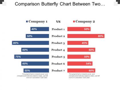
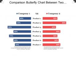
Comparison butterfly chart between two companies and products





Try Before you Buy Download Free Sample Product
 Impress Your
 Audience
 100%
100% Editable
 Save Hours
 of Time


Get your colleagues feeling fully charged with our Comparison Butterfly Chart Between Two Companies And Products. It will energize your associates.
People who downloaded this PowerPoint presentation also viewed the following :
Comparison butterfly chart between two companies and products with all 5 slides:
Implement changes that improve ease of functioning with our Comparison Butterfly Chart Between Two Companies And Products. It helps institute amendments.
FAQs for Comparison butterfly chart between two
So butterfly charts are basically horizontal bar charts that split from the center - bars go left and right instead of starting from zero. They're perfect for comparing two things side by side, like before/after data or male vs female stats. Way cleaner than cramming everything into separate charts honestly. You can spot differences instantly since everything's mirrored from the middle axis. They look similar to tornado charts but you're comparing actual values, not doing sensitivity stuff. Next time you've got two datasets to compare, definitely try one instead of making people look back and forth between charts.
Butterfly charts work great for comparing two related datasets that mirror each other - like before/after stuff, male vs female demographics, or survey responses between different groups. Population pyramids are the classic example. Budget vs actual spending too. Basically anything where you've got opposing categories splitting from a center line. Honestly, I'm obsessed with using them in presentations because they look really cool and people immediately get the relationship between both sides. Just don't make your audience guess what each side means or you'll waste time explaining the chart instead of talking about what it actually shows.
So butterfly charts are basically two bar charts that face each other - super clean for comparisons. The mirrored layout makes differences pop instantly, way better than those cluttered side-by-side charts honestly. Perfect for before/after stuff or comparing two groups. I use them all the time for budget vs actual spending (my boss loves those). The symmetry thing really works - your brain just processes the gaps faster. Works great for this year vs last year too, or really any two-part comparison where you want people to immediately see what's different.
So basically you need that center line splitting your two datasets - that's crucial. Color code each side differently and make sure your scales match perfectly (people mess this up constantly). Short category labels work best, trust me on this one. Toss in a legend if the colors aren't super obvious. Data labels on the bars help too if you've got room. The whole point is making it dead simple to see what you're comparing without your audience squinting at it for five minutes trying to figure out which side is which.
So butterfly charts are pretty straightforward once you get them. Picture butterfly wings - bars shoot out from the center, one group on each side. The length shows you the values, so longer bars = bigger numbers. I use these all the time for comparing stuff like male/female data or before/after results. Honestly, they're way clearer than regular bar charts for this kind of thing. Look for where the wings don't match up - that's where you'll spot the interesting differences between your two groups. Super useful for any head-to-head comparison really.
Honestly, Tableau's gonna be your easiest bet for butterfly charts - the dual-axis thing just clicks. Power BI works great too. Excel's possible but ugh, getting those axes to line up is such a headache (learned that the hard way). If you're into coding, Python with matplotlib or Plotly gives you total control over how it looks. R's ggplot2 is solid too. I'd probably start with whatever you already know best and mess around with the dual-axis features. Though if you're starting fresh, definitely go Tableau first.
Totally! Butterfly charts are way more flexible than most people think. Color schemes can match your brand or highlight specific data points. Categories, scales, labels - you can tweak all of it based on your audience. Technical folks might want detailed annotations, while executives prefer clean, simple labels. Actually, I've seen some people flip them horizontally which looks pretty cool. The key is figuring out what your audience actually cares about first. Then you can adjust everything else around that - whether it's making things more user-friendly or diving deeper into the technical stuff. They're honestly one of my go-to charts because of how adaptable they are.
Look for data that naturally contrasts - before/after stuff, competing groups, positive vs negative. Demographics are solid choices (male/female, age brackets). Time comparisons work too, like this year against last. Honestly? I've made this mistake - creating charts that look cool but don't actually say anything meaningful. Your categories need to match up on both sides perfectly. The differences should be big enough to justify making people work harder to read it. Butterfly charts aren't exactly intuitive, you know? Sketch out what story you're trying to tell first. That'll save you from pretty-but-pointless visuals.
Oh man, the symmetry thing trips everyone up - your scales have to match on both sides or you're basically showing fake data. Super important to label everything clearly too, and pick colors that actually make sense. Don't cram your text together because it looks sloppy as hell. Honestly, I see people try to fit like 10 categories and it just becomes this overwhelming mess. Stick to maybe 5 or 6 tops. You can always make another chart later if you really need to show more stuff.
Dude, colors will totally make or break your butterfly chart. Go for high contrast between sides - navy and orange work great, but avoid light blue with pale green (learned that the hard way). Sequential colors help people follow the data flow naturally. When you're comparing opposites like male/female, diverging palettes are perfect. I've honestly seen way too many rainbow disasters that just confuse everyone. Keep it to 2-3 colors max. Oh, and definitely check how it looks in grayscale - some printers still suck. Your audience shouldn't need to squint at legends to figure out what's what.
Butterfly charts are confusing as hell without annotations, trust me. Your readers will stare at those opposing bars and have no clue what they're looking at. I always add 2-3 callouts minimum - they help highlight the biggest differences between your datasets or explain weird patterns. Place them right next to the data points instead of shoving everything in a legend (nobody reads those anyway). Think of annotations like breadcrumbs guiding people to your main insights. Without them, even the smartest person will miss your point completely.
Butterfly charts are perfect for showing two sides of the same story. You can compare planned vs actual results, or lay out pros and cons side by side. People get the contrast immediately instead of getting lost flipping between slides. The mirrored design creates this cool visual tension that actually keeps your audience paying attention. I always use contrasting colors - makes the differences way more obvious. The best part? You can point to where the bars stretch furthest in opposite directions to highlight your biggest insights. Trust me, it makes your data way more compelling than those boring regular bar charts.
Healthcare, finance, and retail get the most out of butterfly charts. They're perfect for showing opposing stuff side by side - patient outcomes vs complications, revenue vs expenses, sales vs returns. Manufacturing uses them for defects against quality scores too. Really, any industry with "good vs bad" or "before vs after" data works. I've seen people try to cram this kind of contrasting info into regular bar charts and it just looks awful. Next time you're dealing with opposing metrics that share the same categories, definitely try a butterfly chart instead.
So butterfly charts are clutch for comparing two groups side by side - like male vs female data, before/after results, that kind of thing. Population pyramids are probably the most common example you'll see. They work great when your categories sit on the y-axis and you've got two opposing datasets. Budget stuff too - actual vs planned spending looks clean this way. I honestly think they're way better than regular bar charts for this type of comparison, but people don't use them enough. Your audience gets the contrast immediately instead of having to bounce between different sections.
Dude, butterfly charts are actually pretty genius for keeping people engaged. Your audience can instantly spot differences without doing mental math between separate bars - way less brain work required. The "wing" shape naturally draws your eye to where the biggest changes happened. Honestly, regular bar charts start feeling boring once you've seen a good butterfly chart in action. Next time you've got before/after data or need to compare two groups, definitely give it a shot. Trust me, people notice when you make data easier to digest.
-
Innovative and Colorful designs.
-
Qualitative and comprehensive slides.